princessa
TPF Noob!
- Joined
- Jul 23, 2007
- Messages
- 19
- Reaction score
- 0
- Can others edit my Photos
- Photos OK to edit
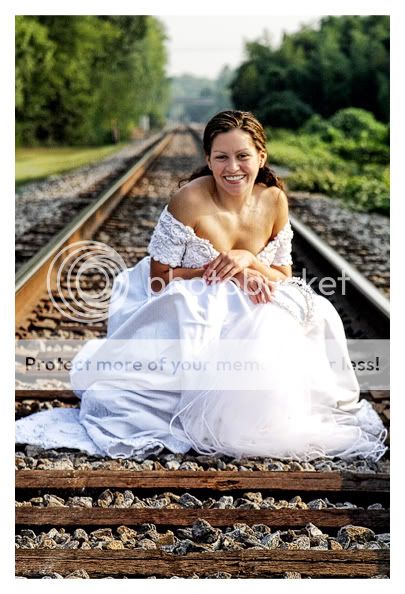
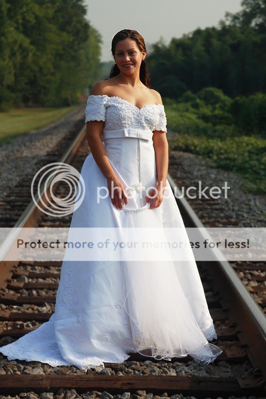
i just got CS3 and Im soo lost, please help!! lol, can someone please edit these for me and tell me what you did? I need help with lighting on her face and whatever else lol Thank you sooooooo much!!!!
here are the photos.......
http://i100.photobucket.com/albums/m39/soeuro/IMG_7810.jpg
http://i100.photobucket.com/albums/m39/soeuro/IMG_7817-1.jpg
here are the photos.......
http://i100.photobucket.com/albums/m39/soeuro/IMG_7810.jpg
http://i100.photobucket.com/albums/m39/soeuro/IMG_7817-1.jpg


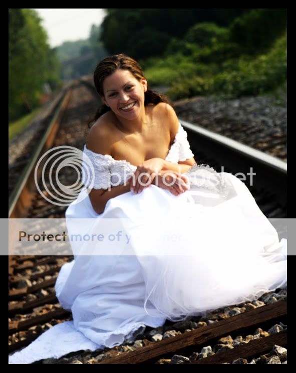
") (couldnt save the veil unfortunatly. maybe with a bit more work id get it, but could only save the tiara)
(couldnt save the veil unfortunatly. maybe with a bit more work id get it, but could only save the tiara)