What's new

1st post to this gallery

erwinem

TPF Noob!
Joined
Sep 23, 2013
Messages
7
Reaction score
4
$DSC_0662_sil efx yellowed lightened_water.webp

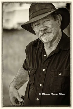
Taken at a photo class.
 
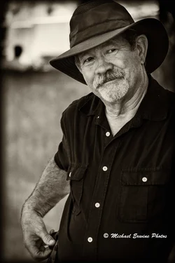
^^agreed but I like the processing of the image.
 
A little darker processing on that one. Still nice.
 
Very nice portrait. :thumbup:
 
"Chekhov's gun is a dramatic principle requiring that every element in a narrative be necessary and irreplaceable, and that everything else be removed.[1][2][3] Stated by Anton Chekhov, "Remove everything that has no relevance to the story. If you say in the first chapter that there is a rifle hanging on the wall, in the second or third chapter it absolutely must go off. If it's not going to be fired, it shouldn't be hanging there."

Including the hand makes the very important in the composition because that means that the head is at one end of the shot and the hand at the other - and there doesn't seem to be any reason for it.
So what it comes down to is that the processing looks nice.

8sb8.jpg
 
Lew you just listed a reason for the hand to be there (compositional balance in opposing corners) and then said that there's no reason for it to be there?? Even in a narrative or portrait shot, the shapes being arranged pleasingly has importance. Photos aren't just stories, they are images that should also just feel pleasing usually regardless of content.

However, I still do take issue with the hand as well, but for a different reason -- he has something on his belt that he is messing with, but it's right in the middle of the fadeout, and you can't tell what it is. Which is frustrating and weird, and probably not in an intentional way. Especially since it looks sort of like a gun (probably a cellphone or something, but any hint at a gun draws a lot of mental attention!).

 
Lew you just listed a reason for the hand to be there (compositional balance in opposing corners) and then said that there's no reason for it to be there?? Even in a narrative or portrait shot, the shapes being arranged pleasingly has importance. Photos aren't just stories, they are images that should also just feel pleasing usually regardless of content.

However, I still do take issue with the hand as well, but for a different reason -- he has something on his belt that he is messing with, but it's right in the middle of the fadeout, and you can't tell what it is. Which is frustrating and weird, and probably not in an intentional way. Especially since it looks sort of like a gun (probably a cellphone or something, but any hint at a gun draws a lot of mental attention!).

Yes, I would understand the hand and the interesting curve of the arm if it had something going on but since its just there ambiguously, it's frustrating and not in a good way. It levers the head to the top corner, causes most of the image to be filled with nothing much at all, it's wrong. If he had a pipe, a gun, a phone, a tool, anything that gives more meaning and a reason for it being there, but, failing that, no.
 
Oh, there is something going on with the hand. It has something to do with the facial expression of the subject. He is reaching for the cell phone to call police on the photographer. Subject is not looking into a camera (that my only "beef" with this photo), he is looking beyond it, seemingly ignoring the photographer, but his face shows tension like in "I gonna get you, you weasel !" :lol:

Luckily cowboys changed the gun for a cell phone nowadays.
 
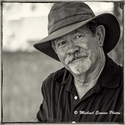
Is it better if I take the hand our of the equation?
$DSC_0662_edited-water.webp
 
IMHO, yes, that is the best one of them.
Agree, but now there is too much empty space on the left side. Picture is right hand "heavy".
 
It now feels a bit cramped. But maybe it wouldn't as much if I had not seen the first two. Weird.
 

Create an account or login to comment

You must be a member in order to leave a comment

Create account

Create an account on our community. It's easy!

Log in

Already have an account? Log in here.

New Topics

Back
Top Bottom