C&C as requested:
#1 Ok. Let's see what we have here. Allow me to ramble as I make some general observations. Perhaps I will notice something you did not. Or perhaps not.
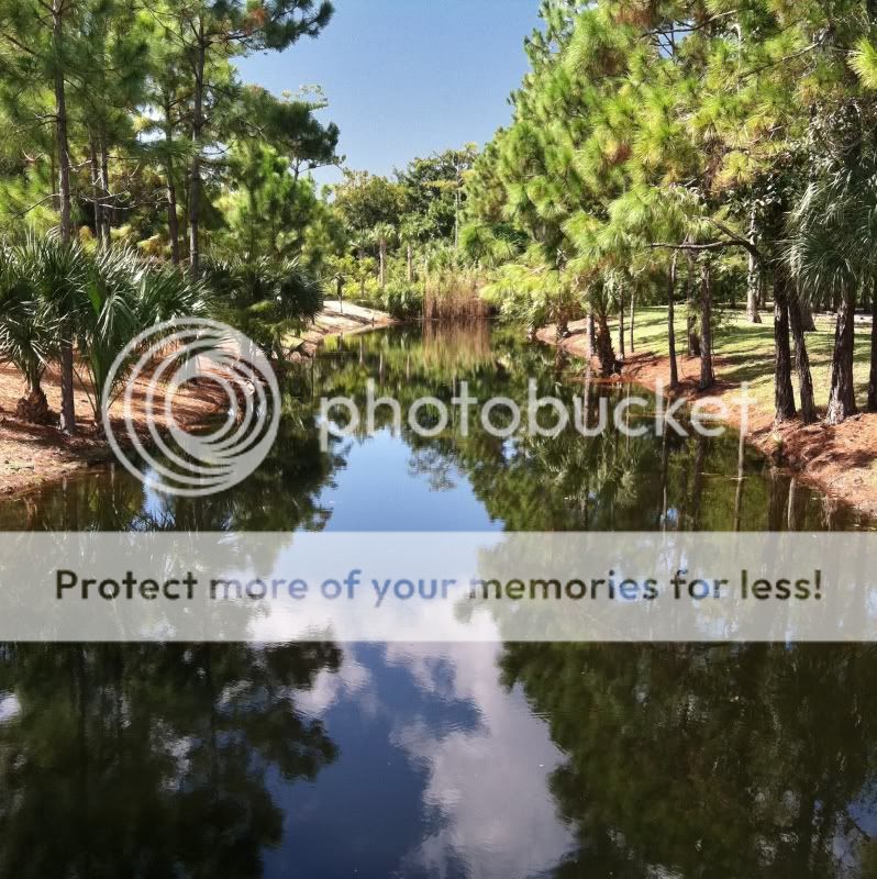
It's a landscape shot vertically. The murky water channel forms a dark triangle which comes to a vague point about 1/3 from the top of the image. The reflection of the blue sky, white clouds, and green trees is close to mirrorlike, but not quite. The trees are evergreen, but there are some short palms to the left. A clump of brown grass shows at the tip of the triangle. Some blue sky is visible at the top but clouds are only visible in the reflection. The trees on the left form a very rough triangle that meets roughly at the place that the water triangle meet, as do the trees on the right. They sky also kind of comes down very roughly to a point. Hard shadows, shadow direction, and color temperature suggest time of day is late morning or early afternoon. The background suggests that the water channel changes course, perhaps to the left.
My thoughts... so what? What was it in this scene that interested you? Was it the reflection in the brown/blackish water? Was it the feeling of distance? Let me ask it to you this way... as an artist, would you draw this scene? Why? Why not?
Technically the image is fine. The sky is a little noisy but that's no biggie considering the camera you're currently limited to. But, as I stated to you before, I think, considering your God-given talent of drawing, you are ready to move beyond technically sound or compositionally balanced images. This image is extremely balanced in my view. But a balanced image does not a great image make.
I like the simplicity of the triangular form that the water makes, but the trees above are just a mess of green. I can't see the trees through the forest, so to speak.
I might be mistaken, but I think I recall you saying that a photographer could make a q-tip look awsome. Well, I don't completely agree with that. I think most landscape photographers would see this scene and keep on walking or they were focus on a small part of it to simplify it. If you give me a q-tip and a dark studio with lights, sure, I could make a q-tip look awsome. But if you tell me take a photo of that q-tip lying in the corner of the bathroom using ambient light, I don't think I could do it.
I remember when I started this hobby, I had a similar thought that a photographer can make anything look great. I don't believe this anymore. Instead, I believe skilled photographers have simply learned to see things that other's are not tuned to.
#2 This is a cleaner, more effective image. I don't think it's "great", but I can see immediately that it is more effective. Let's try to figure out why.
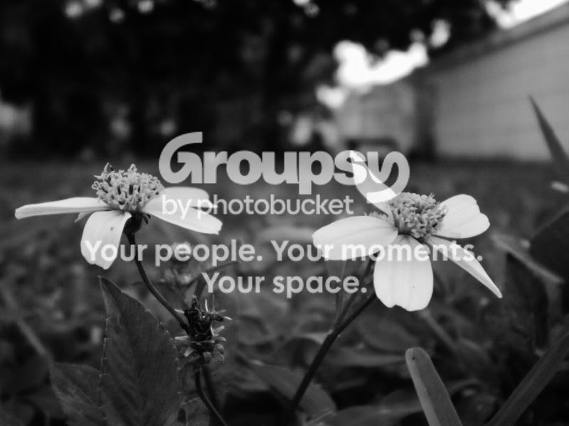
The first obvious thing is it's monotone. We have two flowers that seem to stem from teh same root although we cannot see where or if they join. They are side-by-side roughly half-way up the image. They strongly contrast with their immediate surroundings. The only tones that are similar are in teh upper right where an OOF portion of what appears to be the sky is visible thorugh some trees and above a wall. The two flowers are composed against an area of grass with an out of focus texture of mid-tones. The foreground consists of dark toned grass and a few leaves, which together with the seemingly mowed grass give the impression that these are in a flower bed.
You stripped out the color. I don't know for sure, but I bet that helped to simplify this image more than anything. I can imagine the wide array of colors that are in the original. Limiting the color pallette (or taking it away completely) is a very powerful tool for simplifying the scene and thereby making your "message" more concise.
Secondly, it appears that you carefull framed the flowers against an area of the background that lacks sharp detail/contrast. This allows the white petals to really stand out. Great use of background.
The wall, in addition to the very narrow depth of field gives a strong impression of depth due to linear perspective. I keep following that wall back (which leads toward the center of the image) hoping I'll get something more, but my eye jumps back to the flower. I like that.
What bothers about the image is where you placed the flowers. I think that we, as human's are used to seeing head & shoulders when talking to people. Furthermore, people's eyes are located in the top, oh, I don't know, 5% of the body as a whole? So we are used to seeing objects where the majority is below our line of site. Now, if we think about a portrait of a person... we don't put their eyes in the middle because it feels unnatural (some newcomers tend to do this). We put them higher in the frame. I mean, look at your avatar. Pretend the flower is a person standing... their head is the head of the flower. It wouldn't feel natural to frame them like this with so much empty space above their head. (Unless there was something important above their head that you wanted to display as towering over them.)
Your other post asked about exercises so I have one for you if you are interested. Get an egg, an apple, a strawberry, or some food item, relatively round, relatively simple. Get a plain solid-colored drop cloth like a tablecloth or a bed sheet, but something with no texture, only solid tone, white or gray would be best.
Now find a window. Preferably a north facing window if you have one, or a window that does not have direct sunlight shining through it. Or you can put up a white sheet in front of it to diffuse the light.
Set up your dropcloth on a table or the floor, or whatever you have, in front of the window. Put your item on the cloth.
Observe, not through the camera initially, but just with your eye.
What is the quality of the light?
What is the color of the light?
Now, take notice of the background. I have no idea what you're background will be. It could be a bookshelf, a tv, a plain wall, another windows. I don't know. But it WILL change depending on what angle you are looking at your subject.
Now look at it through the camera viewfinder or lcd screen if that's all you have. Notice the background. Is it cluttered? Is it brighter or darker than the subject and dropcloth? Do the shapes, if there are any, distract or compliment the subject?
Zoom your camera all the way out (wide angle) and get close to the subject to frame it fairly tight. How much background is visible? Can you change your position to remove the background?
Now zoom your camera all the way in (narrow angle) and reframe the subject the same way. You will need to step back quite a bit. If you can't get back far enough, get back as far as you can and adjust the zoom to compose. Now how does the background compare? Is it easier or harder to get a "cleaner" background? Does the background appear to be more or less in focus? Does the subject itself look different?
If you see a composition that you like, go ahead and take the shot.
Doing a simple exercise like this can help you become more comfortable with many important aspects of photography. I hope that this specific exercise can help you to understand the beauty of simplicity and how it is much easier to make an effective simple photograph than an effective complex one. And perhaps this exercise will give you a few ideas of how to simplify.





![[No title]](/data/xfmg/thumbnail/41/41798-aacfc8368463d919cba743fe318706b6.jpg?1734176109)
![[No title]](/data/xfmg/thumbnail/41/41797-ed370d68dae70f5b0a7252ec2d525912.jpg?1734176109)
![[No title]](/data/xfmg/thumbnail/32/32160-4e45e524b050f1afae9fd21bf696d61b.jpg?1734161046)