
teishu
TPF Noob!
- Joined
- Aug 9, 2006
- Messages
- 203
- Reaction score
- 0
- Location
- Staffordshire, UK
- Can others edit my Photos
- Photos OK to edit
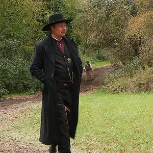
Hi guys, what do you think ?
1#
http://www.juphotography.co.uk/juphoto/main.php?g2_itemId=89
2# (Now black&white)
http://www.juphotography.co.uk/juphoto/main.php?g2_itemId=97http://www.juphotography.co.uk/juphoto/main.php?g2_itemId=93
1#
http://www.juphotography.co.uk/juphoto/main.php?g2_itemId=89
2# (Now black&white)
http://www.juphotography.co.uk/juphoto/main.php?g2_itemId=97http://www.juphotography.co.uk/juphoto/main.php?g2_itemId=93