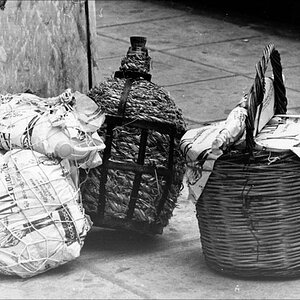
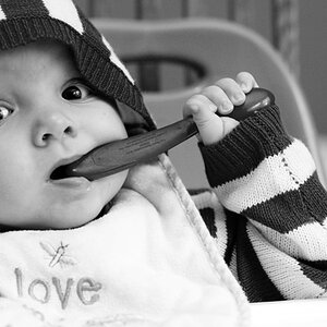
First one is too soft. The eyes need more light.
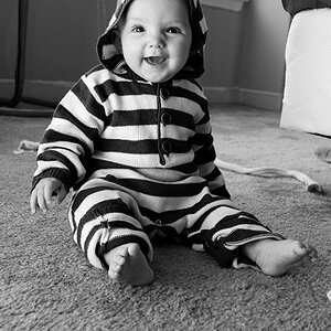
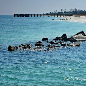
The second needs more light on the eyes too. She looks like she's going to fall backward out of the photo. Just an awkward position or too tight a crop.
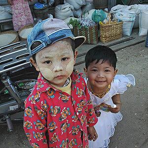
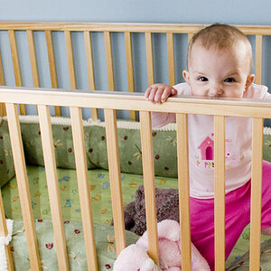
Third on is nice, maybe a little underexposed, but the angle of the fence in the background doesn't work for me.
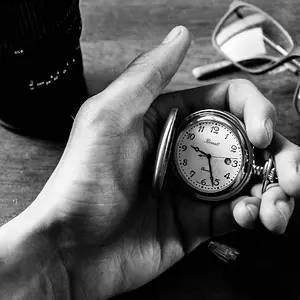
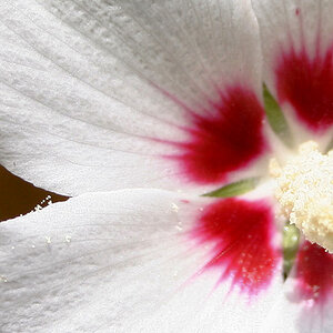
4th one is probably strongest, but it needs some light above them to keep their hair from underexposing.