bumsrmyfriends
TPF Noob!
- Joined
- Jul 12, 2005
- Messages
- 111
- Reaction score
- 0
- Location
- St. Petersburg, FL
- Website
- www.livejournal.com
Okay so, yesterday I was in my backyard fooling around with my camera taking pictures of the sunset.
Here is the original:
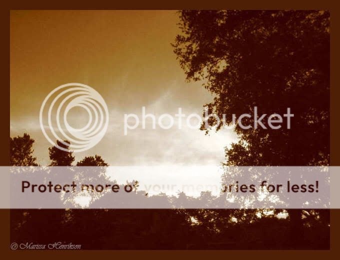
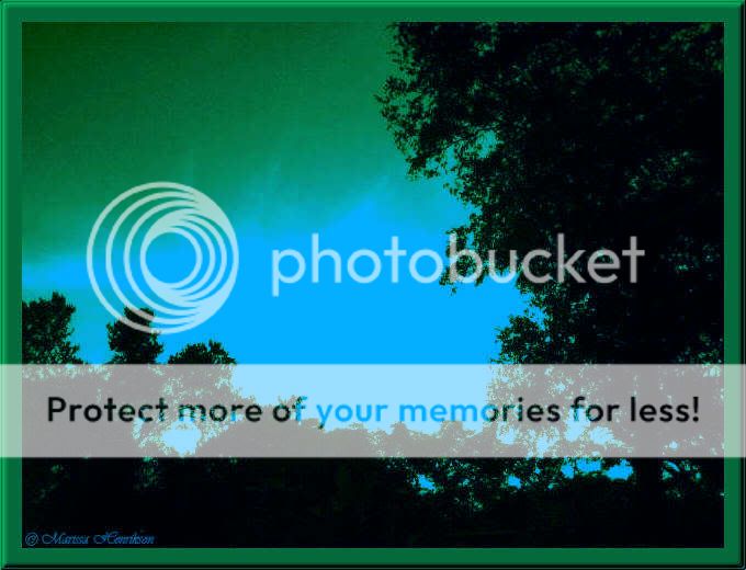
Then I was messing with the brightness and contrast and the border in PSP8 and came up with this:
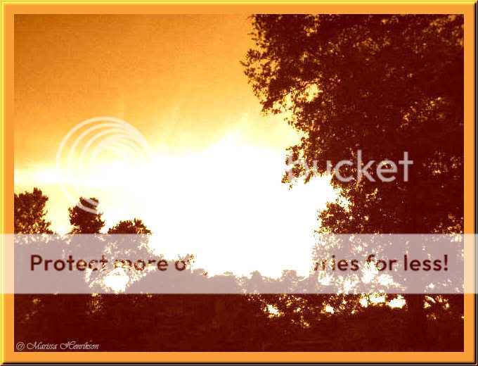
Then I messed with filters and came up with this:
So I am just wondering which you all like best and what you think about them. If there are any other changes you think I should make, please feel free to share.
Thank you!
Here is the original:
Then I was messing with the brightness and contrast and the border in PSP8 and came up with this:
Then I messed with filters and came up with this:
So I am just wondering which you all like best and what you think about them. If there are any other changes you think I should make, please feel free to share.
Thank you!
")