3 year old twin girls in studio

Breanna

TPF Noob!
Joined
Jan 25, 2009
Messages
210
Reaction score
0
Can others edit my Photos
Photos OK to edit
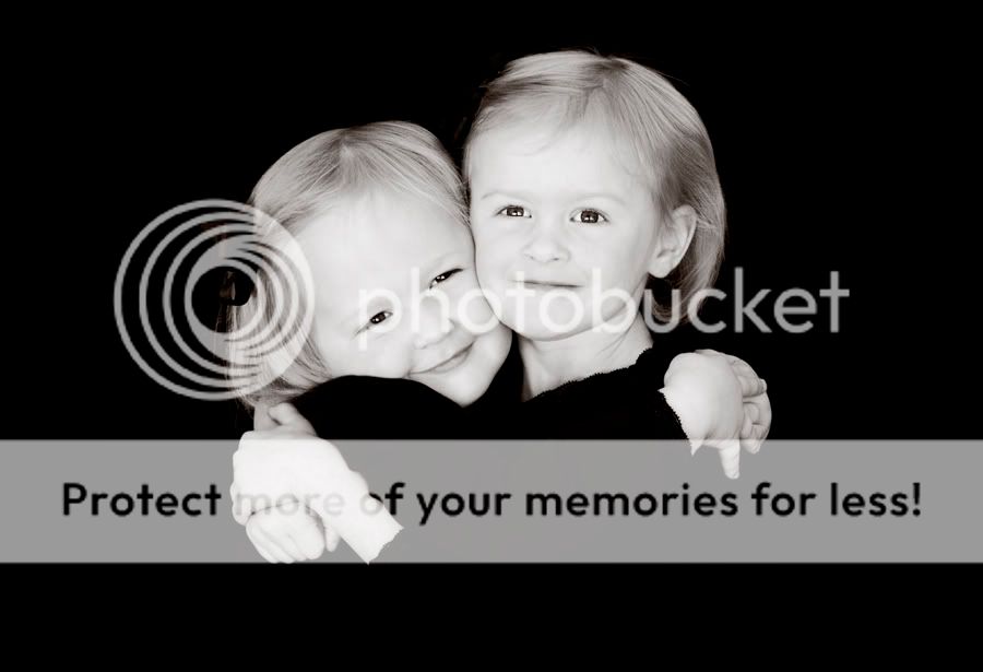
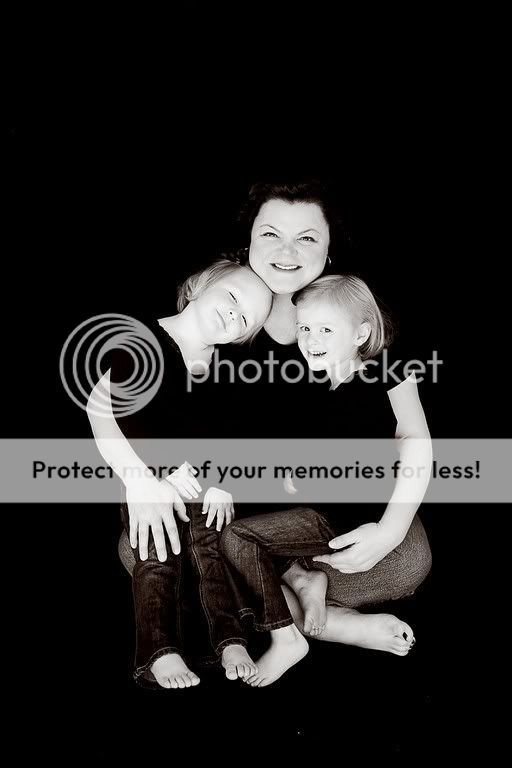
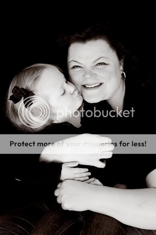
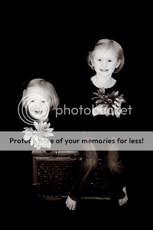
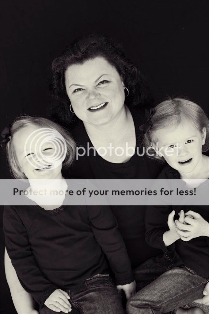
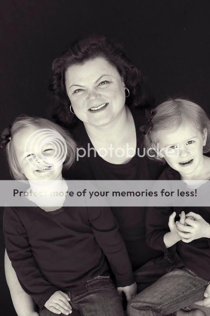
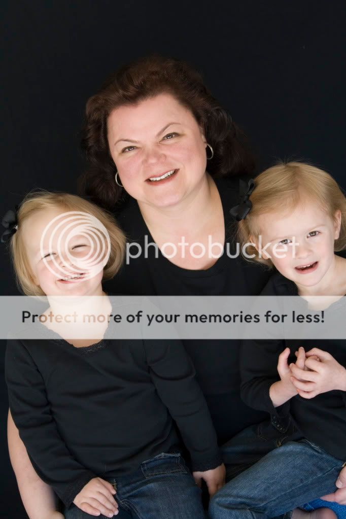
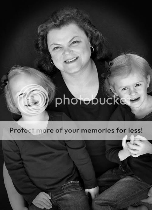
I'll share a few, but I need some advice. Studio work is not my specialty, nor my favorite. The mom wanted very "classic" black and whites on a black background. They showed up in all black tops, which I thought was fine. It would draw more attention to their faces and give it a bit of drama. However, when I converted them all to b&w (an action that I usually love), I completely lost the mom's dark hair to the background, as well as their tops. Does it bother you? Do they appear too washed out or "ghost-like"? I can't decide if I love it or hate it.

1-
IMG_4619.jpg


2-
Gomes1.jpg


3-
Gomes3.jpg


4-
Gomes6.jpg
 
Hmm, this is a tough one, you gave the customer what they wanted but it does look weird. Has the mom seen these yet?

I don't know what you could have done, maybe a dark grey backdrop just to seperate them from the back ground?

The shots are great, I just don't care for how they dissapear into the background.
 
The thing with dark backgrounds and dark hair, you need to use a hair light or a 'kicker' light. Basically, a light from above or behind the subjects. This will help to give you separation between the subjects and the background.
 
The thing with dark backgrounds and dark hair, you need to use a hair light or a 'kicker' light. Basically, a light from above or behind the subjects. This will help to give you separation between the subjects and the background.

Seriously....didn't even think about this. Shows you how much experience I have in studio :lol:

The client has seen them, and while she loves the actual images, she has the concern that they will be "washed out" in print. Not really the word I would use to describe this style, but I get what she is saying. I need to get home on my computer (not at home right now) and play with some different conversions. Oy. Shame, because this was probably one of my most successful studio sessions, composition wise, considering I was working with twin 3 year olds! They were simply wonderful!

Oh, and PS, this was all natural light in my garage :sexywink:
 
The thing with dark backgrounds and dark hair, you need to use a hair light or a 'kicker' light. Basically, a light from above or behind the subjects. This will help to give you separation between the subjects and the background.

So what would that have done? Lightenened up her hair?
 
What it would have done is put a very slight,slight bit of sheen on their hair, and maybe allowed a slight bit of rim lighting, producing a 3-dimensional effect. I don't like the way this set turned out, since the contrast between the skin tones and the stark black background makes them all look very pasty and almost ghostly. Like in the last photo, with the younger girl holding the flower--hr head floats in blackness, with no shoulders or other means of support...the merging of the shirts with the background just looks bad to me.

A small amount of dodging (lightening up) of some of the black clothing and the mother's dark hair would bring in some separation between the foreground figures and the black background,and would give a bit of a three-dimensional look to the people.
 
OH.... you need a BIT of light on the background, just enough to afford some separation.

And, another concern I feel is equal in weight is direction of light. I think you have a wonderful light source, but used this way, is something like a HUGE on-camera strobe.

Turning your subjects a bit will help create some shadows... some shape.

I think too the conversion/PP might be exacerbating your problem. If you like, I'd be willing to give a try with one of these. Send me a raw file if you like.

-Pete

garage.jpg
 
I tried a couple different conversions. I like the drama of the first set. These are extremely boring to me, but I think the client will prefer it. (I don't really care for this photo in general, but thought it was a good base photo to play around with while trying to figure out which b&w would work best)

BW_2.jpg


BW_1.jpg
 
Ew....now that I'm looking at what I just posted vs the first ones, I really dislike the new conversions. They are so BLAH.

If anyone else wants to play, by all means...
Here is a SOOC
TestEdit1.jpg
 
Breana,
I took a shot at a monochrome conversion that looks cool to neutral in hue. I took the color JPEG image and went to Apply Image, and seleted Screen, which lightened up primarily the darkest tones. I then selected a gradient mask, a black one, which converted the image to monochrome, and used the Shadow/Highlight tool to lift the blacks up a bit more and to darken the whites a tad bit, and then I adjusted the curves a bit, to give the image quite a bit of snap, and to make the background a bit darker I pulled the bottom-most pat of the curve (the black point) down a bit, then applied a simple sharpen, just for on-screen punch, then I typed in the text on a layer, then flattened the images and saved as 9 quality JPEG.


TestEdit1-Monochrome_Converted.jpg
 
Well... seeing it here, I think I could have done a better job with the vignetting on the background, but I think you can see what I'm getting at.

Preserve more detail in the middle/flesh tones. I like your color shot.

I hope this helps.

-Pete

TestEdit1.jpg
 
Thank you both, they both look great. :thumbup:
 
Although losing moms hair, I MUCH prefer the original set you posted. (as mentioned, a hairlight would have helped) I still really like 'em =) The subject matter trumps the technical issues (hairlight issue) imho!
 
TestEdit1copy.jpg

Duplicate layer set to multiply, 50% opacity.
Layer mask, large and soft black brush, paint in your new "light" on the subjects.

Then go ahead and convert to B&W, adjust brightness/contrast however you like.
I didn't really get into it here, just wanted to get that hair visible and the background darker.
 

Most reactions

Back
Top