gsm275
TPF Noob!
- Joined
- Mar 24, 2010
- Messages
- 108
- Reaction score
- 4
- Location
- Vancouver, BC
- Can others edit my Photos
- Photos OK to edit
Ran around this weekend practicing my photography, let me know what you think. Trying to sharpen up a lot before going to Africa this June. Love to get some feedback.
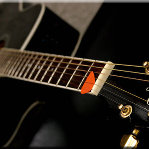
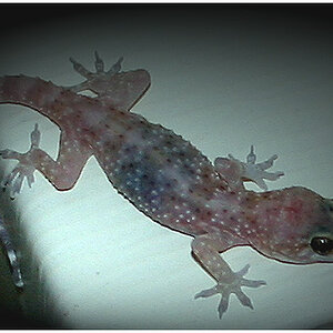
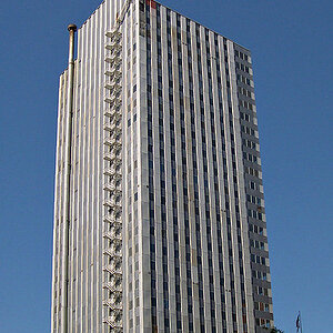
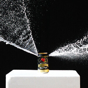
Pic 1:

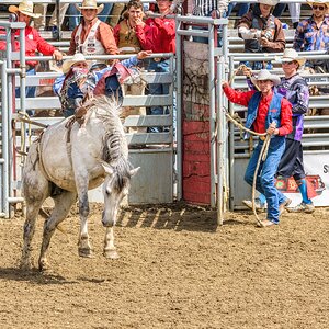
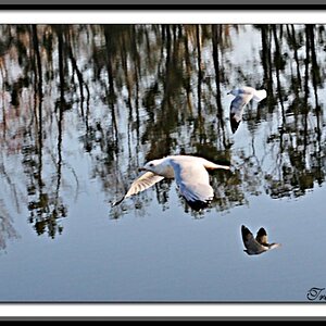
Pic 2:

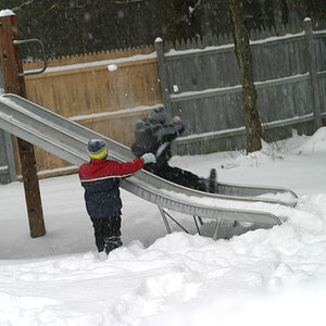
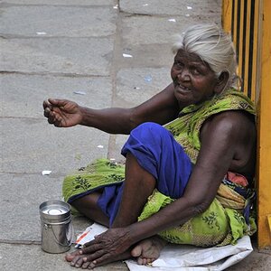
Pic 3:

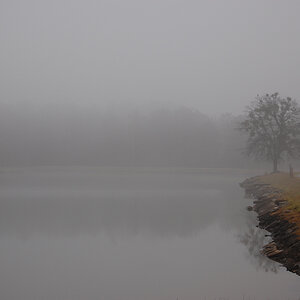
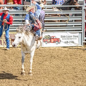
Pic 4:

Pic 5:

Pic 1:
Pic 2:
Pic 3:
Pic 4:
Pic 5:
") absolutely adorable
absolutely adorable ![[No title]](/data/xfmg/thumbnail/37/37128-189b79232a3c6bf0c2c530e4eea0b8cd.jpg?1619737884)