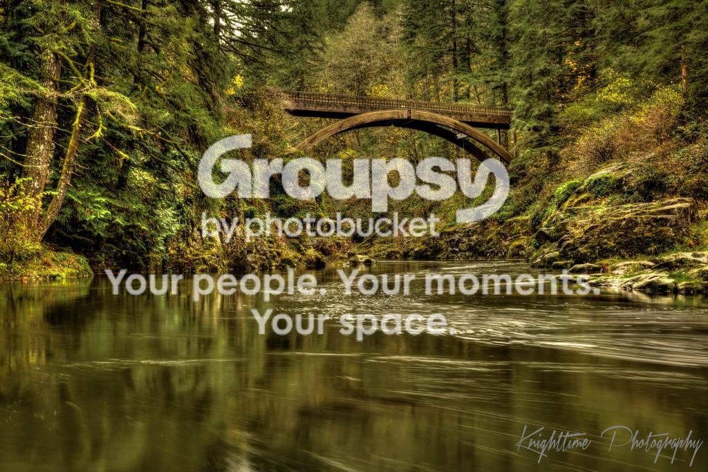
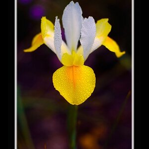
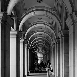
I like this image, but my first thought when I saw it was to wonder what it would be like in black and white as it has very little colour range. It also has very little tonality range, so maybe B&W is not the route to go. If it was mine, I might try it in B&W just to see how it looked.
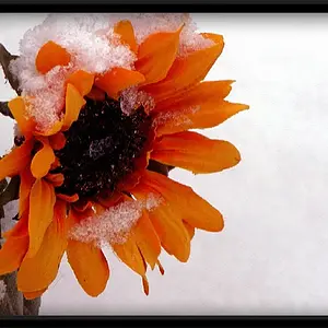
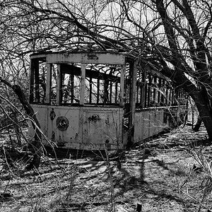
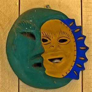
Nice conversions - I like the third one best. The first one looks over sharpened and the second looks has a bit too much contrast for me, but these are just my opinions - others?
Designer, I like your colour version and the B&W conversion. I am assuming you converted your colour version. What did you use for the conversion - just curious?