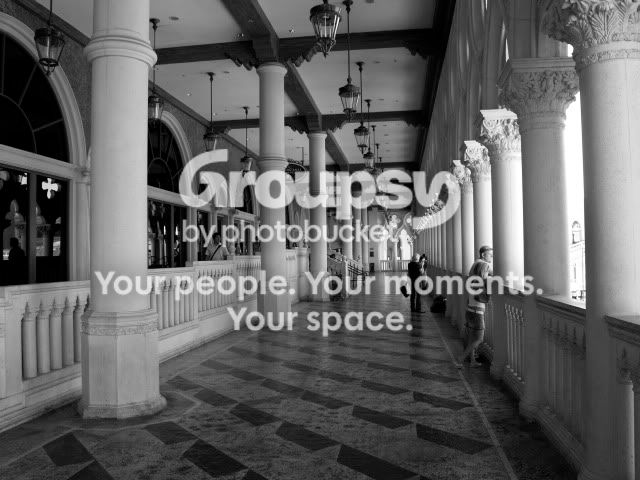
1. Love it. You've got a lot of patterns and shapes going on here that all blend together nicely. I might suggest increasing the contrast a bit though.
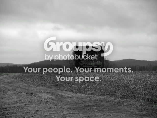
2. It needs a stronger point of interest. The crumbling ouse in a field just doesn't say enough in my opinion.
i like two. but then im a sucker for flat, painting like photos. i figure, just about anyone can take a picture of a long hallway and make it look sortof cool, but flat photos need a certain eye. i tried a square crop on that one and liked it a bit more too. taking out a bit of the bottom, and centering it more to the left of the house. neat shot