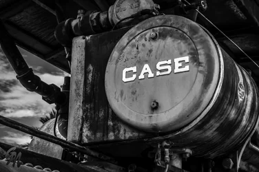
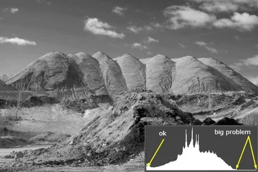
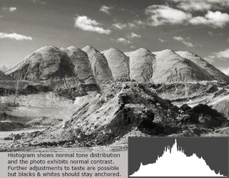
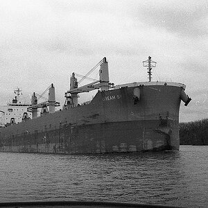
I would say the overall contrast range is acceptable in all three originals. However the local contrast, meaning the tonality difference between similar tones, is a bit too low for maximum enjoyment. ALso, I think the brightness level (or in Nikon Capture speak, the Lightness Channel) is set a bit too low, and that affects mostly the mid-tone brightness. I see the first tow landscape shots as showing a good, full range of tones, but the local contrast is too low; there's just too much of not-really-all-that-well-differentiated grayish vibe goin' on.
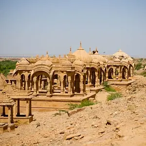
I can tell by looking that if these were sent to print on matte paper that the prints would feel very drab and muddy. These lack what one might call "SNAP!" In the first, Dirt Pile, the problem is NOT the blacks--it's allll the gray tones that meld together.
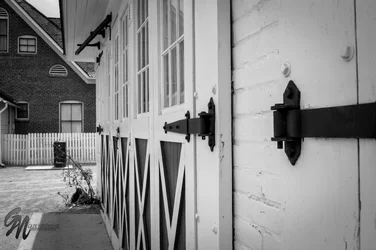
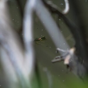
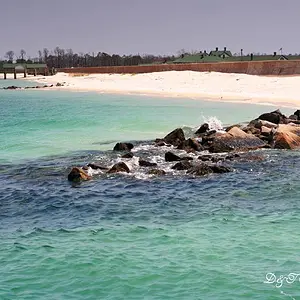
The second scene actually lacks almost ANY really true black subject matter, but again, the tones are so slowly-changing from one value to the other, that the local contrast is not set quite optimally, I think. IT'S A VERY SUBTLE scene, for sure, but I think Unsharp Masking at 10% at 150 pixel radius and a 0 threshold a time or two would add realism and a feeling of texture. ANd YES, those numbers are not transposed! 10%, 150 pixel radius, threshold ZERO! Maybe do one pass, then fade it to 40%, then repeat, then fade that once again down to to 40%, then do the same 10/150/0 pass, one last time. That will make that scene more contrasty, and will make it look more REAL.
DIGITAL is actually rather weak at conveying shape and texture in scenes like #2, and there are software applications designed specifically to add the feeling of clarity/texture/shape, but the strange Unsharp Masking method I mentioned is a well-known way to add local contrast and the feeling of real, actual texture, of real actual depth, to digital B&W files.
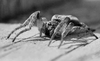
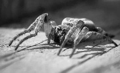
The spider is very light grayish all over most of the frame, but so was the actual subject matter, so...it needs to be "juiced" a bit.








![[No title]](/data/xfmg/thumbnail/31/31758-546fe80b548bda08983001811ab5be60.jpg?1734160480)
![[No title]](/data/xfmg/thumbnail/31/31704-42c2fcbcc4b6ba8c2c5ae54202cad6ec.jpg?1734160376)