You are using an out of date browser. It may not display this or other websites correctly.
You should upgrade or use an alternative browser.
You should upgrade or use an alternative browser.
A different approach........not sure I achieved and conquered! (pic heavy)
- Thread Starter AMOMENT
- Start date

Pallycow
TPF Noob!
- Joined
- Nov 16, 2012
- Messages
- 1,697
- Reaction score
- 520
- Location
- United States
- Can others edit my Photos
- Photos OK to edit
It will help out more than you can exclaim in words. It makes me feel really stupid looking back at my other shoots wondering why I didn't take the time to learn it and then do it. My pp time has been cut down 75% just in not having to fix ludicrous WB issues.

Mully
TPF Noob!
- Joined
- Jul 23, 2012
- Messages
- 3,066
- Reaction score
- 788
- Location
- Mt Ulla, NC
- Can others edit my Photos
- Photos OK to edit
Liquify is great for retouching faces also ...use it to reduce
puffiness of eyes and cheeks.....push in big ears, it is a very handy tool.
bunny99123
TPF Noob!
- Joined
- Apr 24, 2012
- Messages
- 771
- Reaction score
- 110
- Location
- Sherwood, AR
- Can others edit my Photos
- Photos OK to edit
I use Liquify often. Especially in glamour and single shots. If a person is good with cloning, smudge and liquify, a picture can be improved a lot. The trick is to use it just enough to see improvement, but not enough to be noticed.
I like that you are out there trying different ways to shoot. It appeared the couple was having good time which is good.
I like that you are out there trying different ways to shoot. It appeared the couple was having good time which is good.
ColorExperts
TPF Noob!
- Joined
- Jul 24, 2010
- Messages
- 71
- Reaction score
- 4
- Banned
- #20
Mind blowing photos collection. Your every shots are outstanding. Thanks for sharing !!
NorthbyNorthwest
TPF Noob!
- Joined
- Oct 12, 2012
- Messages
- 38
- Reaction score
- 5
- Location
- Washington State
- Can others edit my Photos
- Photos OK to edit
Some of the Vignettes were a bit instagramy, but otherwise I don't hate anything. Lay off the vignetting some and if the creative aspect of the colors and effects are working for you than great. Definitely some good shots here.

- Joined
- Dec 11, 2006
- Messages
- 18,743
- Reaction score
- 8,049
- Location
- Mid-Atlantic US
- Can others edit my Photos
- Photos NOT OK to edit
- Banned
- #22
Vigenette bad? Vignette good? I do love the vignette....can't help it
You left out 'vignette overdone', 'vignette horrible' and 'vignette amateurish look'
You pictures are way underexposed from shooting against the low sn and will print looking terrible.
Take some time, get the people in a better place in regards the sun and get more detial and color in them.

Ms.Nash
TPF Noob!
Can making that heart symbol go away and die somewhere already - it's the worst!!!
dhris
TPF Noob!
- Joined
- Nov 27, 2012
- Messages
- 53
- Reaction score
- 7
- Location
- Ottawa
- Can others edit my Photos
- Photos NOT OK to edit
I'll just pick out a couple of the images that stand out to me.
#3 - This is the best photo of the set from my perspective. The thing holding it back most is in fact the color balance.
Just a note on color balance. My suggestion would be to shoot in RAW, which would allow you to worry about color balance later in post processing. If you insist on using .jpg, you really have to do custom color balancing before you start shooting and every time your lighting changes.
#4 - The vignetting on this particular shot is probably the most egregious--dark vignettes on white backgrounds are probably not a good idea. I think it hurts the impact of your photos. The really tough part about accepting this is that so many lay persons (non photographers) love the Instagram look--at least this year. Next year ?
#3 - This is the best photo of the set from my perspective. The thing holding it back most is in fact the color balance.
Just a note on color balance. My suggestion would be to shoot in RAW, which would allow you to worry about color balance later in post processing. If you insist on using .jpg, you really have to do custom color balancing before you start shooting and every time your lighting changes.
#4 - The vignetting on this particular shot is probably the most egregious--dark vignettes on white backgrounds are probably not a good idea. I think it hurts the impact of your photos. The really tough part about accepting this is that so many lay persons (non photographers) love the Instagram look--at least this year. Next year ?

DiskoJoe
Been spending a lot of time on here!
- Joined
- Mar 24, 2011
- Messages
- 4,540
- Reaction score
- 528
- Location
- Houston
- Can others edit my Photos
- Photos NOT OK to edit
any tips for not losing as much detail when shooting with the sun directly in back/ to the side like that? Also...I believe I shot my white balance in cloudy....which maybe gave it that warmer tone but I also did it bc it was a very grey day and are trees are all barron by now......everything around is and was grey. However, doing so...I really have a greenish/yellowish tint that works for the background but not their skin tone. This was my first try at shooting with the sun purposefully in that place................
Its time to stop thinking in terms of the preset options and starting to understand that there is a scale for the white balance and the presets just move you too that. For a portrait session you should start using a gray card to set a custom white balance. This will give you more consistent output and make editing easier since all pics will have exactly the same white balance. A gray card costs almost nothing but is priceless. A white sheet of printing paper will also work okay but not quite as good but still better then the presets. Try it, you'll like it.

e.rose
Been spending a lot of time on here!
- Joined
- Jan 27, 2011
- Messages
- 4,789
- Reaction score
- 1,985
- Location
- Nashville, Tn
- Can others edit my Photos
- Photos NOT OK to edit
The vignetting is not good. It looks really unnatural and amateurish. Sorry.
3. Could stand to gain a little warmth.
4. I have no idea what you did with processing here, but it doesn't work at all. Their faces are blown, and the vignetting against the blown out...sepia tone? No bueno
6. You shot against the sun and then tried to pull them back using a lot of contrast... and it shows. Your blacks are like... UBER black. Those black have gone down into the depths of hell never to see the light of "just normal black" again.
If you don't want a washed out look, don't shoot your subjects against the sun.
11. If you absolutely must do the heart thing... this is the best one. Don't give your subjects... clients... whatever, 3 different versions of the same shot. Don't process 3 different versions of the same shot. Just pick the best one and go with it.
13. Out of all of these... I'd actually say that I like this one. HOWEVER... that keychain on his pants... has GOT to go. The way his shirt is pulling back after tucking his hands in... I would have had him pull it back forward or done it myself.
Her expression looks worried or annoyed and his looks annoyed as well.
14. I think this is the cutest one of them, but that vignetting has GOTS TA GO.
15. She looks like she's hugging this dude, but thinking about that summer long ago with Juan... and wonders if it COULD have worked out had called her excitedly on the phone to say, "Joanna! I'm coming home early! I was wrong to go away for so long! I LOVE YOU! MARRY ME!!!!"
I would have had her maybe lookingly slightly down... smiling... Even looking the way she is looking now with a happier expression would have been alright.
Her face is blown out though.
I won't even mention the vignetting this time.
...vignetting.
......vignetting.
.........be gone vignetting.

3. Could stand to gain a little warmth.
4. I have no idea what you did with processing here, but it doesn't work at all. Their faces are blown, and the vignetting against the blown out...sepia tone? No bueno
6. You shot against the sun and then tried to pull them back using a lot of contrast... and it shows. Your blacks are like... UBER black. Those black have gone down into the depths of hell never to see the light of "just normal black" again.
If you don't want a washed out look, don't shoot your subjects against the sun.
11. If you absolutely must do the heart thing... this is the best one. Don't give your subjects... clients... whatever, 3 different versions of the same shot. Don't process 3 different versions of the same shot. Just pick the best one and go with it.
13. Out of all of these... I'd actually say that I like this one. HOWEVER... that keychain on his pants... has GOT to go. The way his shirt is pulling back after tucking his hands in... I would have had him pull it back forward or done it myself.
Her expression looks worried or annoyed and his looks annoyed as well.
14. I think this is the cutest one of them, but that vignetting has GOTS TA GO.
15. She looks like she's hugging this dude, but thinking about that summer long ago with Juan... and wonders if it COULD have worked out had called her excitedly on the phone to say, "Joanna! I'm coming home early! I was wrong to go away for so long! I LOVE YOU! MARRY ME!!!!"
I would have had her maybe lookingly slightly down... smiling... Even looking the way she is looking now with a happier expression would have been alright.
Her face is blown out though.
I won't even mention the vignetting this time.
...vignetting.
......vignetting.
.........be gone vignetting.

AMOMENT
TPF Noob!
- Joined
- Sep 27, 2011
- Messages
- 701
- Reaction score
- 48
- Location
- NY
- Can others edit my Photos
- Photos OK to edit
- Thread Starter 🔹
- #27
Thanks guys and gals! Erose lolol I like how u put things. I know I screwed up and tried to recover with contrast but I so love hose shots with the sun in the background. I know that generally shooting in his direction is no optimal or easy for exposing right for skin but I figured I'd give it a whirl. 

jowensphoto
Been spending a lot of time on here!
- Joined
- Feb 28, 2011
- Messages
- 2,983
- Reaction score
- 906
- Location
- Northern Viriginia, US
- Can others edit my Photos
- Photos NOT OK to edit
are the heart thing photos meant to be silhouettes? If so, they are kind of in that awkward in-between exposure.
Here's a quick and dirty edit, just changed the black point and lowered exposure a tiny bit. By no means perfect, but illustrates what I'm saying.
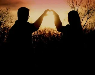
Here's a quick and dirty edit, just changed the black point and lowered exposure a tiny bit. By no means perfect, but illustrates what I'm saying.


![[No title]](/data/xfmg/thumbnail/38/38264-552eb428d8a704186dcc43400f417d0f.jpg?1734172154)

![[No title]](/data/xfmg/thumbnail/38/38262-10a9668da9a2b36a92cddde57caf87bc.jpg?1734172150)