What's new

A few from today for C&C

dustin0479

TPF Noob!
Joined
Oct 10, 2010
Messages
227
Reaction score
9
Location
Delaware
Can others edit my Photos
Photos OK to edit
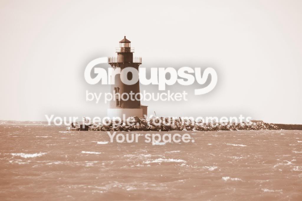
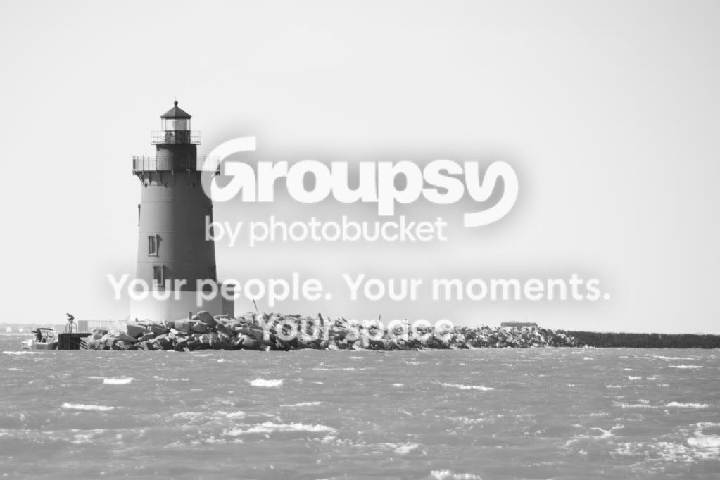
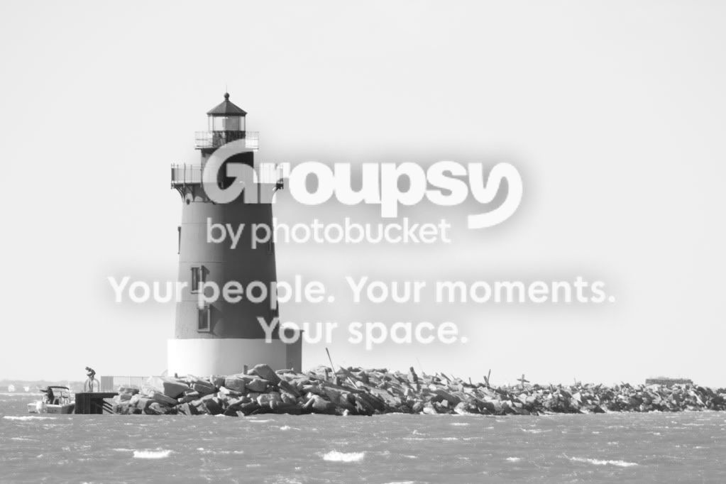
I could not decide what to do with this first shot, the color was really dull today so I tried a couple options (#1 and #2)
1.
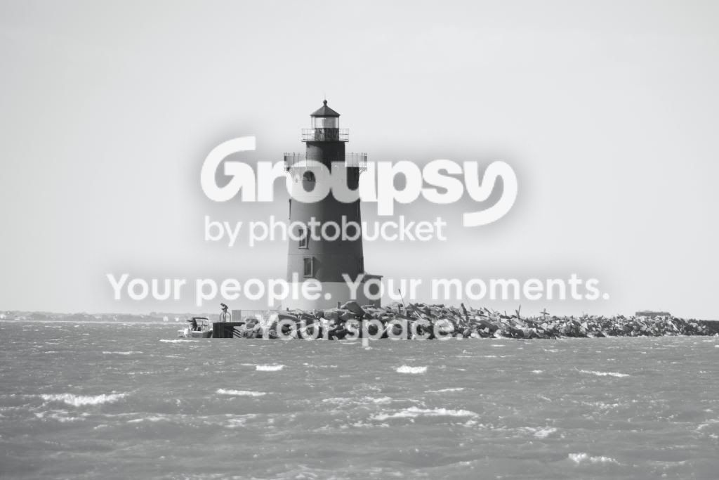
LighthouseBW.jpg

2.
HenlopenSep.jpg


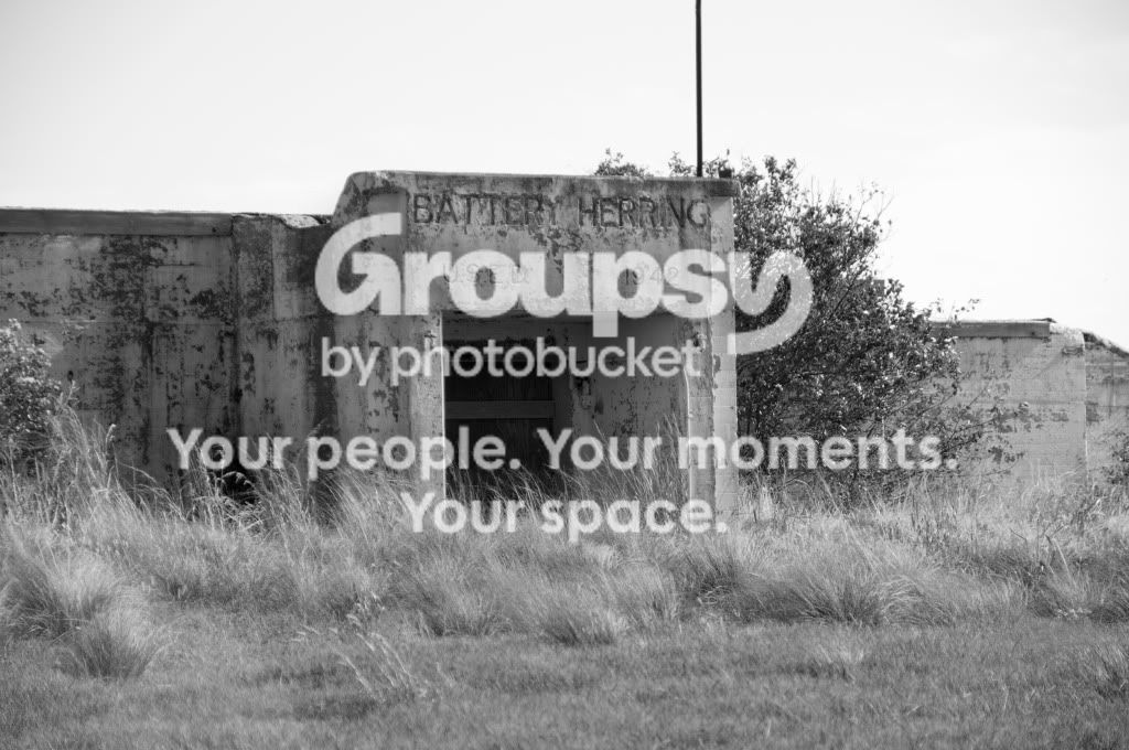
3.
BatteryBW.jpg

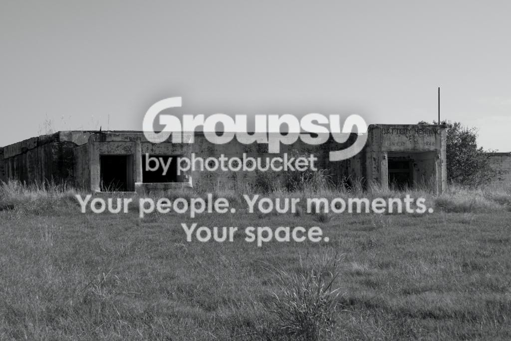
4.
Battery2BW.jpg

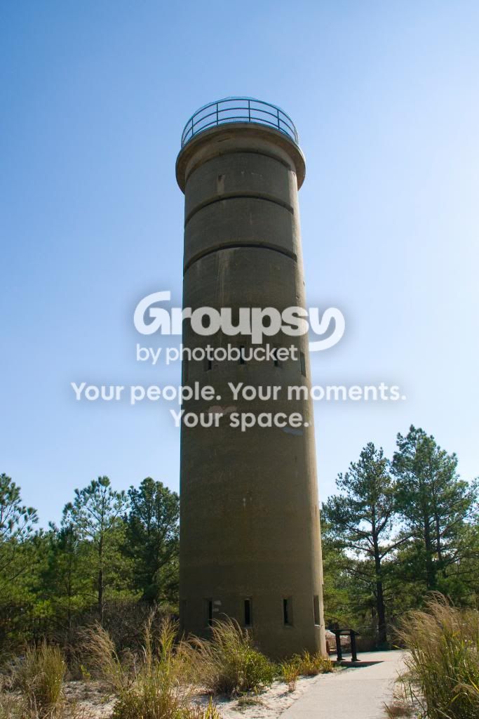
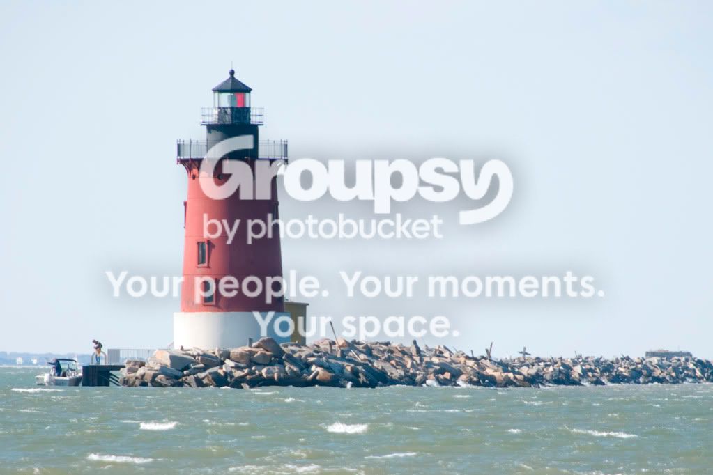
5. Probably my favorite.
TowerColor.jpg


I am always trying to improve so any advice would be great!
 
Views and no feedback? Ugh....
 
I think the first one's the best of the lot. The third one's not bad, but I'm not sure about the entrance being set dead centre in the photo. The last one's sort of a snapshot. It's how 9 out of 10 people might take a photo of this lighthouse. I recently tried photographing a lighthouse from the same perspective and ended up with nothing engaging or interesting.
 
For me, they don't work because most of the frame is almost empty (flat sky, water, grass, etc.) and the central object (which is too centered) is not really that interesting. Moving closer to the concrete structure in 3 looks like it might provide some interesting detail shots; the others not so much. The lighting was tough on the last - very contrasty and the side of the tower we are looking at is shadowed - best to go back on a cloudy day and get closer.
 
I'll give it a shot.

On the light house maybe the rule of thirds would have helped. I know the sky was dull but the shot seems dead with the lighthouse centered. Maybe try a different crop. Try removing some of the shot on the left.

The last light house seems tilted. I mean a not level horizon. I would have liked to see the top of the lighthouse or a different perspective.

Just my opinion. Others may differ.
 
Just what i was looking for.

Overall it was windy with a pale/empty sky today making everything seem "boring". To top it off the sun was still high making things even more fun.

I have adjusted the only shot that I may be able to salvage. I had originally left the right side out as I found the breaker wall shaded and boring. Let me know if you feel this helps.
LighthouseRev.jpg
 
i'd probably crop out 1-3 inches off of the right side on the first pic, kinda where the rocks stop. That's just me though.
 
Final take, but i think the image is a dud. The image seems soft around the top of the lighthouse.
LighthouseRev1.jpg
 
Final take, but i think the image is a dud. The image seems soft around the top of the lighthouse.
LighthouseRev1.jpg

Better but I think you're probably right. I'm not a big fan of the B&W in this shot. It really needs more contrast. I don't know what program you're using for PP but if you can increase the blacks/contrast it might make it pop.

The crop is much better though.
 
Yeah, I went B&W because of the boring sky and dull color.
LighthouseColor.jpg
 
Cape Henlopen in Lewes Delaware
 
i think it looks better b&w because of the boring colors, what you should of done is purchased a cheap spray paint, and prove your art skills, would of made a cooler pic with an awesome prison story imo. haha
 
like others have pointed out they just seem soft and for the subjects being centered makes the photos uninteresting.
 
5 is crooked.

1 would be better if shutter speed wasn't so fast, also needs a lot of work in pp.

the b&w attempts are flat.
 

Create an account or login to comment

You must be a member in order to leave a comment

Create account

Create an account on our community. It's easy!

Log in

Already have an account? Log in here.

Back
Top Bottom