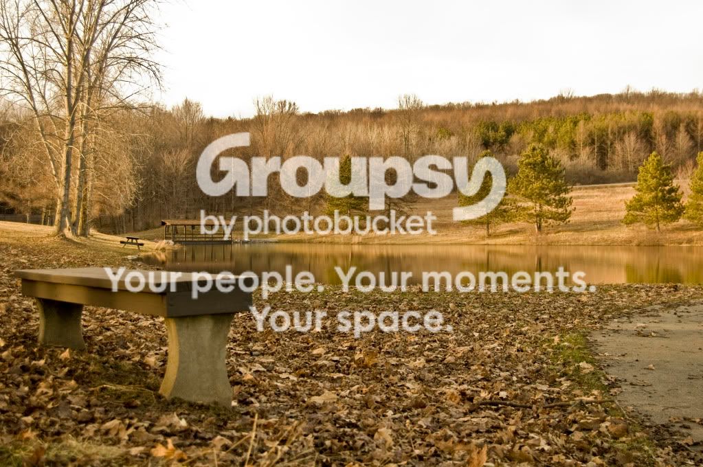
#1 - your best of the 3. What makes this image is the element in the foreground, as well as the background. I'm not sure about the walkway on the right, might try to crop/cut that or process it out of the image. The stark white sky doesn't really help either but if it were blue it would interfere with the overall mellow green and brown color palette it's using (which I personally like a lot)
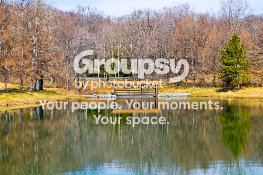
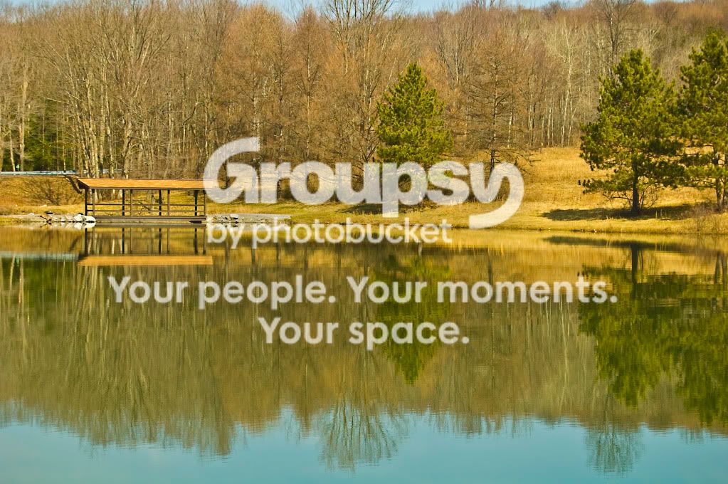
#2 and #3 look a little overexposed and they're a little boring in terms of subject (for me) and I mean no offense by that. I do like the reflections but there's just too much going on around the bridge to make it an interesting picture. Get closer to it if you can I bet it looks nice close up.



![[No title]](/data/xfmg/thumbnail/42/42348-b961c40032587da9952402de14b5976a.jpg?1734176873)