What's new

A few new shots for C&C

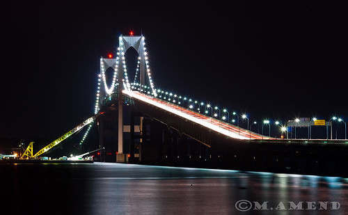
1. I love it. The bridge leads you through the image and also throws a major blip in there to keep it very visually active.
I am not so keen on the next two tone mapped/hdr whatever images. They feel muddy or something to me. But I am a fan of HDR only when it's done so that it's not REALLY noticeable.
The last one reminds me of home. very nice.
 
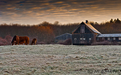
I think #4 is the best of them. The lighting is really nice and it's really peaceful without seeming too plain. I did notice that the barn is cut off though, which kind of breaks the continuity of the image. But then again, if you did move the camera over some the horses would be right against the frame. :(
A slightly wider angle, maybe? It's still a really nice image.

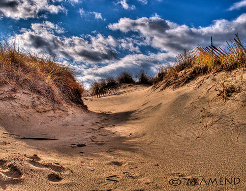
I like #3 as well, even though the HDR is a bit heavy. The clouds look like they're CGI rendered. I like the way the HDR works with the shadows, though.

I like #1 pretty well. I do think that the lights are too undefined, but that was probably caused by a longer shutter speed. Some things can't be helped.

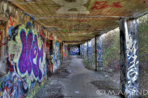
I do have to agreewith MLeek on #2, though. It just seems like it's too much. Too muddy. :(
 
Love #1 and #3 but there is something that i find off with the processing of #2 and #3. Are they single exposures that are tone mapped?
 
I really like the desert photo. #1 would be my second choice and it would have been awesome to take it before it got totaly dark. Would have been nice to see some clouds and or sky in that image. The bridge looks so lonely. #2 looks like and HDR image but I honestly I think it needs something more I think it can be a much better picture with a little more processing. 4 is cool the last choice and my input would be to use some selective coloring to bring out some yellow and green..
 
Excellent shots! Here are my thoughts on them.

1. Something that looks a bit off to me in this photo is the water... Looks like it was tilted, giving you a sort of diagonal horizon. Since the pillars of the bridge are perfectly vertical though, the camera wasn't tilted and it's probably just the bridge covering up some of the water. As is suggested above, I would recommend shooting this scene earlier in the night with some light left so you can get some more detail in the area where the water meets the bridge.

2. I love the vibrant colors on this one! Is it HDR? The only thing I can possibly recommend is to rotate the camera slightly to the left, so the passageway is on the right side of the photo and we can see more of the art on the wall. That way you get the contrast between the beautiful graffiti and the dank, grungy area in which it's located.

3. This one is visually very interesting, however I agree with the others that it looks a little too HDRed. Letting the shadows stay a little darker might improve the over-all effect of this image.

4. My favorite of the bunch! It looks so serene. I would suggest cropping (or re-shooting if you can) so that more of the sky is shown than the grass. This is because the sky is more interesting than the grass and changes in appearance the higher it gets, so the eye wants to see more of it. The grass on the other hand, though it has an attractive texture, is relatively monotonous so we don't need as much of it. The soft, warm lighting on both the horses and the barn is perfectly captured. :)
 
1. I love it. The bridge leads you through the image and also throws a major blip in there to keep it very visually active.
I am not so keen on the next two tone mapped/hdr whatever images. They feel muddy or something to me. But I am a fan of HDR only when it's done so that it's not REALLY noticeable.
The last one reminds me of home. very nice.

Thanks!
 
I think #4 is the best of them. The lighting is really nice and it's really peaceful without seeming too plain. I did notice that the barn is cut off though, which kind of breaks the continuity of the image. But then again, if you did move the camera over some the horses would be right against the frame. :(
A slightly wider angle, maybe? It's still a really nice image.

I like #3 as well, even though the HDR is a bit heavy. The clouds look like they're CGI rendered. I like the way the HDR works with the shadows, though.

I like #1 pretty well. I do think that the lights are too undefined, but that was probably caused by a longer shutter speed. Some things can't be helped.

I do have to agreewith MLeek on #2, though. It just seems like it's too much. Too muddy. :(

I have a several others I shot at the same time that included all of the barn and were from multiple angles. Most of which I liked better. But the problem is I was on the way to work and I only had a few minutes so i didnt have my tripod set up. This was the sharpest one of all of them so I chose to use this. Im still kicking myself for not pulling the tripod out of the trunk.

Thanks for the input!
 
Love #1 and #3 but there is something that i find off with the processing of #2 and #3. Are they single exposures that are tone mapped?

Thanks!
#2 and #4 where single shots in raw, and ran through photomatrix as 3 exposures, -2, 0, +2
 
I have multiple angles and shots of the bridge I shot on my flickr page.

yes it is Hdr

Thanks for the input!

Excellent shots! Here are my thoughts on them.

1. Something that looks a bit off to me in this photo is the water... Looks like it was tilted, giving you a sort of diagonal horizon. Since the pillars of the bridge are perfectly vertical though, the camera wasn't tilted and it's probably just the bridge covering up some of the water. As is suggested above, I would recommend shooting this scene earlier in the night with some light left so you can get some more detail in the area where the water meets the bridge.

2. I love the vibrant colors on this one! Is it HDR? The only thing I can possibly recommend is to rotate the camera slightly to the left, so the passageway is on the right side of the photo and we can see more of the art on the wall. That way you get the contrast between the beautiful graffiti and the dank, grungy area in which it's located.

3. This one is visually very interesting, however I agree with the others that it looks a little too HDRed. Letting the shadows stay a little darker might improve the over-all effect of this image.

4. My favorite of the bunch! It looks so serene. I would suggest cropping (or re-shooting if you can) so that more of the sky is shown than the grass. This is because the sky is more interesting than the grass and changes in appearance the higher it gets, so the eye wants to see more of it. The grass on the other hand, though it has an attractive texture, is relatively monotonous so we don't need as much of it. The soft, warm lighting on both the horses and the barn is perfectly captured. :)

 

Create an account or login to comment

You must be a member in order to leave a comment

Create account

Create an account on our community. It's easy!

Log in

Already have an account? Log in here.

New Topics

Back
Top Bottom