A glimpse at . . . ME!

twocolor

No longer a newbie, moving up!
Joined
Feb 26, 2008
Messages
1,044
Reaction score
227
Location
Utah
Website
www.twocolorphotography.com
Can others edit my Photos
Photos NOT OK to edit
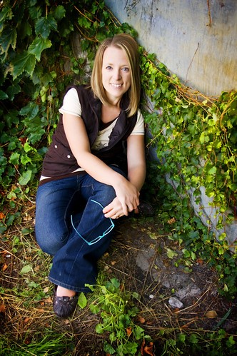
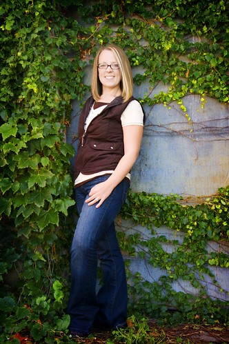
Here's my attempt at getting some shots of me for my website. I truly hate being the "victim" of a photoshoot! It makes you feel for your clients!

1.
4002773113_893d37e612.jpg


2.
4002772505_e86bda00cf.jpg


3.
4003535116_fbfd47f5af.jpg


4.
4002771787_e103fc85e9.jpg


5.
4003534716_1077e019a2.jpg


6.
4003534148_1bf3ce9822.jpg
 
I do like your Colour and crop on most, but #3 is freaking me out a bit.

That CRACKS me up!!! I'm a little freaky I guess?! My sisters say that's the one they like the best - they say it looks like me the most! Is it the desaturating, the crop, my expression, what's buggin' you about #3?

My husband and kids like #4 the best. It's a tad soft, my friend had never used a DSLR before, but considering, she did a GREAT job using it!
 
what's buggin' you about #3?

It is the skin tone with the eyes, they eyes seem overly intense or over processed with the skin tone being a bit dead looking. I am remined of a zombie movie.

#1 & #5 are the ones I like the best!
 
These are great, although I've already seen them on Facebook ;)

I have GOT to get some pics of me taken but I just dread it. LOL

DO IT Lyncca!! I took a close friend, and we laughed our butts off at each other trying to look all cool and stylish and what not! I think there needs to be a sticky on here somewhere of all of our self-portrait pics! That would be awesome!
 
what's buggin' you about #3?

It is the skin tone with the eyes, they eyes seem overly intense or over processed with the skin tone being a bit dead looking. I am remined of a zombie movie.

Yeah, I can see that! I was kinda going for the Twilight look. (TOTALLY KIDDING) I'll go and reprocess that one. Less on the eyes, more on the color maybe?!
 
Two - I really like the last one the best. I wuold say #3 is a keeper too with different processing. I have to so some shots of myself soon and I am not really looking forward to it either. Oh well, I guess we should all subject ourselves to what our clients go through...
 
I love #1 except that your foot is cut off and the pose is a little awkward, but the angle is nice. And I like the last.
 
My picks are #4 and 6. #4, you would need to clone out that green line on the background though.

#1 I don't like the angle. Something weird about the image because of it.

#2 Could be alright if you cropped it square. As is, there is too much space over your head.

#3 Maybe changing the PP would make the difference but I feel it is also your expression that makes it a bit "twilight zone."

#5 The pose looks awkward.


Edit = I much prefer your avatar. Maybe because I have a great story of a barefoot portrait. I was asked to shoot a portrait for a freelance technical writer for publications that wanted to include a image of him with the columns. He was all dressed up business style but had no shoes on because he didn't think his feet would show up in the photos. And they didn't for the most part. But I did a few with his bare feet and a lot of people liked them.

So, after a bit of arm twisting he was convinced to try and use that one to start with. He got amazing reactions to it. Some years later it even ended on the back of his first book. The bare feet just made him look more interesting than the average fairly dry writer. Cheers.
 
Last edited:
I don't mean this as offensive, but #3 you look ... dead.
 
Like everyone else has mentioned #5 is ur best pic, of course I'd go back to the drawing board ;)
 
okay, I had a few spare minutes today, here's the rework on vampire shot!!

4069568377_59eaf51d46.jpg


I have such a hard time seeing these in a detached non personal sort of way.

All I see is how I've aged :lol:
 

Most reactions

Back
Top