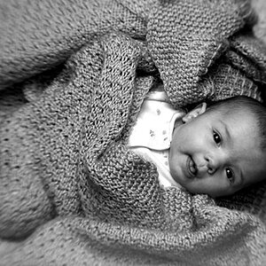
1 looks overexposed to me. In comparison 2 looks sharp and more vibrant but I'm not crazy about the the window to the right. I think here face and hair are lovely
+1 on all the above.
The first is blown out, the second, the windows intense brightness draws your eyes from the subject. I try to look at her but I keep getting drawn back to that window. Also, the vignette in the 2nd is too pronounced. The idea is to make it so that it's not noticable. Just a slight falling off as the light fades to the corners. It looks much better in the 1st pic though. I see what you're rying to do in the first pic though...a high key look. She needs to be better exposed first, and then you can work on the high key part. Personally, I wouldn't have combined the blur to the high key pic, but that's just me. Her pose is too bold as well. A side angled pose, head down, eyes up might do the trick.
Idk, it's all in the creators eye I suppose.


")