A natural progression

spiralout

TPF Noob!
Joined
Nov 11, 2004
Messages
679
Reaction score
5
Location
University of Houston
Does the selective coloring work on this? This is one of the more psychological/philosophical pieces I've done. My intent was to use the coloring of the sunflowers at different stages to represent the progression of a human's life: at birth we are self-aware but haven't developed a conscience; we can't see the world in "full color." Reaching maturity we thrive and our perception of self and world are fully developed. In death we no longer physically exist but our legacy and influence on others, however large or small, is still alive.

birthlifedeath1small.jpg
 
Wow Scott!!! This is fantastic work, and I think your point is quite clear and strongly shown. The thought process behind this is great!!! I love the use of selective coloring with this, the concept is just awesome! Here's my one suggestion that make make this stronger...but I'm not sure, so if you hate it that's cool :) I would suggest a square crop around each to tighten things up a bit more. Right now each has more negative space which is dominant, but if you give them a nice tight square crop the emphasis would really be on the flowers and strengthen the compositon and use of selective coloring IMO.
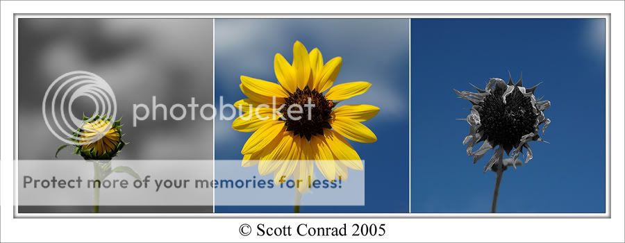
Really fantastic idea here, and I think it looks even better on DA nice and full sized!!!
 
Yeah, I think you're right. I think I was in too much of a hurry to post these to give enough thought to the crop. :) I'll try and clean it up later.
 
Yesss!
That's right it!
I was impressed by your first version already for I really dig a) the theme you chose and b) the means you used to express yourself. And now it is JUST RIGHT!
 
thats really good spiralout worthy of a print and wall hanging I think.. I prefer the square crop as well, it gives a greater sense of the progression because the viewer has a better idea that it's supposed to be the same flower.
 
wow Scott! That's amazing! really neat work! Congrats!
 
Nice Scott, the crop is perfect!!! Ready to be printed and framed!!!
 
its nice sharp and clear. awesome colours. i wish the bg of the first ones was blue like the others. it's throws it all off and is distracting. it's also weighs that side down
 
Quite excellent indeed! I grasped the concept right off so it's quite clear!
 
I tend to agree with Photong. The concept and execution is great but the one grey background distracts me too. If it was the centre pic it would probably balance, however then that stuffs up the progress of the flowers life cycle doesn't it. :)
Can we see it with all 3 in colour? Just to compare??
 
Scott, this is one of the most innovative shots that I've seen here. It is really put together nicely. The selective color works very well and I also like your thoughts behind this. Composition, cropping, detail, color, etc... all spot on in my opinion.
 
I think the gray background in the first photo works well and is balanced by the gray pedal in the last photo. Nice concept - very nice work!
 

Most reactions

New Topics

Back
Top