PixelRabbit
A naughty little bunny...
- Joined
- Nov 28, 2011
- Messages
- 6,593
- Reaction score
- 3,719
- Location
- Ontario
- Can others edit my Photos
- Photos NOT OK to edit
Hi everyone and thanks for checking out my thread :thumbup:
We got permission to wander around an abandoned farm so the other day we headed over.
These are a few from our visit.
Would love some c&c on them.
Thanks in advance!
Here we go, so ... one of the things I had trouble with on my last C&C was tooooo much stuff going on! Well this place was a treasure trove of too much stuff going on so I tried to simplify things and capture the details for the most part. Pop of colour here, contrast or light there. I had trouble isolating/choosing shots inside the barn, I could only stand in the doorway (was totally not going to see if there was floor under the hay since the roof already caved in and there was visible holes in the floor) and felt lost with finding the good compositions within the shadow and light but I know they were there!
The house was the same deal but worse on the clutter.. and there was a large scary animal in the basement ... who decided to make it's presence known when I was standing beside the basement door trying to capture the light through the glorious blue window above the front door, I'm glad I had a couple shots before squeaking like a girl and making a hasty retreat lol. I'm having a hard time choosing just a couple so if there are a couple too many pics in this thread I apologize in advance!
So here they are:
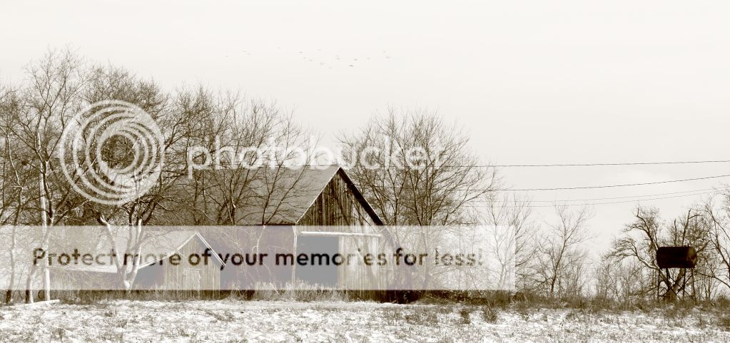
1.
Shot of one of the outbuildings, there wasn't a lot of colour with the snow, gloomy sky and grey and white barn board so I decided on sepia. I like the feeling of the shot but don't like the bird smudges in the sky (pretty sure that's what they are anyway lol) and not sure about the hydro lines. I like the weight/balance added to the right side by the old gas tank.
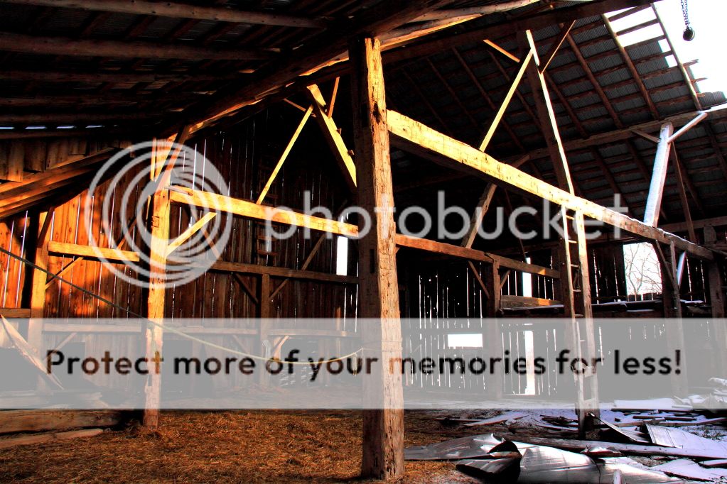
2.
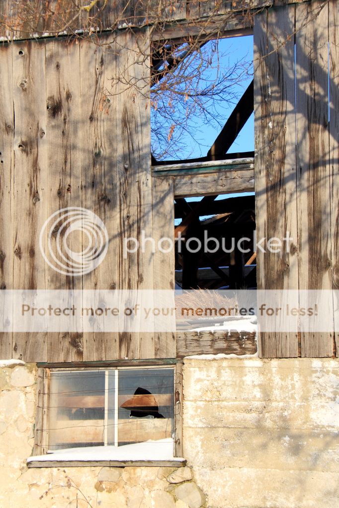
This is the inside of the barn where I struggled finding pieces of light/interest to frame, everywhere I chose seemed to lose it's appeal with the framing because I lost too much shadow to balance or it became too complicated. I chose this shot because I liked the transition between the hole in the roof on the right and the light hitting the back of the barn on the left, wish I could have gotten a wider shot to include the whole hole in the roof and capture the transition between the rich warm wood to the cold snow under/around the hole in the roof. Suggestions on how to chop this up into pieces to capture the beauty in individual places would be MUCHLY appreciated!
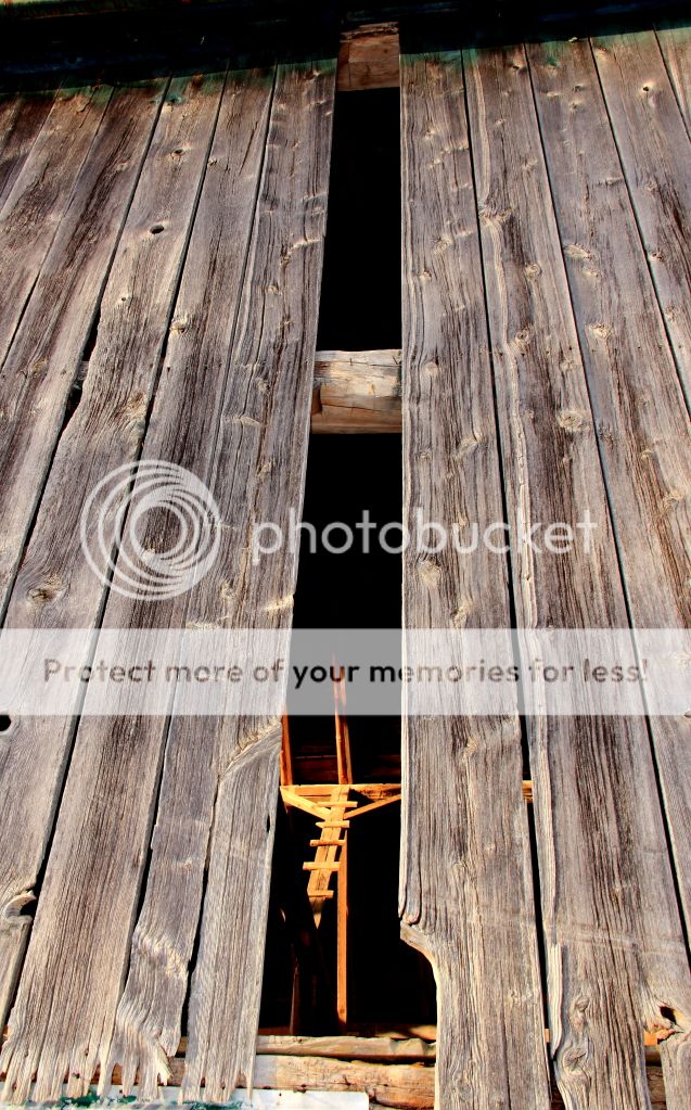
3.
Ah this one, this one makes me go hmmm ...there is another version in my photobucket acct that is zoomed in more, I chose this one because I like the scale of it. It has a very religious undertone to me, I immediately think of a crucifix when I see it and I love the light on the wood inside and detail on the barnboard outside.
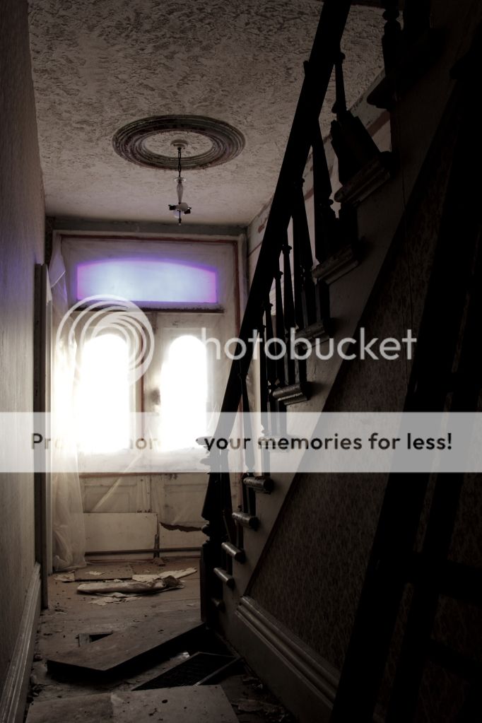
4.
This one is the "thankgoodnessigotthisbeforethescaryanimalmoved!" The glass over this door was stunning! but alas I didn't do it total justice. I took the saturation down in this image to the point where the blue stayed and the red tape that was on the plastic over the door/window blended in.
I like the feel.... almost... there is something here for sure...
5.
I like the composition of this one, wish the shadows of the branches were more pronounced.
6.
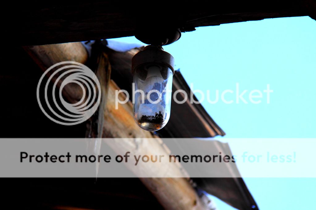
Finally this light was way cool, was shooting up at it and would have liked more light perhaps? something to really make the broken bulb inside "pop"")
We got permission to wander around an abandoned farm so the other day we headed over.
These are a few from our visit.
Would love some c&c on them.
Thanks in advance!
Here we go, so ... one of the things I had trouble with on my last C&C was tooooo much stuff going on! Well this place was a treasure trove of too much stuff going on so I tried to simplify things and capture the details for the most part. Pop of colour here, contrast or light there. I had trouble isolating/choosing shots inside the barn, I could only stand in the doorway (was totally not going to see if there was floor under the hay since the roof already caved in and there was visible holes in the floor) and felt lost with finding the good compositions within the shadow and light but I know they were there!
The house was the same deal but worse on the clutter.. and there was a large scary animal in the basement ... who decided to make it's presence known when I was standing beside the basement door trying to capture the light through the glorious blue window above the front door, I'm glad I had a couple shots before squeaking like a girl and making a hasty retreat lol. I'm having a hard time choosing just a couple so if there are a couple too many pics in this thread I apologize in advance!
So here they are:
1.
Shot of one of the outbuildings, there wasn't a lot of colour with the snow, gloomy sky and grey and white barn board so I decided on sepia. I like the feeling of the shot but don't like the bird smudges in the sky (pretty sure that's what they are anyway lol) and not sure about the hydro lines. I like the weight/balance added to the right side by the old gas tank.
2.
This is the inside of the barn where I struggled finding pieces of light/interest to frame, everywhere I chose seemed to lose it's appeal with the framing because I lost too much shadow to balance or it became too complicated. I chose this shot because I liked the transition between the hole in the roof on the right and the light hitting the back of the barn on the left, wish I could have gotten a wider shot to include the whole hole in the roof and capture the transition between the rich warm wood to the cold snow under/around the hole in the roof. Suggestions on how to chop this up into pieces to capture the beauty in individual places would be MUCHLY appreciated!
3.
Ah this one, this one makes me go hmmm ...there is another version in my photobucket acct that is zoomed in more, I chose this one because I like the scale of it. It has a very religious undertone to me, I immediately think of a crucifix when I see it and I love the light on the wood inside and detail on the barnboard outside.
4.
This one is the "thankgoodnessigotthisbeforethescaryanimalmoved!" The glass over this door was stunning! but alas I didn't do it total justice. I took the saturation down in this image to the point where the blue stayed and the red tape that was on the plastic over the door/window blended in.
I like the feel.... almost... there is something here for sure...
5.
I like the composition of this one, wish the shadows of the branches were more pronounced.
6.
Finally this light was way cool, was shooting up at it and would have liked more light perhaps? something to really make the broken bulb inside "pop"
")


![[No title]](/data/xfmg/thumbnail/39/39530-22640b2d2bd20ed221ed012d78771dc9.jpg?1734173676)