Aloicious
No longer a newbie, moving up!
- Joined
- Mar 12, 2010
- Messages
- 1,661
- Reaction score
- 452
- Location
- UT
- Can others edit my Photos
- Photos NOT OK to edit
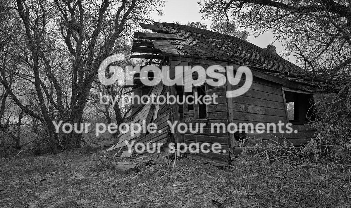
So I'm not too much of a black and white guy, but this one looks just much better in B&W than color...I'm going to be shooting alot of similar stuff during the next couple weeks and I have a feeling that some will probably be better in B&W...so a little practice...so far, I've found that I REALLY need to get camera RAW that supports the D800, my CS4 doesn't support it :thumbdown:...oh well I kinda saw that coming....they'll be more workable at that point...I had to convert this to TIFF then make some crude adjustments, and convert to JPEG... looks like CS6 upgrade will be my next purchase...maybe I can try re-processing it at that point...
this is an abandoned house I found out in the middle of nowhere just off the highway. lighting was terrible, it started raining as I was putting my gear away...but when I saw it I couldn't pass it by without taking a shot of it.
D800 19mm f8 1/100s
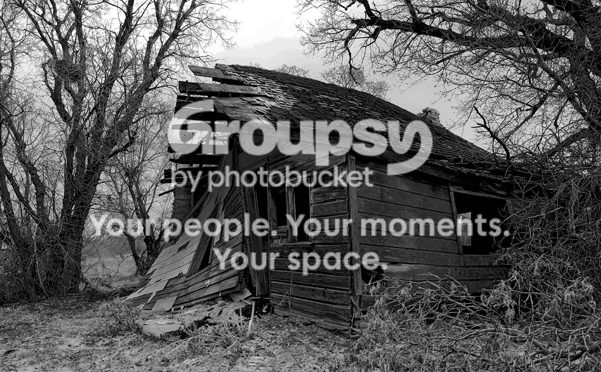
it might be a little on the dark side, but I wanted it to give off that kinda vibe...thoughts? suggestions?
looks like CS6 upgrade will be my next purchase...maybe I can try re-processing it at that point...this is an abandoned house I found out in the middle of nowhere just off the highway. lighting was terrible, it started raining as I was putting my gear away...but when I saw it I couldn't pass it by without taking a shot of it.
D800 19mm f8 1/100s
it might be a little on the dark side, but I wanted it to give off that kinda vibe...thoughts? suggestions?