Absolute Pants I-IV

Chris of Arabia

Herding cats since 1988...
Supporting Member
Joined
Mar 10, 2007
Messages
7,824
Reaction score
16
Location
The Magic Kingdom
Website
www.flickr.com
Can others edit my Photos
Photos OK to edit
I

2036978209_9608a3d099_o.jpg


II

2037774134_c0951cca0a_o.jpg


III

2036978043_d390d67673_o.jpg


IV

2037773924_50a12db9f4_o.jpg
 
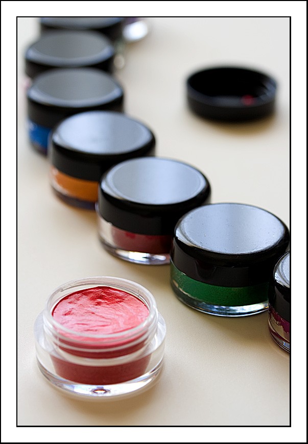
Would there have been a possibility for you to work with a polariser on the last photo? Probably only with a tripod around ... since these were taken indoors and a polariser DOES take away A LOT OF light .... but I think the last might have benefitted from it to reduce the gleam on the lids and also the red colour. All in all, though, I really like the arrangement of the colour pots in the last!

What are they there for?

And if this were a contest and I were a juror and had to (were FORCED to) select a favourite out of these four, it would be the first! Lovely play with DOF. Interesting POV, nice arrangement, good colours (in all senses? Are they good colours, whatever they`re there for?)
 
They were done for the Open University course mentioned in my sig. The Week 5 assignment (it's now week 7, so I'm right up there on the timing front) was on the use of colour. These are a bunch of watercolour paints that Anne-Marie has just got for her card making. All were unused and unopened before I got my hands on them.

Oh, a polariser might have been nice, but I don't have one (yet).
 
This should probably be considered as a bump. I actually hadn't anticipated any comments at all, but seeing as how LaFoto has been kind enough to offer a few suggestions, I wondered whether anyone else had any thoughts to offer.
 
i do like the first one alot... I think composition could be improved as something about it bothers me. not sure what ... yet.


2 is very nice as well, but in an almost-top-down view, using a longer focal length (maybe a tele lens) can help to eliminate perspective effects, since you will be much further away from the scene.
 
I thought it was make up at first. I don't have any helpful suggestions. But I would like to give kudos on making something ordinary look very interesting. Your colors are very nice. Along with the composition. I always enjoy your work.
 
and there I was thinking there'd be photos of knickers :lol:

Well its not my sort of photography but I like them
 
Actually I wasn't overly happy with them when I processed them, hence the title - it wasn't till afterwards that I noticed the small addition of an 'i' would have made it "Absolute Paints" which would have been kind of appropriate in a contrived sort of a way.
 
"Absolute Paints" which would have been kind of appropriate in a contrived sort of a way.

After opening the thread, I just thought you had a typo ;)

But anyway, people seem to like these images more than you do :)
 
May I for one short instance go all off topic here, Chris, and tell you how much I enjoy your constantly changing signature :lol: ... very nice to alerting people to both your last week of being MOTW and Krueger's this week of being MOTW. Always up to date. Cool.

Back to pants, pains, paints ... whatever. I still like the first.

You might through lassos around the lids and the red paint in your last photo, feathered, of course, widely feathered (60px or even 90?) and try to selectively lower brightness by taking out some of the highlights. Do in pp what the polariser might have done for you (just imitating, but...). That is an idea I'd been having...
 
I'll give it a go. I'm always a little nervous about selectively altering photos, mainly because my selection technique with a mouse is woeful - I know the answer is not to use a mouse, but that's what I have...

Perhaps I need to look into the feathering more, as it doesn't appear to have attracted much of my attention to date - still learning though.
 

Most reactions

Back
Top