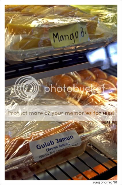
1- I’m not feeling the split screen effect here, I think mainly because the top subject is crammed in the top of frame. Having more space for each item, or zooming in on one item would help I think.
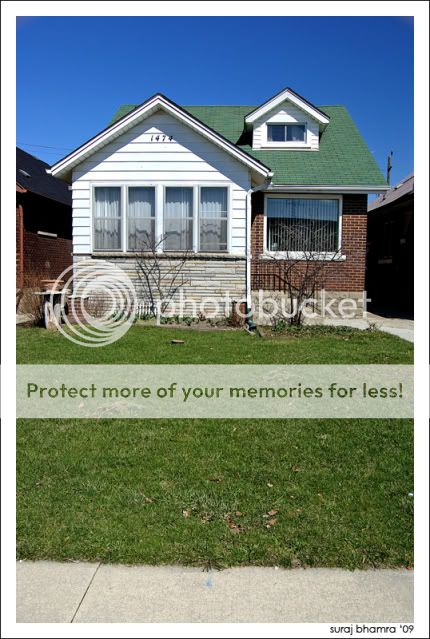
2- I somewhat like this image. Cute small house, very standard, very typical. What I don’t like is the amount of foreground in the image. The grass (and a bit of the sidewalk) dominates the majority of the picture. Nice exposure on the overall image though
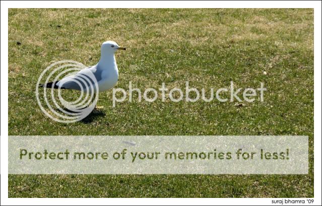
3- Same as above, too much empty space (grass)
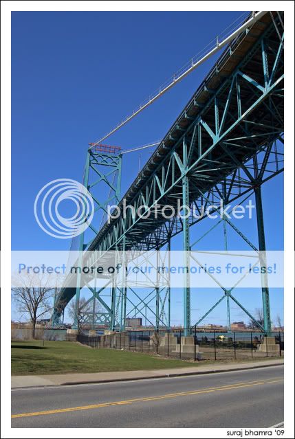
4- Probably my fave of your set. Good line with the bridge, good exposure on the overall shot
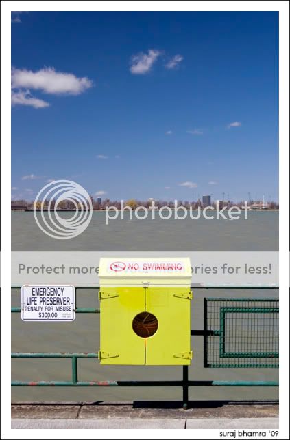
5- I like the horizontal lines in this one… from the cityscape to the boxes and bars in front. Good intention
Ah, the Ambassador bridge -- so narrow and uncomfortable. I once spent 5 whole minutes in Canada after crossing that bridge (followed shortly by 2 more years ).
Comments: for the most part, none of these photos really catch my eye. They're fine -- nothing technically wrong -- but there's just nothing that grabs me. For example, #2 is a pretty standard house: what makes it interesting? #4 and #5 are more interesting for their angles and composition, but you could probably do even more with the angles on the bridge.
Sorry to be a downer, but those are my initial thoughts.
thanks for all the input guys, keep bringing it on!
and as for the house, that was the first house my parents got when they moved to canada. we went back to their old neighborhoods to look at all the old houses they owned in the past. that house was also the same house my sister grew up in so in a way i guess that pic holds a sentimental value for me
and dc clark, i think with this set i was going for a very simple, small town theme. i tried to keep my lines as simple as i could to really give that small town vibe.
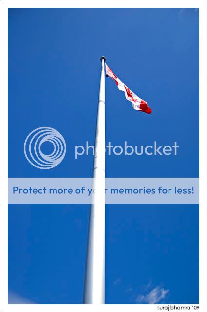
finally, in regards to the pole being crooked, i kind of was forced to angle it since barrel distortion makes it look curved anyways. i could have corrected it but i thought it gave it a cool look like this.
anyways keep the comments coming i really appreciate them
")
 ).
).


![[No title]](/data/xfmg/thumbnail/32/32947-11daccca0ca979c310e3963ceb9d01d8.jpg?1734162797)

![[No title]](/data/xfmg/thumbnail/32/32004-4455324f0b4b5cc318dd35877147ac47.jpg?1734160793)


![[No title]](/data/xfmg/thumbnail/35/35947-ab35bfc67d8e12ce65dda301d3bf2b66.jpg?1734167744)


![[No title]](/data/xfmg/thumbnail/36/36651-948fc64542c147745d3f3c48bce31dce.jpg?1734169165)