advice for photo album cover needed.

John_05

TPF Noob!
Joined
Nov 26, 2005
Messages
523
Reaction score
4
Can others edit my Photos
Photos NOT OK to edit
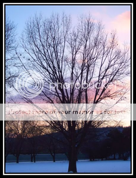
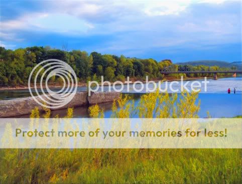
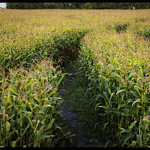
i am in the process of going through all of my photos and getting prints made. i have about a dozen different albums i am going to put them in once i have them sorted. the last album i am working on is going to be for nature/outdoor type shots i took. after looking though all of the photos i will be putting in that album, i have decided its between these 2 shots that i want to use for a cover photo. i have asked a few friends and a couple family members, but they havent been able to help me make up my mind as to which would look better, so i thought i would come here for some advice.

#1
630955fc.jpg

#2
d0a654cc.jpg


i should point out that these arent the same image. i just zoomed a little more for the first one, and neither has been cropped at all, just resized. i have decided that if i use #2, that i am going to try to clone out the bit of branches at the upper right part and maybe crop the road out from the bottom as well or maybe clone more snow into it to hide it. a couple of people i asked have said they like #1 better, but i think i am leaning towards the second myself. if anyone here would like to give me their opions/advice, i would be very grateful. thanks in advance to anyone that takes the time to give me their input. :mrgreen:
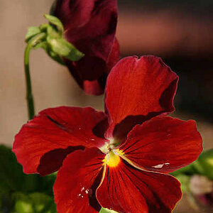
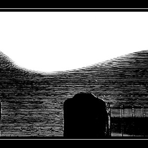
 
I would have to see #2 cropped to be sure, but I think that is the better one for a cover for a landscape album. There is a nice openess about it. I think you are right, the road gotta go.
 
I think they are both a little dark as the lower trunk gets lost in the blackness. I think the second shot is a little too busy, maybe that shot cropped but leave a little space around the sides. I'd almost prefer if you cropped just slightly below the skyline to get rid of the big black strip (the bottom third doesn't really have anything worth keeping anyway). Do you have any other options for your cover? -Joe
 
Number one looks a better shot to me as the frame is filled with interest. The second one has a distracting bit on the right which should/could be cropped out. I prefer the first as they stand, but I'd like to see the second cropped a little bit tighter.

Rob
 
i did some editing to #2, but i wasnt sure which i liked better so i will post what i came up with. the first is the original, the second is the first edit to remove the little bit of tree on the right side and i brightened up the whole pic some, and the third i touched up the sky a bit to give it more color/contrast and added snow to the bottom instead of just cropping it.


as for other possible pics for the cover, i had quite a few i liked so i just added smaller versions of them all to 3 different pics to make it easier for anyone on dial up to have a look at the thread.
#1
b582b13d.jpg


#2
7d849d5a.jpg


#3
798ec67c.jpg


if anyone has an opinion on a different pic on any of the ones i posted, just let me know what # pic it is, what row and what number in the row it is. if i need to, i can post thumbs to larger versions of any of the smaller pics so a better opinion can be made. none of the additional pics in the 3 pics (other then the tree ones) have been edited or cropped other then to remove noise so i have them full size if edits/crops should be made.
thanks again to everyone for their opinions. i also want to add that if anyone feels like editing any of the pics ive posted here, feel free to. i tried to clone in some snow into the 3rd tree in the very fist pic at the top, but i dont think it looks too good. if anyone else can do a better job, go ahead and have a go at it. i am leaning towards that one myself, but only if the snow at the bottom looked better. thanks again to everyone for their comments/advice. it helps alot because i have a hard time making up my own mind.:lmao: i am making the albums for friends and family to look at and not for myself, so i want them to have a look that makes someone other then myself want to look at them. thanks again!!
 
I am wondering what #3, 2nd row, 3rd colomn looks like.

In the first two photos you posted, I just feel as if it is missing a little bit of colour "wow"/b&w contrast factor to it.
 
Peanuts said:
I am wondering what #3, 2nd row, 3rd colomn looks like.

here is the one you are referring to in a larger form.
749a32c5.jpg


Peanuts said:
In the first two photos you posted, I just feel as if it is missing a little bit of colour "wow"/b&w contrast factor to it.

which ones do you mean? the very first 2? also, are you saying they would look better in B&W, or no? thanks, and sorry for not understanding what you mean. i think i know what you mean, but i dont want to assume anything. thanks for the comments, and let me know what you think of the other pic i posted here.
 
Personally I like the one in your last post (#3, row two, column 3) the best of them all.
So sorry, I didn't describe what I meant clearly :). What I meant to say was this photo didn't have enough colour to really 'pop' out at me as being a front photo on an album. But I wasn't just aying colour photos work, a black and white could work as well.
Sorry once again for the mis understanding.
Brittany
 
I really like the one Britt chose, I'd also like to see #3, first row, second column *crossing my fingers thats the one I mean* but I would crop off the top of the clouds so it isnt split in half. A little advice for horizon shots... try not to split the frame in half, make it one 3rd land two 3rds sky or vice versa or something along those lines, it just makes the shot look more dramatic.

-Joe
 
thanks peanut. thats pretty much what i thought you meant, but i wasnt sure. the colors really didnt seem to "pop" to me either, so i tried to touch up the pic some to give the sky more color and to brighten the bottom, but it still isnt looking the way i would like it to. i also like the one you picked, but i had originally wanted something with a little more content to it. i may have to have a couple of them printed larger and try them to see which looks better.


Joerocket said:
I really like the one Britt chose, I'd also like to see #3, first row, second column *crossing my fingers thats the one I mean* but I would crop off the top of the clouds so it isnt split in half. A little advice for horizon shots... try not to split the frame in half, make it one 3rd land two 3rds sky or vice versa or something along those lines, it just makes the shot look more dramatic.

-Joe

i think this is the one you meant. its #3 row 2 column 1. i mix up columns and rows alot too, but row 1 column 2 is the one with the groundhog/gopher? in it and you mentioned sky, so i hope this is the one you meant.

a3aabe39.jpg


i also see what you mean about cropping the sky at the top. i scrolled the screen here to look at it, and i think it does look better with a slight crop at the top. once i can find that pic in original size, i will crop it and post it here. i was thinking about either cropping it at the top of the tree on the right, or just a little above the hole in the clouds on the left. im not sure which will look better so i will just do both. :lol:

thanks again to everyone for their help. it gets frustrating not being able to make up my mind, and getting help from impartial people really helps alot. maybe if i would have listened to my family about the hazards of motorcycles long ago, i would have a better mind to work with.:lmao:

one other quick question. i havent had any of my digital photos printed yet, so i am wondering what dimensions would be suitable for having an 8x10 print. these are all 5MP pics and the original size is 2592x1944. thanks again!
 
Yea thats the one, the reason I say to chop off the clouds is cuz the horizon splits the frame in half. Mind if I have a stab at it?

and as far as the print size you should have at least 150 pixels per inch, you have 243 so thats more thats more than good for an 8x10 print.

-Joe
 
Joerocket said:
Yea thats the one, the reason I say to chop off the clouds is cuz the horizon splits the frame in half. Mind if I have a stab at it?

and as far as the print size you should have at least 150 pixels per inch, you have 243 so thats more thats more than good for an 8x10 print.

-Joe

thanks for the info, and i said earlier that the pics here were OTE. i probably should have included it in the title or made it more apparent. sorry about that. next time hopefully i will remember to make it more obvious.

just another quick question. that pic is just resized and not cropped originally so if i do crop it the way you suggested, will i still have enough left for a decent 8x10, and will the aspect ratio still be correct? thanks.

**edit** also wanted to say that if you want, i can upload the full sized pic for you to work with as well. just let me know.
 
a3aabe39copy.jpg


well here's my try, as far as the sizes again, you would have to know the dementions to say for sure, its not that large of a crop so I'm sure there wouldn't be a problem.

-Joe
 

Most reactions

Back
Top