Advice, Opinions, C&C Please!

JosephCarter

TPF Noob!
Joined
Aug 27, 2013
Messages
34
Reaction score
12
Location
Golden, British Columbia
Website
www.josephcarter.ca
So I've decided to take the leap from landscapes to portraits. I plan to start shooting engagement, family, newborn portraits once I obtain some flashes/lights, and only after a lot of practice/reading. I also plan to start assisting some pro's with weddings and eventually start shooting on my own, again, once I've gained enough experience.

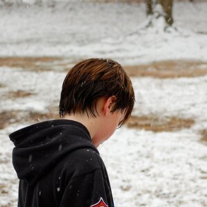
I've been doing a lot of reading this past week, and yesterday I decided to drag my girlfriend out to use as a model to practice on. We only went to a couple different places, and these are actually the only 2 images I made as I wanted to try out the Brenizer Method. (we're currently in Prague visiting her family)

I was pretty happy with the way these turned out but I would LOVE if you more experienced portrait photographers would pick them apart and tell me what you would have done differently, and maybe what I got right.

My goal was to find locations with nice natural light, as practice, and also because I have no lights yet.


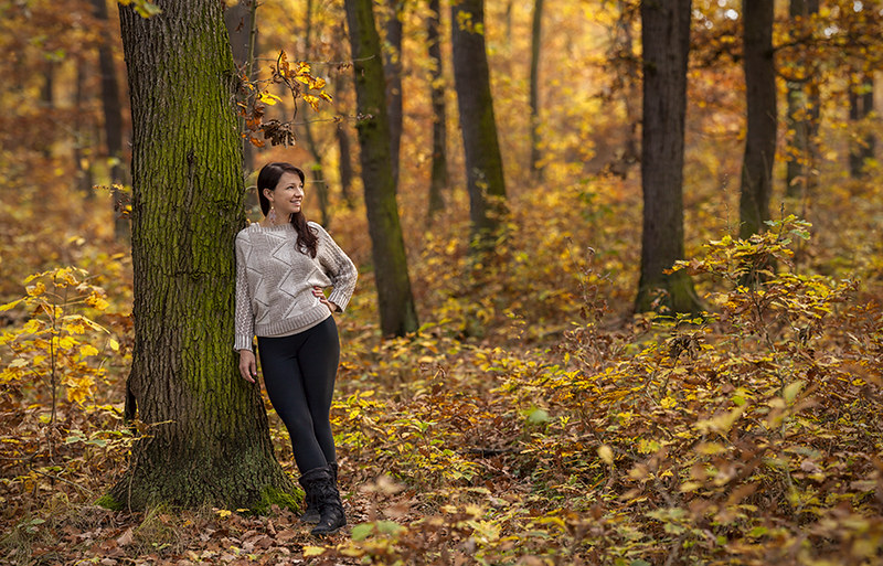
marie forest sml by josephcarter1, on Flickr


marie alley edit sm by josephcarter1, on Flickr


I would also love to hear your crop suggestions, or anything else!

Thanks!
 
I'm not an expert at all, but there are two things that caught my eye in the first shot. The first is her sweater. It just doesn't seem to fit with the color scheme to me. It works great in the second shot, but I'm not feeling it in the first. The second is her pose. When shooting in a natural environment like this, I try to go for a more natural pose to the subject. It's hard to explain, but when in the woods, one doesn't normally stop and lean on a tree like that. Maybe on a building while waiting for a bus, but here her body language doesn't seem to reach out and speak to me. Her facial expression is great though. I don't know if what I'm saying makes any sense to anyone else but me, but that's not atypical of me. All that being said, I still like the shot.

The second pic, I like. Her pose seems a little stiff and straight at the camera to me, but for some reason I like it in this shot. With an off camera flash, this would be an especially nice picture. Just my opinion. Again, I'm by no means an expert, so take all this with a grain of salt.
 
I like the first one, even if the subject is too small in the frame to my liking. The second one is a bit weird - that line between her legs, it makes it look like she is having a pee.
 
These are okay but it is rather obvious that you are still thinking in the landscape photographer mode. Get in up close and personal, those are the shots people pay for.
 
Robert Capa once said, “If your pictures aren’t good enough, you’re not close enough.”
 
I really like both of these the way they are, even with the loose crop. And I say use your skills as a landscape photographer to your advantage; these have a unique perspective that makes your portraits more interesting to me. I know famous photographers like Joey Lawrence create amazing portraits using similar sticking techniques and large environments like this, and he's doing pretty damn well as far as I'm concerned.

On the subject of light, it looks like you have a skill for using natural available light. You don't need OCF to craft amazing light in my opinion, and it looks like you're already doing well with the available light. Don't waste your money on OCF; get a nice 85mm or 135mm lens instead. ;]
 
Thanks everyone for your input.

Just to be clear, I left the images this wide because I wanted to hear how YOU would have cropped it in camera. I do like them the way they are, but I realise portraits are more traditionally shot tighter than this.

As I mentioned, I shot these using the Brenizer Method, so cropping them down really tight is no problem.

I guess I will do some cropping on my own and hopefully get a bit more feedback.
 
I would have cropped it like that:

$10440830345_8ed6d97aca_c.jpg

$10441094863_84df4d360c_z.jpg
 
I quite like both of these! I would maybe tone down the green (on the tree mainly) in the first.. its really distracting to me. That location is so beautiful, I am so jealous! We don't have anything like that in my city. #2 all the colors seem to work together better than her outfit vs the backdrop in the first like someone else mentioned. You are lacking a connection with your subject though, no eye contact anywhere. I'd like to see some with her looking at the camera!
 
Super rough just to show what I envision for the tree.. maybe something like this: (the thumbnail is desaturated, you'll have to click to see)
$10440830345_8ed6d97aca_c.jpg
 
There's something interesting about the depth of field that seems to make the wide perspective work for me, because some of the background details are softened.

Are these Brenizer'd? Not that it matter. It's just that the DoF on the second looks a bit shallow the the perspective. I actually like both images.

I even like the second how it is. It's kind of unorthodox, but I think that's why I like it.
 

Most reactions

New Topics

Back
Top