What's new

Amateur Animal Pics C&C PLEASE and Thank you

tmjjk

No longer a newbie, moving up!
Joined
Mar 28, 2012
Messages
550
Reaction score
61
Location
Cleveland
Can others edit my Photos
Photos OK to edit
All comments and critique are welcome... please help me out :)

1 $tpf1.webp
2$tpf4.webp
3$tpf3.webp
4$tpf5.webp
5$tpf6.webp
6$tpf2.webp
 
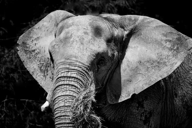
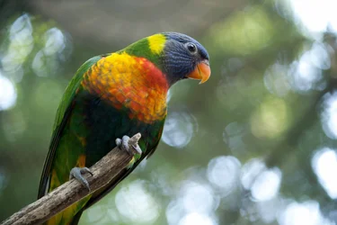
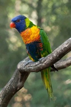
1 and 4 are particularly nice!

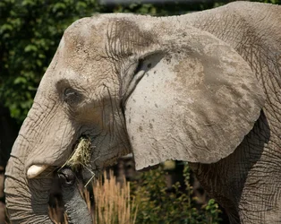
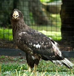
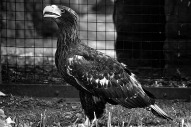
They are all perfectly exposed and well composed apart from maybe 2 and 3. I don't think a side-on shot is the best angle of an elephant's head unless it includes the whole trunk or you are shooting close details, plus it's cropped a bit too tight to the trunk. The fence behind the eagle ruins an otherwise perfectly exposed shot, but I guess there wasn't much you could do about that.

Overall though, very nice indeed. :)
 
Thank you Forkie... here are a couple more

7$tpf7.webp
8$tpf8.webp
 
Bump for c&c :)
 
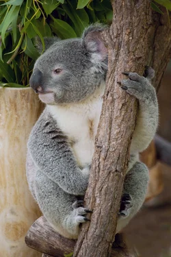
Nice photos Although you could improve the compositions. Maybe you should do some research on the rule of thirds'. I really like the 5# and 6# image. They would have been nicer if you had composed ^^ the subjects (in both) more to the right and more empty space to the left. Usually it makes it a more overall nice photo when you have more negative space towards the direction the animal is looking. Good job though.
Try to space your photos out it little too. Took me a while to see if I had the right number with the photo. Lol, don't want to sound like a old grumpy granny.
 
thanks rick93.. I appreciate you taking the time to comment. And ironically enough I cropped out the negative space because I was told not to have the negative space in other images, but maybe it was because it was people. Who knows, I will post some of the originals and space them out.
 
ok these aren't originals but is the rule of thirds expressed any better? With the important sections being on the grid?
9$tpf9.webp


10$tpf10.webp


11$tpf11.webp
 
Any more suggestions for improvement? Anyone?
 
[/LEFT]RoT's is an oft misunderstood beast.

While in many of your first posts images, your entire subjects are indeed centered. But that's OK. Many of them have the creatures eyeballs at the sweet spot, or thirds intersection.

Don't always try to off center an entire subject. If I fills the frame, like those above, then look at elements of your subject, and see where they fall.

There are reasons to use dead space. There are reasons not to as well. Don't fall into the trap of putting your entire subject off center because it's s'pose to be better that way. Dissect The image, the subject, and make decisions with good reasons behind them.

:sexywink:​
 
Thanks Bitter!!! And yes Cleveland does rock! :D
After our "abstract discussion" I was checking out your flickr stuff and was totally impressed. Then I thought, "but I don't have that kind of imagery where I am." Saw where you were and, well you could see my surprise :). Now I see beautiful things I want to capture every other moment. Everywhere. Thanks for the encouragement... off to the "real job".
 
As a noob my comments are worth very little, so take them for what they are worth.

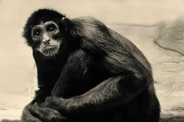
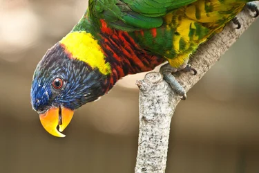
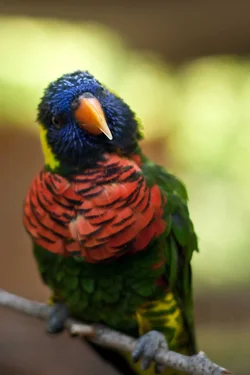
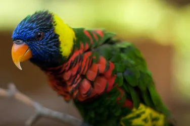
I find #8 and #11 the most interesting, I think this is because even though the subject fills most of the frame their heads are still follow the ROT.

I think #10 isn't flattering to the bird. perhaps moving more to the left side of the bird and getting more of a profile would have improved it.

 
Very nicely shots loving the details in these pictures! Nice job.
 

Create an account or login to comment

You must be a member in order to leave a comment

Create account

Create an account on our community. It's easy!

Log in

Already have an account? Log in here.

Back
Top Bottom