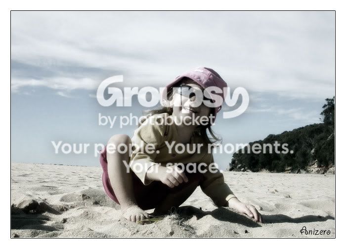
i like this one. it's a little bright, but i'm sure it was tough lighting conditions to deal with, and you fixed it up quite nicely. the low saturation also works for this image, as one that was completely filled with color might be a bit much, and detract from the subject. the expression and 'pose' is great, but unfortunately the harsh lighting made itself most noticeable on the subject's face unfortunately. again, something you couldnt really control (unless you used fill flash, which would have helped, or a reflector). i wish there was a bit more contrast between the sky above her and her hat though. it kind of blends together, nothing some PS cant remedy. the horizon is tilted, not sure if that was intentional. again, an easy fix. if you placed her on the left side of the photo, then it would have had a little better balance with the hills on the right too. nice job with this