Obviously you're messing around with depth of field. I don't think all of these shots are good candidates for it.
Additional comments.
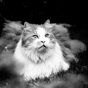
#1. The transition from crisp to blurry is too moderate and it makes the blurriness stand out too much. Maybe a tighter crop would help? Or if the background was more uniform (no big white area on the right side)?
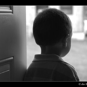
#2. The towel is too much in the foreground and therefore it brings out the out of focus portion of the picture and overpowers the face of the kitty. It also brings the cabinet that it's hanging from a little more into focus, again detracting from the focus of the shot.
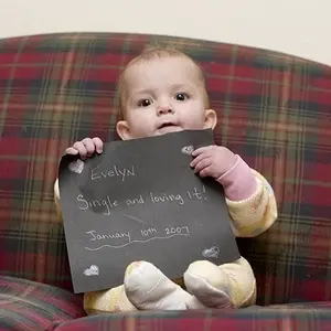
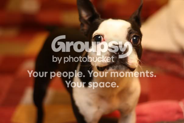
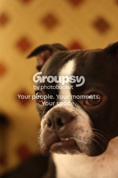
#3. Agree that part of the face is out of focus. Eye is most noticeable but the rest of the face is as well. The dog seems to be sporting a really cute expression, most of which is in the muzzle area, which is out of focus. I would even focus on the smirk over the eyes in this particular shot if I had to pick between the two.
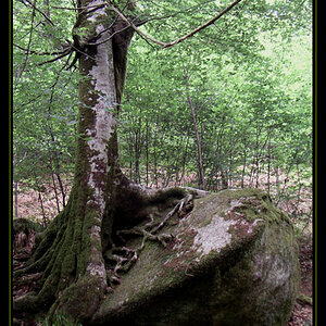
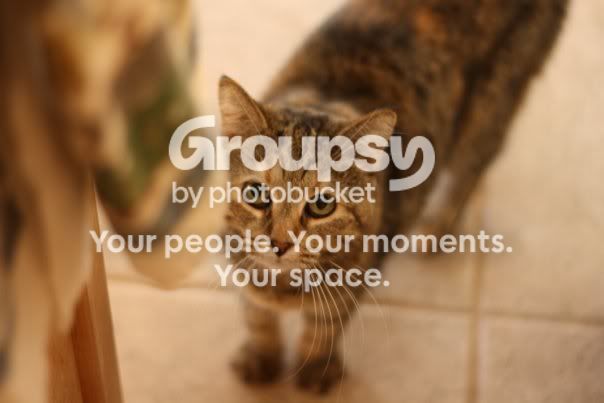
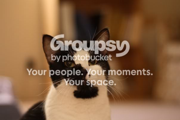
#4. Again, I'd prefer a tighter crop, but as with any of these comments, it may just be me. We all have different tastes. The reason I think it may benefit is because of the coloration of the face. The black spot covers a lot of the details of the face so the focus turns to the eyes. Which is great since cats have striking eyes.
So a tighter crop and centering the eyes using the basic rule of thirds would bring them more to attention.
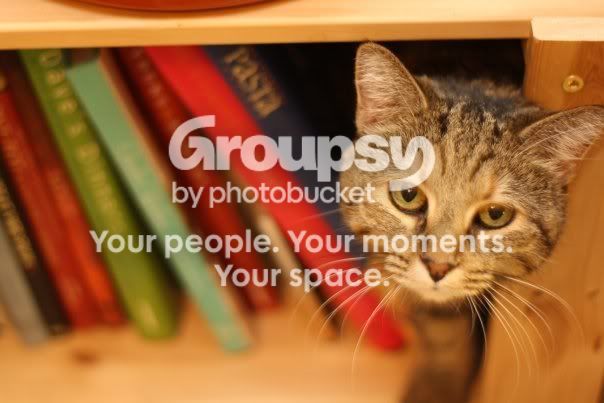
#5. As the previous poster mentioned, the ear is indeed cut off. The subject is also a little too far to the right, making the cropped ear stand out even more. Or depending on your eye it could be that the cropped ear makes the subject look even farther to the right than it is.
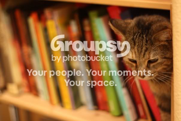
I would also personally, either not choose books with a high enough contrast that you can make out the writing (ie. Pasta) or pick books that give the shot character and the titles be barely but still decipherable. Maybe books about different types of food?
This may be a stretch, but the bowl or planter on top of the shelf is also a bit distracting, as is the screw on top of the cropped ear.
The later picture you have as a replacement addresses a lot of these things.
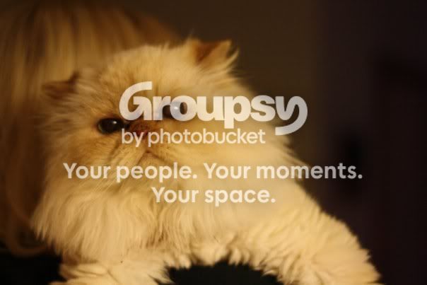
#6. Again I find myself uncomfortable with the crop on this one. Maybe a few steps back to get the entire cat. Even parts that are blurred are part of the picture, so the front paws and rear tail being cut from the picture give it a snapshot feel. The right eye (viewer's perpective) has some discoloration, but nothing that PS can't fix. It would be nice if the darker shading on the right side was also more uniform.
It's difficult to see where you want the viewer to focus. The shot draws the attention to the cat's face, right between the eyes. Maybe a change in aperture to bring the whole face in focus would remedy this. By doing so you are going to bring the front paws a bit more in focus so you may have to either crop them so that the picture tapers after the top chest. Or as said above, bring the whole front into view.
Sorry if it's long winded, I used to critique photographer's work to see if it was adequate for marketing for a living and tend to have a hard time shutting up.



![[No title]](/data/xfmg/thumbnail/35/35263-86f580cf5d28d23109a45984030a79ad.jpg?1734166920)
![[No title]](/data/xfmg/thumbnail/42/42481-e35ff0c514a554d7bd4381fb2ae79c5a.jpg?1734177006)

![[No title]](/data/xfmg/thumbnail/42/42482-3d0e794a92737ca7ecbc8125874457aa.jpg?1734177007)