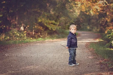
SOme keen observations above from lambertpix. If it were my shot, I would clone out that light-colored blob in the left background area--that's really distracting, and on a bigger version of the image would really pull the eye away from the boy.
I think this could be processed darker too, so that the woods behind seem a bit darker, and the shaft of light coming across the road would still be bright, but the road behind would be darker in tone...I think that might make the boy separate from the background a bit more. I like the way you've placed his head right over the vanishing point!!! That effect will appear much better when the image is printed or seen significantly larger than this.
When I say "darker", what I man is to enhance the feeling of the dappled sunlight coming down in open shade...the interplay of the light shafts on the gravel seem weak, pallid...I want to see more "light play" on the road in the foreground, and also behind him...the way this is lightened up makes the dappled light appear insignificant, but my brain tells me it was really gorgeous light, but it doesn't look "gorgeous", it looks unnaturally desaturated. I really like his placement in the frame though,and think the composition is nice. In this shot, the roadway itself is a very significant item, and I like how you handled the road, and the boy.