What's new

Any Appeal?

Bitter Jeweler

Been spending a lot of time on here!
Joined
Apr 27, 2009
Messages
12,983
Reaction score
5,003
Location
Cleveland, Ohio
Can others edit my Photos
Photos OK to edit
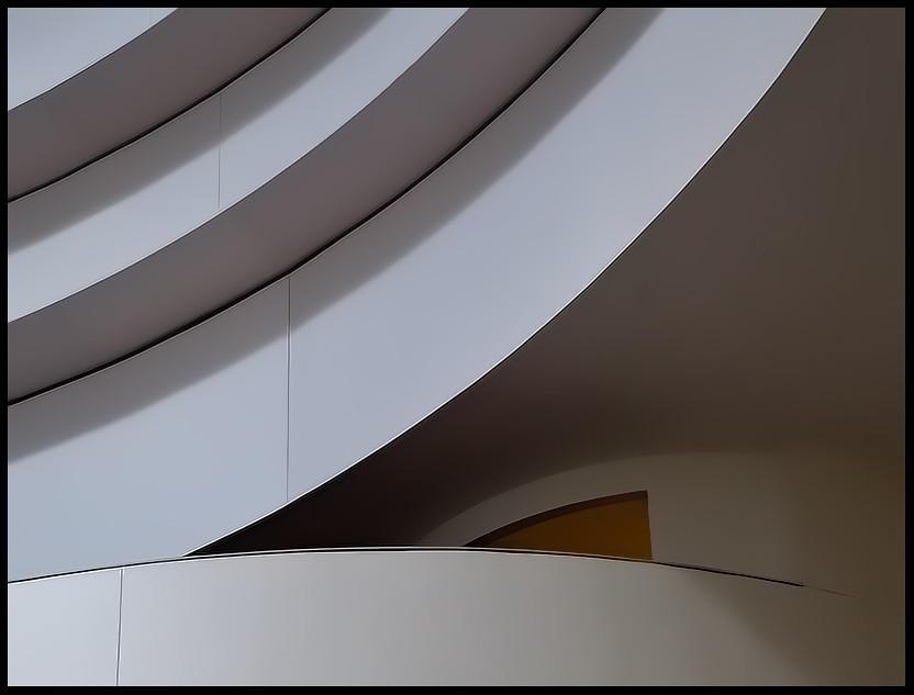
4869968385_4006857406_b.jpg
 
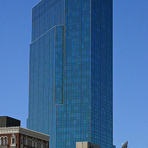
I don't like the color in the hole. If it was momochrome it might not stand out as much. The lines are lovely though, especially the vertical seams that break things up.
 
Sex appeal is the only thing that appeals to me. Well, I guess appeal a banana too...
 
I like it, I like the color it is a bit of a surprise but it is not overly bright which would ruin it for me.

Very nice work.
 
Sex appeal is the only thing that appeals to me. Well, I guess appeal a banana too...

Do you find me sexxy, baby?

Bitter - I agree about the hole... it sort of breaks the flow for me.

Hmmm...as BC suggested, I'll go home and post a b&w.
I've been on the fence about that yellow triangle.

erose, is it the color or shape for you?
 
I like the shape of it but if you wanted to get fancy and make the vertical edge on the right side of it match the vertical seams throughout I think it would be doubly nice.
 
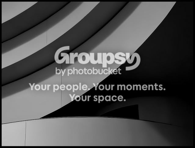
Hope you dont mind ,, i have never done this before but anyway just put in bw and increased the shadows a tad nothing else
bitterbw.jpg
 
Reminds me of the Guggenheim in NYC. Is it the Guggenheim? Maybe a B&W would be better in this pic. Jus' commentin' with the little experience I have.
 
Hmmm...as BC suggested, I'll go home and post a b&w.
I've been on the fence about that yellow triangle.

I'd just desaturate the triangle because I like the subtle colors in the rest of the image. Good to see your "curves" series is alive and well!
 
Hmmm...as BC suggested, I'll go home and post a b&w.
I've been on the fence about that yellow triangle.

I'd just desaturate the triangle because I like the subtle colors in the rest of the image. Good to see your "curves" series is alive and well!

+1.

I don't think I'd like it as much B&W... but the triangle is distracting... so perhaps desaturating it is the way to go.


I was thinking in this direction....

I kinda like the color as it provides some punch to the curve going the opposite direction, but I can see people's objection to it as somehow it also takes some of the drama away. I'd try desaturating it to the point that it's almost B&W so there is just a hint of color and maybe up the contrast for a more "graphic" result.

 
I like it but the three vertical lines throw it off and are a little off straight up and down.
 
ok so just the same bumped the shadows a bit cause i love that they give you more cruved lines and obvisouly changed it to bw :)
 

Create an account or login to comment

You must be a member in order to leave a comment

Create account

Create an account on our community. It's easy!

Log in

Already have an account? Log in here.

New Topics

Back
Top Bottom