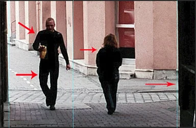
The interesting thing about pictures with repeated elements is the repetition of the enjoyable pattern.
In this picture, the off-kilter verticals and the sharpening halos are distracting, I think
Yes, it needed a bit of straightening and then sharpening. It was a a bit of a snapshot at the time of taking and I've used it to see what could be done by selecting the area with the most interest and then blowing that up a bit. I'm reading through Hedgecoe's The Art of Colour Photography at the moment, and there are a few examples where he does just this. I'm happy that the patterns have been picked up on and know the rest could be a lot better.
Moving away; moving towards.... showing one face, hiding the other.... one male, one female.... really intelligent
I felt the objects in the corridor a bit distracting
Fred; I love it! I immediately smiled as I digested your composition. You should be very happy with it.
Yes, please straighten it, correct the halos, and crop the two right-most metal racks. Then, if you still feel like playing with it; clone out some of the reflecting elements in the dark areas.
Moving away; moving towards.... showing one face, hiding the other.... one male, one female.... really intelligent
I felt the objects in the corridor a bit distracting
Thanks, Frequency; I'm happy that you got so much out of it. Maybe the objects are a bit distracting because there isn't enough shown of them in this crop.
Fred; I love it! I immediately smiled as I digested your composition. You should be very happy with it.
Yes, please straighten it, correct the halos, and crop the two right-most metal racks. Then, if you still feel like playing with it; clone out some of the reflecting elements in the dark areas.
I took another look at the original photo this morning and decided to try a different crop. Perhaps more is less, and the problems are not as obvious from this viewpoint. Also, some other elements are now included which support what's going on within the centre of interest:
The table on the left is intriguing, and I love those arrows above it, matching the direction of the figures, but the colorful stuff on the right should go.
The story would have been different, if instead of the notice boards, a street cat or dog or any such interesting thing appeared towards the viewer's end when you zoomed out; as of now trimmed image is better
Regards






![[No title]](/data/xfmg/thumbnail/34/34054-75057fa828bda4184ea808ff8bd8dfcf.jpg?1734164464)
![[No title]](/data/xfmg/thumbnail/31/31045-f4eb92f5d5eaca89ec5966763eea2dae.jpg?1734159149)
![[No title]](/data/xfmg/thumbnail/31/31046-f1d28c614676726741e90ce5b420a03e.jpg?1734159151)