Assignment: Still Life....C&C?

Markw

No longer a newbie, moving up!
Joined
Jul 25, 2008
Messages
4,057
Reaction score
230
Location
Baltimore
Website
www.outsidetherainbow.com
Can others edit my Photos
Photos NOT OK to edit
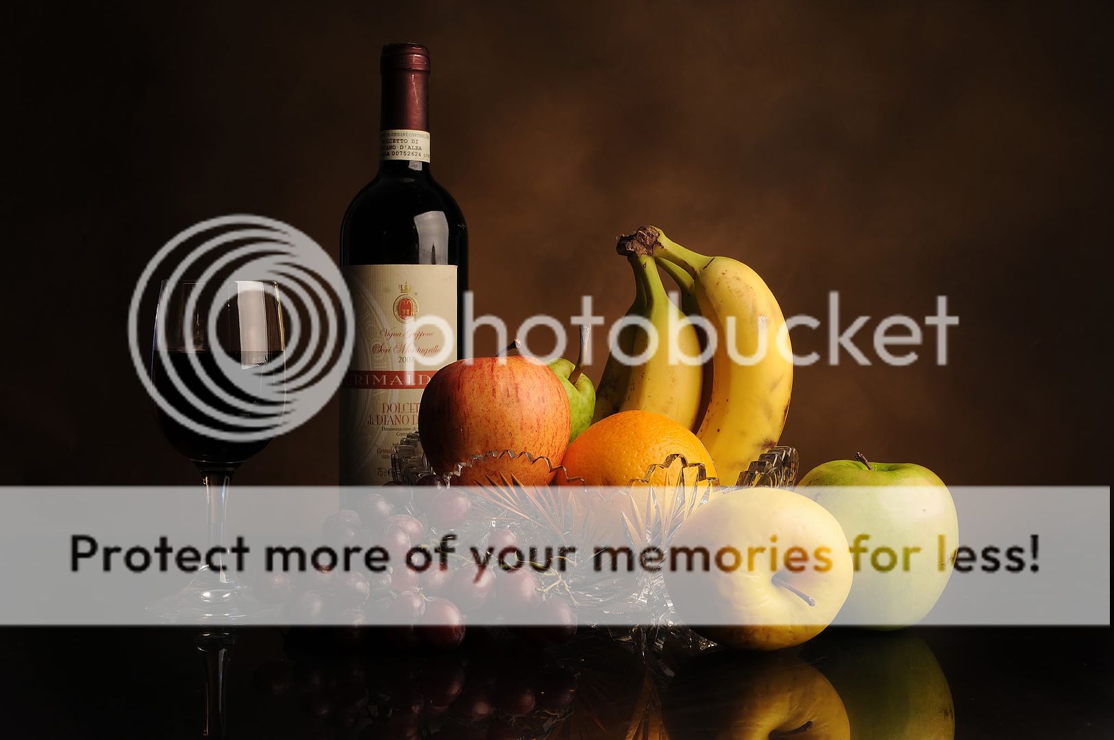
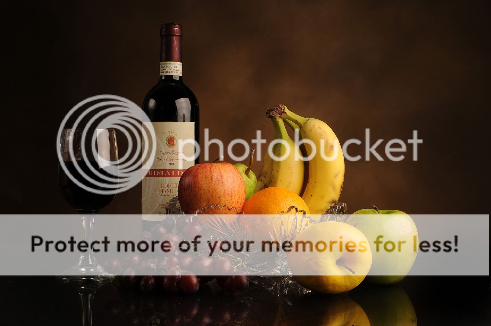
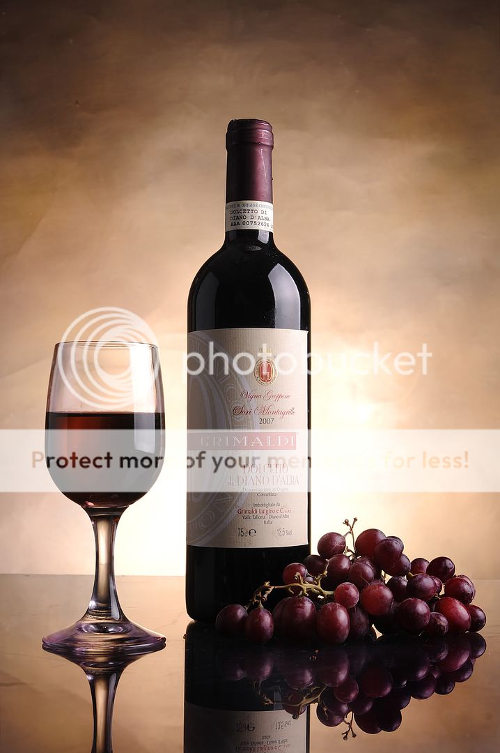
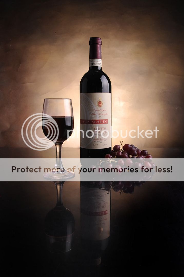
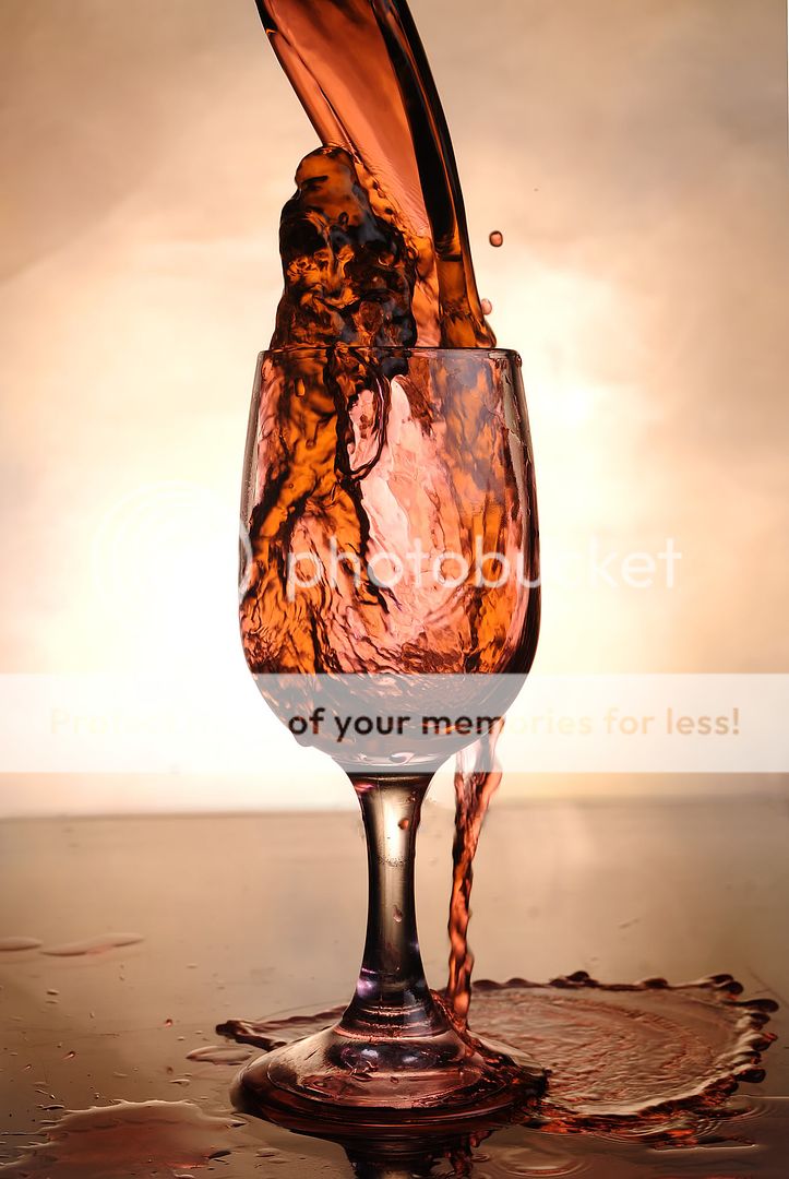
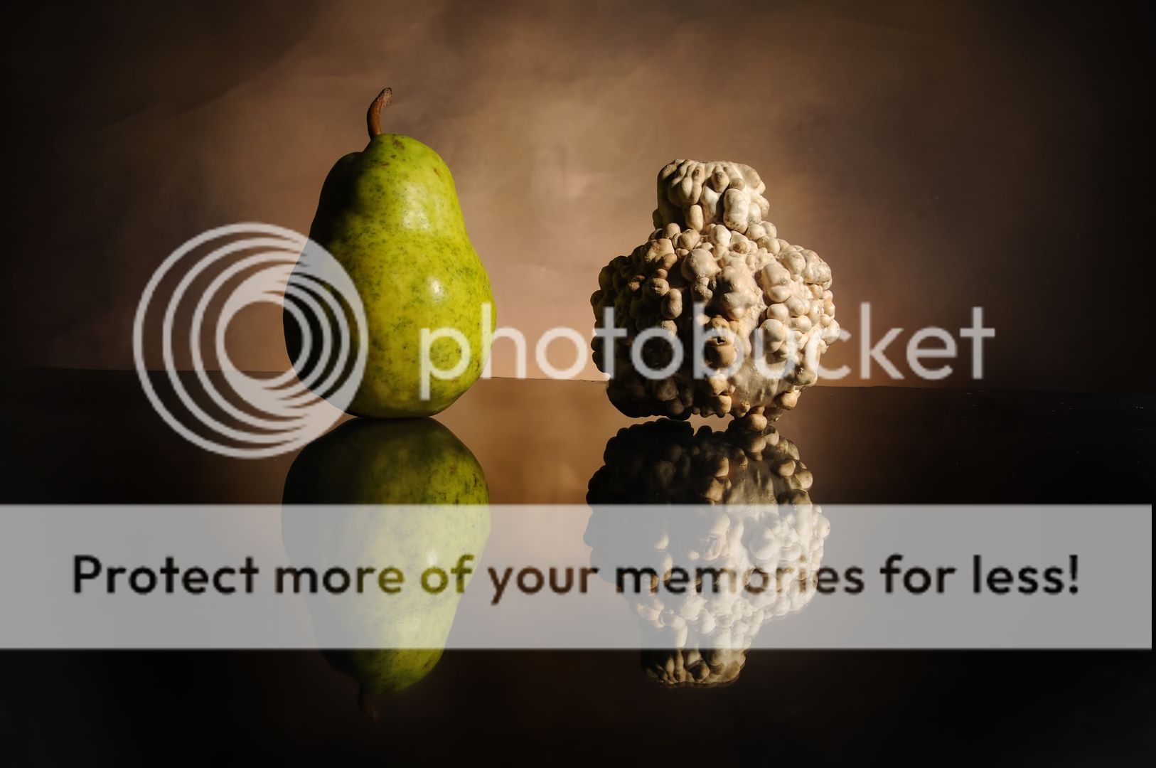
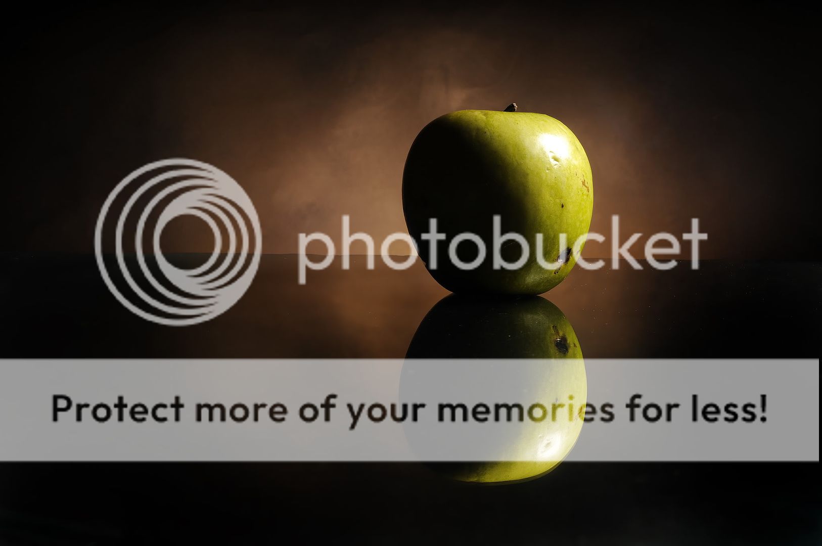
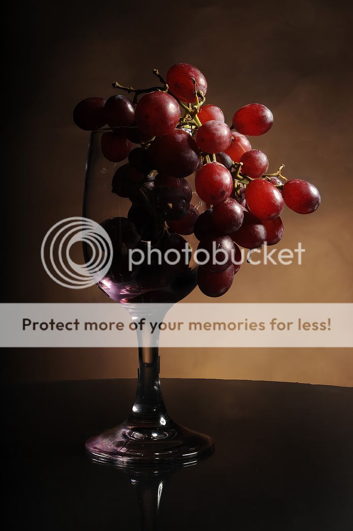
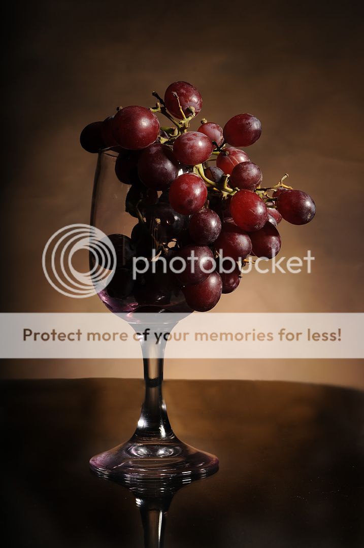
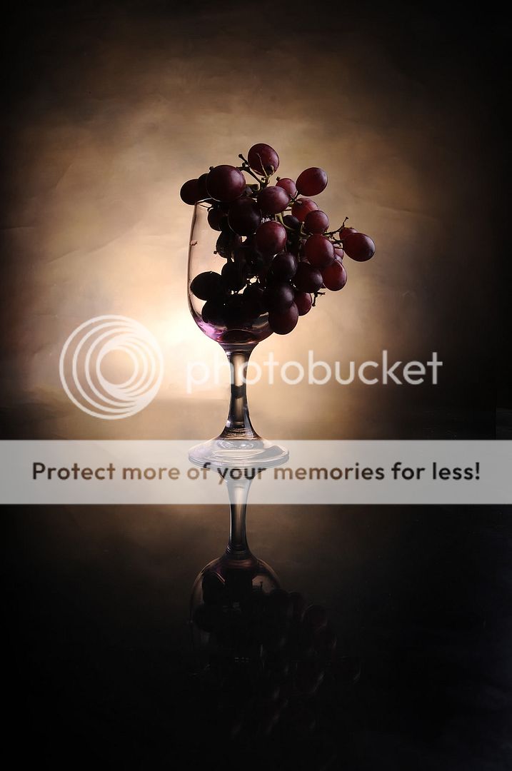
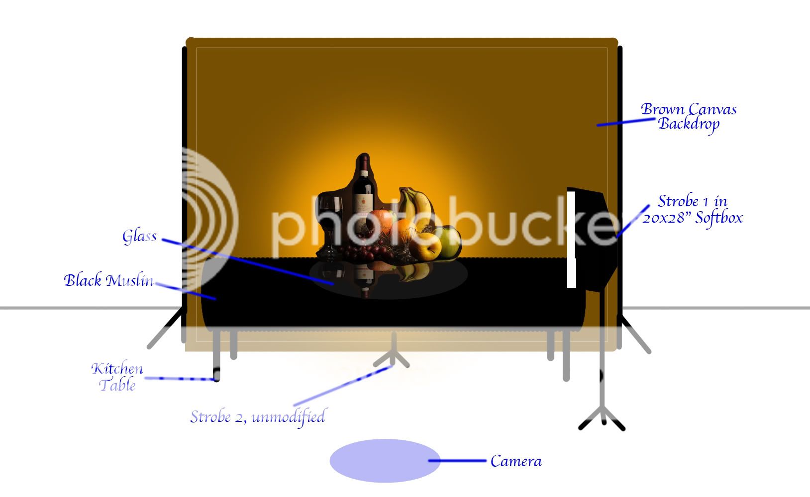
This past week, a friend and I were looking through a bunch of old paintings in an antique store. She really like this particular still life. The typical one with the fruit. They wanted an astronomical price for it, and i told her I could compose a photo that would be almost exactly like the one she liked so dear. And that I did. I'd love your thought on some of these. I know, it's a little heavy-handed with the amount of photos. Don't feel obligated to comment on them all. But I would like your thoughts on your favorites.

1-1 (No reflector)
DSC_8276.jpg


1-2 (Reflector)
DSC_8278.jpg


2
DSC_8324.jpg


3
DSC_8326.jpg


4
DSC_8313.jpg


5
DSC_8335.jpg


6
DSC_8354.jpg


7
DSC_8349.jpg


8
DSC_8352.jpg


9-1
DSC_8356.jpg


9-2
DSC_8343.jpg


Thanks!
Mark
 
1 & 6. Very cool. You've been busy mate! :)
 
I very much like the lighting in number 3.
 
I like number one better that two. The bottle went flat with the reflector. One has wonderful depth, and feels so rich. Nice job.
I wonder if getting just a bit more highlight on the edge of the wine glass would be goin to far?


I really :heart: number five!!!


I like the placement in the frame, dead space, and that you have both highlights on the grapes and grape silhouettes. Just beautiful.
 
Some fun stuff you have there Mark! In the first two "classical" style still-lifes you've done a pretty good job of emulating the classic work in that specific genre. A couple nits though: the wine bottle is too close to the top of the frame, causing tension...it needs more top space. The wine glass needs a bit of edge help on the left hand side. Overall, the framing is just a bit too "tight"...it needs more space at the top, and a little bit more at the bottom would have been nice to capture that beautiful reflection. The "real culprit" here is the 3:2 aspect ratio of your capture medium...this would look MUCH better captured with a "more-squareish" camera that captures at 4:3 or 4:5. The "35mm style frame" is not that good for this type of photo with a really tall object,like a wine bottle shot as a major element in a horizontal shot

In shots 3,4,5,6,7 the wrinkles in the background are emphasized quite a bit by having the backlight raking in from such a steep angle...that looks bad, and the BG is too much in-focus...the BG itself is "an element with presence", and has texture and wrinkles...just not good. The way you used it in 1 and 2 is much better. When the BG's texture and state of wrinkliness can be ascertained...I don't like the shot,no matter who shot it. Kind of like seeing the boom microphone in a movie shot...it just totally spoils the effect.
 
Absolutely lovely Mark. What kind of set up did you have for this. Turned out awesome.
Thank you!
Setup.jpg


great shot all of them...but the apple is my fav...
Thank you.

Some fun stuff you have there Mark! In the first two "classical" style still-lifes you've done a pretty good job of emulating the classic work in that specific genre. A couple nits though: the wine bottle is too close to the top of the frame, causing tension...it needs more top space. The wine glass needs a bit of edge help on the left hand side. Overall, the framing is just a bit too "tight"...it needs more space at the top, and a little bit more at the bottom would have been nice to capture that beautiful reflection. The "real culprit" here is the 3:2 aspect ratio of your capture medium...this would look MUCH better captured with a "more-squareish" camera that captures at 4:3 or 4:5. The "35mm style frame" is not that good for this type of photo with a really tall object,like a wine bottle shot as a major element in a horizontal shot

I have a complex about going against the 3:2 aspect ratio that comes out of the camera. I think it's because all of my prints thus far have followed that. And, should I want it to be printed, I would like it to be that size. I agree, but more space on top and bottom would have effectively given me 1.5x the space gained on top and bottom, on both sides. Without changing the crop, I would have had far too much dead space on either side. But I see what you're saying, completely.

In shots 3,4,5,6,7 the wrinkles in the background are emphasized quite a bit by having the backlight raking in from such a steep angle...that looks bad, and the BG is too much in-focus...the BG itself is "an element with presence", and has texture and wrinkles...just not good. The way you used it in 1 and 2 is much better. When the BG's texture and state of wrinkliness can be ascertained...I don't like the shot,no matter who shot it. Kind of like seeing the boom microphone in a movie shot...it just totally spoils the effect

Ahh. thanks for pointing that out. Hindsight is always 20/20 right?.

I like number one better that two. The bottle went flat with the reflector. Agreed. One has wonderful depth, and feels so rich. Nice job.
I wonder if getting just a bit more highlight on the edge of the wine glass would be goin to far?

I really :heart: number five!!!

I like the placement in the frame, dead space, and that you have both highlights on the grapes and grape silhouettes. Just beautiful.

Thank you, really!

Thank you everyone! Messages in red.


Mark
 

Most reactions

Back
Top