- Joined
- Jul 14, 2011
- Messages
- 4,173
- Reaction score
- 2,551
- Can others edit my Photos
- Photos OK to edit
Got around to processing another shot from my visit to this beautiful place.
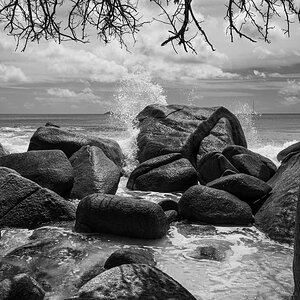
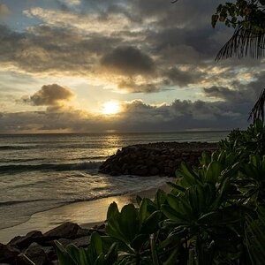
"This section of the upper Rogue River is relatively flat and gentle above here, then crosses under the Mill Creek Drive Bridge (what was at one time a covered bridge), and drops rapidly into the Gorge. The view from the bridge encompasses the Rogue’s roaring waters (in spring) with Mt. McLoughlin in the distance. A trail north of the river is a view from a 100-foot-tall cliff. Trails south of the bridge wind you down into the boulders. Viewing old photos – available at the Prospect Historic Hotel (just 1/4 mile away), one can see the impact of the power of the Rogue River. Several huge boulders that are in the historic photos have moved a considerable distance downstream." -- Avenue of the Boulders - Central Cascades Geotourism Project

Avenue of Boulders Sign by Rotanimod, on Flickr

Avenue of Boulders by Rotanimod, on Flickr

Avenue of Boulders Landscape by Rotanimod, on Flickr
"This section of the upper Rogue River is relatively flat and gentle above here, then crosses under the Mill Creek Drive Bridge (what was at one time a covered bridge), and drops rapidly into the Gorge. The view from the bridge encompasses the Rogue’s roaring waters (in spring) with Mt. McLoughlin in the distance. A trail north of the river is a view from a 100-foot-tall cliff. Trails south of the bridge wind you down into the boulders. Viewing old photos – available at the Prospect Historic Hotel (just 1/4 mile away), one can see the impact of the power of the Rogue River. Several huge boulders that are in the historic photos have moved a considerable distance downstream." -- Avenue of the Boulders - Central Cascades Geotourism Project
Avenue of Boulders Sign by Rotanimod, on Flickr
Avenue of Boulders by Rotanimod, on Flickr
Avenue of Boulders Landscape by Rotanimod, on Flickr
Last edited:


![[No title]](/data/xfmg/thumbnail/38/38735-2245cc1b04db3f96fa74095ae14558a6.jpg?1619738703)