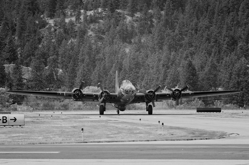
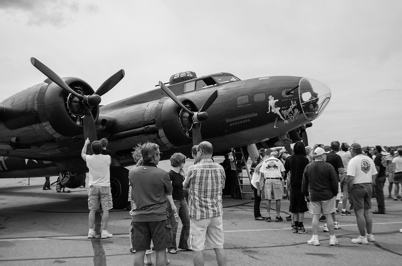
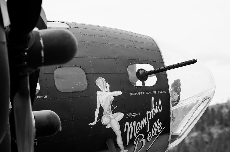
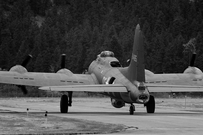
They all look kind of dark to me. I think the plane may be a little underexposed to try to keep the sky? But the sky is gone anyways, let it go.
The first shot does nothing for me. It's just a bunch of people standing around. Perhaps if you were on the other side and we could see faces, we'd get more connection with the crowd? As it is, it looks like a picture of an airplane, but there's a bunch of people in the way. I think you wanted the picture to be about the people?
The second one's pretty nice. It's a good detail. I think stepping back a hair, to make it obvious that you wanted the prop in-frame, rather than letting it look like an accident might have improved this one a bit.
The third one is also pretty good. I think a bit of work in post to separate the plane from the background would improve this. Getting the propellor blades separated is going to be tough, but I'd muck around with curves and some burning/dodging to see what could happen. Also, the framing looks a bit accidental again. You've lost hunks of the wings on both sides, and it's not clear that you *meant* to.
In general, all three feel a bit casual, as if you were paying some attention to framing and timing, but not enough. I don't know how attentive you actually were, of course, it's just the way the pictures feel to me.


 . I think I've seen pictures of A10 with the hogs teeth right where Avengers muzzle is.






![[No title]](/data/xfmg/thumbnail/32/32984-d9969dc997f82365b4d1f097cb5838c3.jpg?1734162939)

![[No title]](/data/xfmg/thumbnail/37/37518-fb05b52482bd05e84fb73316ba1a9c8f.jpg?1734170679)
![[No title]](/data/xfmg/thumbnail/31/31750-f3936d67895e1ef2756eb06d7b15fe9c.jpg?1734160469)