B&W Color

John E.

TPF Noob!
Joined
Jul 19, 2004
Messages
2,221
Reaction score
13
Location
Living in Kootney time
Generally not a big fan of this type of process but I thought this looked different


Driftlakebcopy.jpg
 
i agree with Chris. i like this one a lot Cruzin; great sky!

btw, is the color version that much off the b&w tone?
 
Great effect,
Gives a sensation that something is out of place, but in the good way.
It is somehow misterious
 
JonMikal said:
i agree with Chris. i like this one a lot Cruzin; great sky!

btw, is the color version that much off the b&w tone?


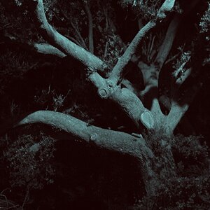
True in the color verson there was not a big difference, but enough to make the logs look on the dull side and a little dark. With the channel mixer I was able to get the tone and brightness the way I wanted and have the logs pop out. I preferred the sky in color, I did not want to loose that little bit of orange.

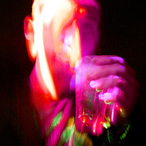
I am still stumbling in PS but I took an overexposed image and an underexposed image and blended both together . I still need more practice on this process as I feel I could have done a better job.

Seriqoizal I thought in the same lines as yourself.

Thanks for the comments all.
 
lol that looks great

never thought back and white and colour could fit in so well
 
Great shot, I love the effect with this picture especially. A job well done :)
 
The tones work well with this picture, very nicely done!
 
Whoa!!! I really like this. Great effect. :thumbup: :thumbup: :thumbup:
 

Most reactions

Back
Top