Rick58
Been spending a lot of time on here!
- Joined
- Jun 23, 2012
- Messages
- 4,227
- Reaction score
- 1,473
- Location
- Reading, Pa
- Can others edit my Photos
- Photos OK to edit
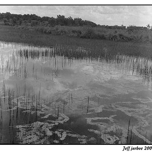
its official. whatever I like, everyone else doesn't. and vice versa. the reason I like 1 is because it is busy. I have more to look at in the frame. The reason I don't lik 2, is I really don't have anything to look at. couple stacks coming up, some wires. I don't find these particularly interesting I just don't see much there. The bw tones in 2 and the contrast, are also kind of flat or dull, boring to me. The various tones in 1 stand out, make it more appealing.
1 is interesting, if nothing else my eyes follow around the frame looking at things. 2, I my eyes made it about two seconds and I think I saw all I could there.
Yep, could not have said it better myself. I'm not even sure about the DC. The distortion adds to the chaos


![[No title]](/data/xfmg/thumbnail/38/38262-10a9668da9a2b36a92cddde57caf87bc.jpg?1619738547)

![[No title]](/data/xfmg/thumbnail/41/41493-60071420f928565170996b4edc3de2f0.jpg?1619739820)