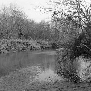
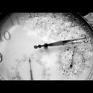
You are right about the distortion. I only have PSE, so no lens specific correction. I did correct it, but with the generic filter, it doesn't get all the distortion. You have a sharp eye! :blushing: Thanks, Lee
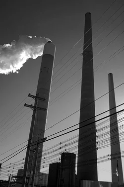
I like #2 better. I know it is tilted, but in this case I think the tilt is fine.
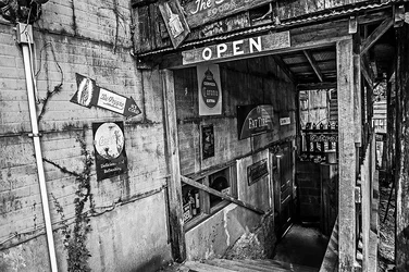
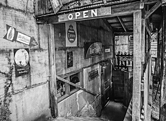
#1 might look better just straightened. I think I'd crop the cable connection. There is so much going on here that it's hard to say any particular thing is the subject. Quite busy.
I like #2 better. I know it is tilted, but in this case I think the tilt is fine.
#1 might look better just straightened. I think I'd crop the cable connection. There is so much going on here that it's hard to say any particular thing is the subject. Quite busy.
Yes, it looks better without the cable connection. Thank you for suggestion and improved version. And yes, the tilt in the 2nd one was intentional. Lee
Dutch angles and things that are supposed to be straight but rant...me no like them. I lilt eh idea behind the first shot, but doesn't do it for me as is. I am a sucker for a monochrome though..
its official. whatever I like, everyone else doesn't. and vice versa. the reason I like 1 is because it is busy. I have more to look at in the frame. The reason I don't lik 2, is I really don't have anything to look at. couple stacks coming up, some wires. I don't find these particularly interesting I just don't see much there. The bw tones in 2 and the contrast, are also kind of flat or dull, boring to me. The various tones in 1 stand out, make it more appealing.
1 is interesting, if nothing else my eyes follow around the frame looking at things. 2, I my eyes made it about two seconds and I think I saw all I could there.





 Lee
Lee







![[No title]](/data/xfmg/thumbnail/39/39419-5d4fd8535ab4f6e01caa38b72bf396e0.jpg?1734173503)
![[No title]](/data/xfmg/thumbnail/31/31757-4f5257d19be4e34c6bdcbd2519380d53.jpg?1734160480)