I love the contrasts in these shots, black and white REALLY works well here.
A few problems with the composition though.
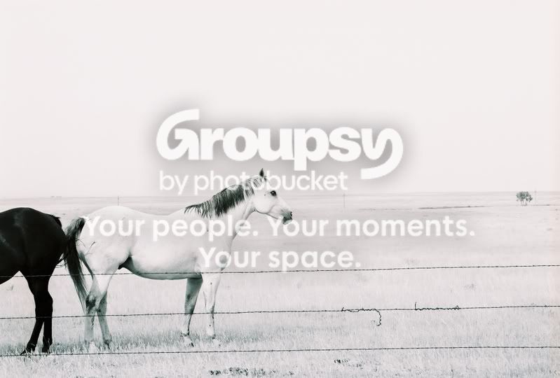
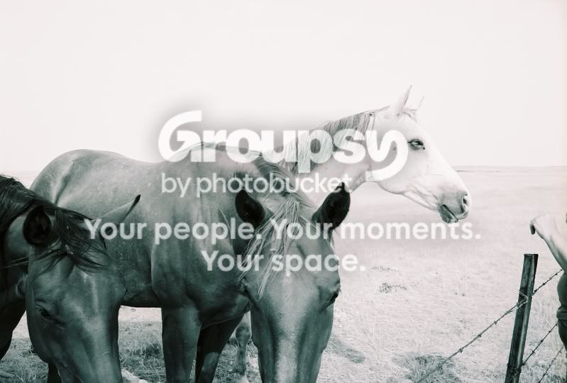
You commented on the first shot already, and indeed I'd much prefer the white horse alone. In this case though a crop-out wouldn't work so well, that would leave the subject pushed right against the frame which rarely works well. It does have an oddly nice effect, almost as though the horse is mirrored in inverse colours, but I can't help but feel this was too accidental.
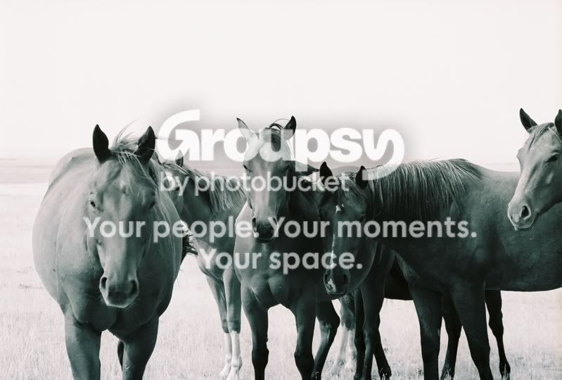
In the second shot the head on the right either needs to be further in-frame, or left out entirely. Personally, I'd crop it out.
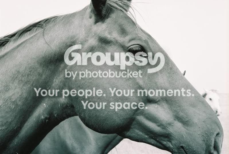
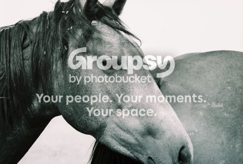
Your 3rd and 4th shots look fine as they are, but I'd like to see future head shots leave the complete head in frame, unless you have a really close shot of the eye, for example. Here you've chopped the ears and lower mouth out. If the chop wasn't even at both sides, it would look somewhat careless.
Unfortunately your last shot however, takes on the careless look with similar chops. Both horses in the lower of the image are missing noses, and on the right you somebody hand =).
Composition comes with experience. Just keep practicing and I'm sure your next set will look fantastic. Whatever settings you used to get those contrasts, please keep!