I like the adjusted one that makes them both the same size. Also, the vignetting causes the eye to focus on the priest mainly. Maybe a combination of both.
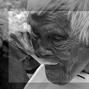
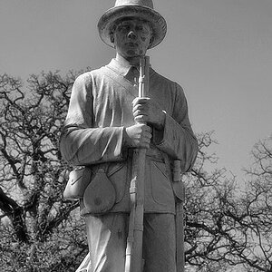
I like the adjusted one that makes them both the same size. Also, the vignetting causes the eye to focus on the priest mainly. Maybe a combination of both.
Thanks for your time commenting this.
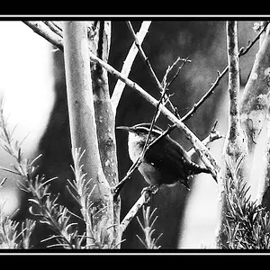
There is vignetting on bw edit, although not as strong as on PhotoHobbyist. In my opinion if tou see vignetting its too much, I prefere it less obvious.
Thanks for your time commenting this.
There is vignetting on bw edit, although not as strong as on PhotoHobbyist. In my opinion if tou see vignetting its too much, I prefere it less obvious.