What's new

Baby and new signature

Robin Usagani

Been spending a lot of time on here!
Joined
Jun 6, 2010
Messages
10,347
Reaction score
2,174
Location
Denver, CO
Can others edit my Photos
Photos OK to edit
Anyway, what do you think of my new signature? I know aperture logo has been used so many times. I made it so that it is showing my last name initial.

1
_MG_3101.jpg


2
_MG_2954.jpg


3
_MG_2757.jpg


4
_MG_3039.jpg


5
_MG_3020.jpg


6
_MG_3013.jpg


7
_MG_2996.jpg


8
_MG_2962.jpg


9
_MG_2877.jpg


10
_MG_2846-Edit.jpg


11
_MG_2816.jpg
 
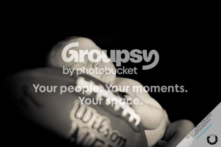
Looks well done, but I have to ask... Why is the baby with props such as the football, guitar, etc.? It's pretty untraditional (not always bad, I might add), but still throws me off a bit. It's just not very fitting in this scenario.
 
These are great. What type of lighting did you use? I'm starting to learn about "studio" lighting.
 
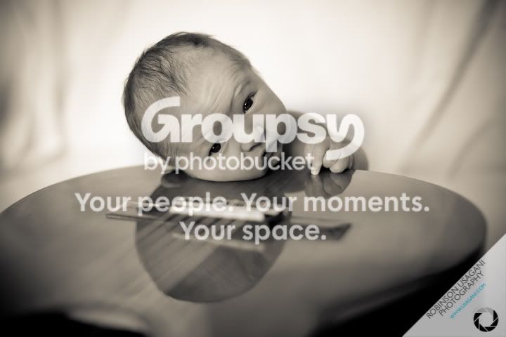
The baby looks dreadfully uncomfortable propped up on that guitar. The joy of infant photography is that warm snuggly feeling you get when you look at the photos. Definitely don't get that from the guitar set.

I Love the others! :thumbup:
 
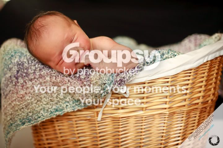
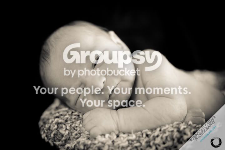
1 is very cute, but the right of the frame feels empty.

2. I agree. Cute idea, but maybe there should have been a blanket or something...

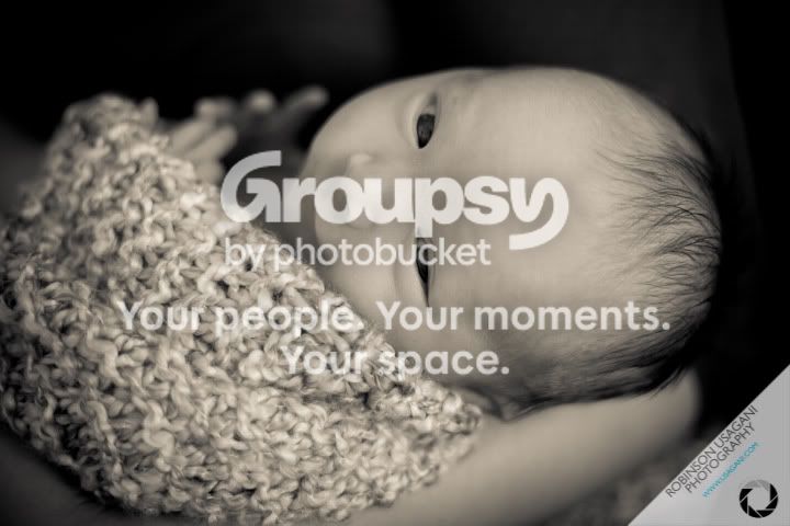
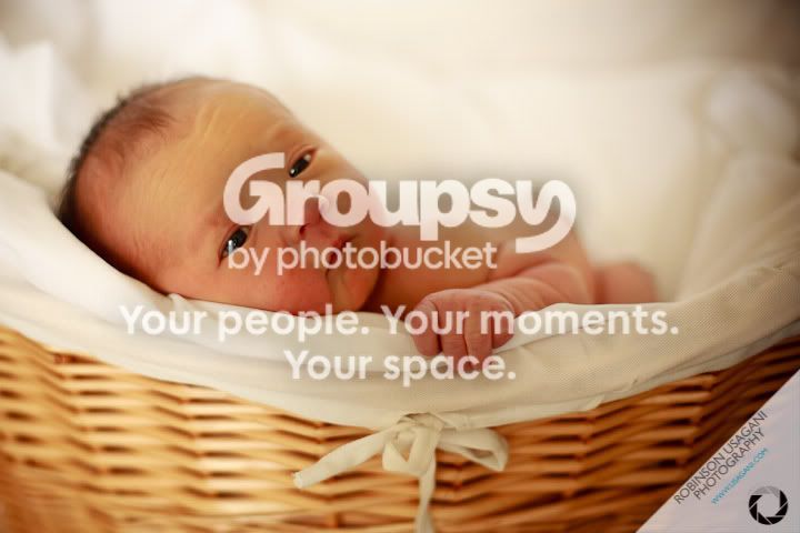
3. I love the eye contact, but it looks like focus might have fallen on the blanket and baby looks overprocessed. His skin looks like it's still in the womb or something... like a 3d ultrasound or something.

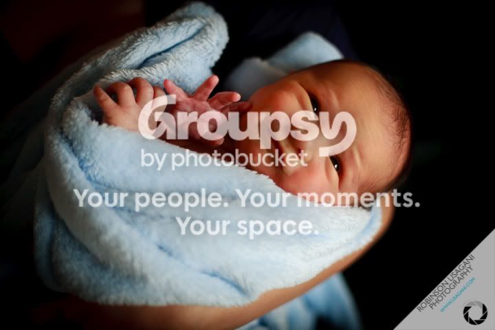
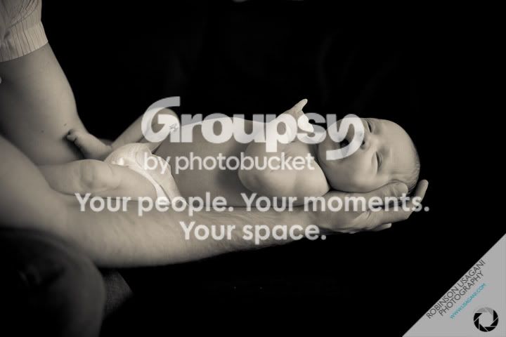
4. I might try to burn out top left of frame, the persons neck or something? And I might try to reduce the red on the baby. Good shot.

5. precious! I'd try to clone out that little piece in top left corner. What's on the baby's nose?

6. Again it looks like focus fell on the blanket, but it doesn't bother me too much. I think this shot is precious.

7. <3

8. better than the last, but again looks uncomfy. I might think a blanket or something down there for him.

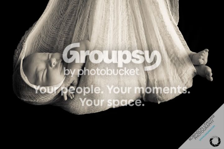
9. This pic looks unfinished?

10. Cute, but baby looks uncomfortable. I don't know if it's his arm or if it's his head position, though. Something on his arm?

11. Very cute, but I think skin may be softened a tad too much.

 
Last edited:
His hand on #2 is distracting along with the matching facial expression.
 
Uncomfortable? You havent seen nothing yet. We put the baby laying down on the side of the guitar LOL. But he wasnt happy hahah.

The dad loves football and guitar. He wants his son to have an early start thats all :).
 
Uncomfortable? You havent seen nothing yet. We put the baby laying down on the side of the guitar LOL. But he wasnt happy hahah.

The dad loves football and guitar. He wants his son to have an early start thats all :).

Ugh...That makes me cringe! Sorry...being a mother of two...I just remember how I never wanted my babies to cry when they were newborns!

Maybe try finding a blanket with football or guitar print and use a football/guitar as a prop in the background rather than actually laying the baby on it.
 
Looks well done, but I have to ask... Why is the baby with props such as the football, guitar, etc.? It's pretty untraditional (not always bad, I might add), but still throws me off a bit. It's just not very fitting in this scenario.
Look at my early response. Thank you


These are great. What type of lighting did you use? I'm starting to learn about "studio" lighting.
All natural lighting


The baby looks dreadfully uncomfortable propped up on that guitar. The joy of infant photography is that warm snuggly feeling you get when you look at the photos. Definitely don't get that from the guitar set.

I Love the others! :thumbup:
Thank you. Look at my earlier post. I just did whatever they wanted to do LOL.


1 is very cute, but the right of the frame feels empty.
Negative space isnt always bad. I kinda like it on this pic.

2. I agree. Cute idea, but maybe there should have been a blanket or something...

3. I love the eye contact, but it looks like focus might have fallen on the blanket and baby looks overprocessed. His skin looks like it's still in the womb or something... like a 3d ultrasound or something.
Used very shallod DOF. But it looks like his left eye and blanket are both sharp.

4. I might try to burn out top left of frame, the persons neck or something? And I might try to reduce the red on the baby. Good shot.
Good idea

5. precious! I'd try to clone out that little piece in top left corner. What's on the baby's nose?
Good idea... I think you are looking at an older version on your cookie. I made a mistake on LR3 and cloned out a few pictures at once.

6. Again it looks like focus fell on the blanket, but it doesn't bother me too much. I think this shot is precious.

7. <3

8. better than the last, but again looks uncomfy. I might think a blanket or something down there for him.

9. This pic looks unfinished?

10. Cute, but baby looks uncomfortable. I don't know if it's his arm or if it's his head position, though. Something on his arm?

11. Very cute, but I think skin may be softened a tad too much.

His hand on #2 is distracting along with the matching facial expression.
hah.. finally someone caught it..


got to go to a meeting!
 
Uncomfortable? You havent seen nothing yet. We put the baby laying down on the side of the guitar LOL. But he wasnt happy hahah.

The dad loves football and guitar. He wants his son to have an early start thats all :).

Ugh...That makes me cringe! Sorry...being a mother of two...I just remember how I never wanted my babies to cry when they were newborns!

Maybe try finding a blanket with football or guitar print and use a football/guitar as a prop in the background rather than actually laying the baby on it.
+1

There's even ways to make them comfortable ON the guitar. Lots of heater (to the point you are sweating your balls off) the safety of having someone spot on right there. And making sure the baby is happily fed. I guess it depends on the age of the baby, too.
 
Misstwinkle,

Sorry, had to go to a meeting before. Anyway, I didnt soften anything. That is the result you get from using shallow D.O.F.
 
I'm curious, lol Been trying to figure out what happened to the nose in 5?
 
All I can think of with your signature is ADORAMA.


My thought as well. I think your name is too close to the edge of that annoying corner white-out thing, too close to the image area. And the web address is hard to read at web size. And that iris diaphragm...I think people "get" that the logo is for the photo company that took the photo that they are looking at the watermark on...the inclusion of a photo-related symbol on a photographer's watermark with his name, and his web address might be a bit too much.
 

Create an account or login to comment

You must be a member in order to leave a comment

Create account

Create an account on our community. It's easy!

Log in

Already have an account? Log in here.

New Topics

Back
Top Bottom