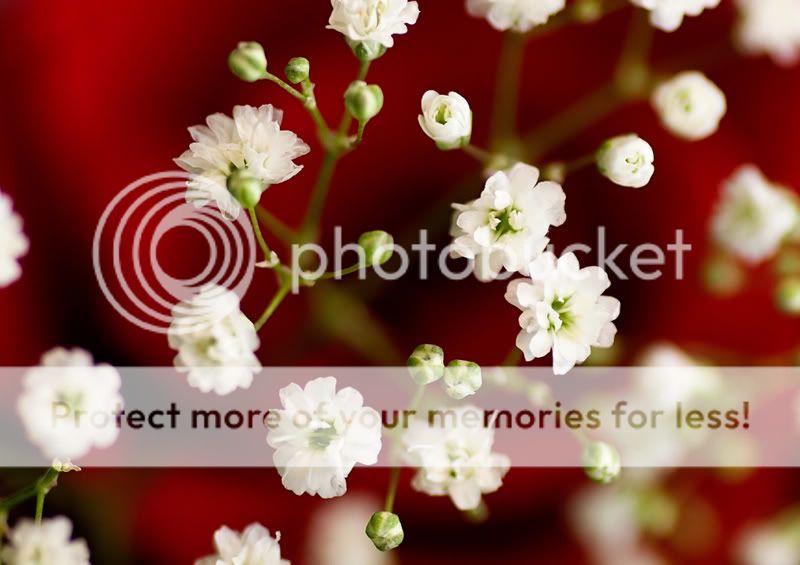
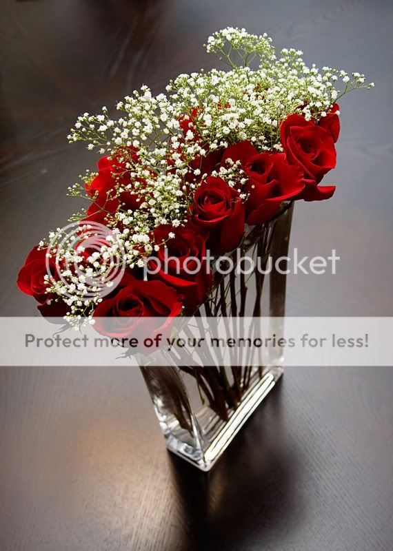
On the first photo, the "as in a painting" style of composition is a nice device, but the large area of uninterrupted red in the upper left hand corner is somewhat distracting to they eye; a slight shift of the camera to the left, to cut down on the uninterrupted red would have helped. All the corners have at least some white in them,except for the ULC; I have a flower-shooting web buddy who goes absolutely nuts over this exact type of foreground/background control and positioning. It might seem overly harsh to fault this photo on the background, but I think you could clone in even a small amount of white baby's breath in the ULC and the composition would magically strengthen,
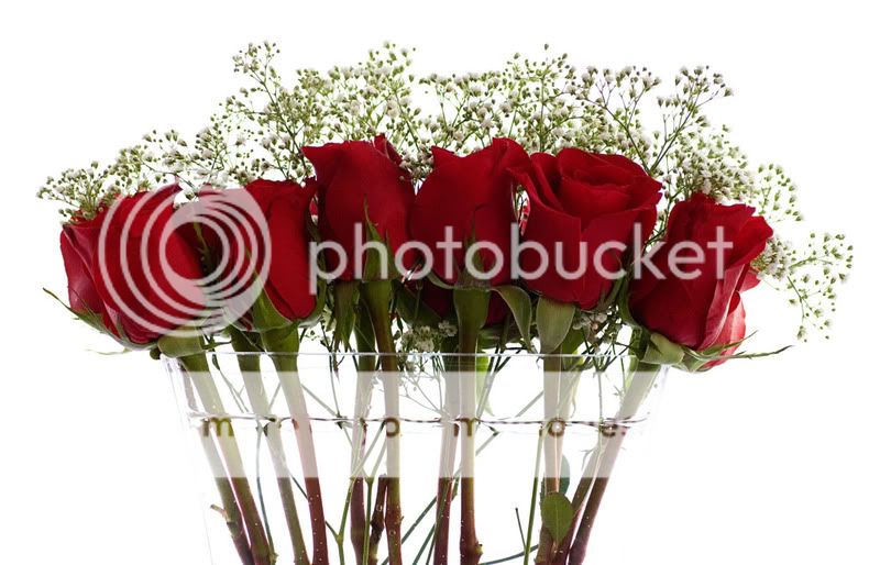
Shot two is nice enough, but the vase containing the flower and waters is blown out on the sides due to too much blowback or "wrap" coming from the background. Placing two black cards close to the vase edges would have helped, as would have lowering the background light's output as little as .4 stop. The lighting ratio between background and foreground is a slight bit too high. I think the roses in front look a bit too dark, and in need of a slight bit of fill light. With those subtle changes, this shot would be a greeting card type of illustration.
Shot three has a bit of distortion that makes the vase and flowers feel a slight bit off-balance to me, and the background on the table top in the ULC area is slightly distracting to me. It looks like a laminated wood table top like one we have in the dining table,and I think I know why it has the radial lines, but it's still just a bit distracting. This is a tranquil photo, but I find the distortion caused by the downward-pointed camera a bit hard to overcome. This is an example of where a movable camera, like a view camera, is typically used to correct the keystoning. Moving farther back, and using a longer focal length lens would help alleviate some, but not all, of the distortion; shot as it was, from close with a short focal length lens, causes the shape distortion to be a bit more pronounced than if you'd shot from a ladder and farther away. A polarizer would have cut some of the reflection on the table top in the background, but that would also have altered the photo; the background here is the large, diffused highlight on the table caused by the backlight from what I am guessing are dining room windows. The way the ULC drops off to darker wood breaks the unified background theme you have going on over 75% of the background.
I hate to sound so harsh on these types of photos; these are better than average, but if I were a stock photo buyer, I would pass on these since these types of photos demand almost virtual perfection, and still life photos of this type are basically an opportunity for a photographer to demonstarate his or her technical mastery, as well as compositional abilities. I'm old-school, and I know how the vase shot should/would look if shot with a view camera using some front and rear standard swing to correct the keystoning.
My POV when giving C&C on these types of photos is based on how good the pictures *could be* if every facet of the shot were controlled perfectly,and with the idea that these types of shots are each 2-hour shots, exposing two or three Polaroids, and three sheets of 4x5 film.
Thanks everyone! The first was a clear favourite for me, as well.
And wow! Thank you, Derrel. I really appreciate the well thought out and informative critique. I'll have to try to remember all that when I am shooting next. Flowers are among my favourite subjects. With regard to the first one, my intention with leaving that upper corner free of white blooms was that I felt it added structure to an otherwise pretty free flowing photograph. Hmmm, not sure that makes sense. What I mean to say is that in my vision, all those blossoms sort of loosely create a flowing line from the bottom left up to the upper right. I liked the path, and the way that leads the eye despite there being no blatantly obvious structure to the composition. I felt that the blank upper left corner strengthened it. Of course, I may have been wrong! I know there are a few shots very similar to this where the blooms fill the entire frame so I'll go back and have a look. Thanks again!

")
![[No title]](/data/xfmg/thumbnail/40/40309-c759bfd4ae7c079632e7402d21d332f1.jpg?1619739414)