Bangles and Beads At Night

Tuna

Fotoğrafçı
Supporting Member
Joined
Apr 1, 2004
Messages
1,092
Reaction score
1,167
Location
Virginia
Can others edit my Photos
Photos NOT OK to edit
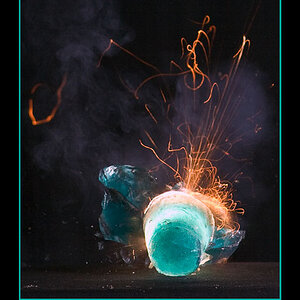
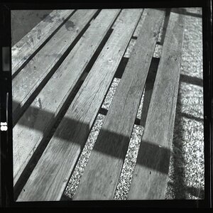
Not sure if this one is trying too hard - a little uncomfortable composition but it seems to have a certain balance for me. Also, the reflections in the glass on the right side should somewhat show up - different monitor calibrations and all... maybe burning down of those reflections - or leaving them as is? As always, any other aesthetic or technical comments are appreciated.

Leica IIIc, 50mm Elmar, HP5.

Tuna

BanglesAtNight215.jpg
 
I like the photo and actually enjoy the lack of anything really interesting on the right. That's usually a waste of space and a distraction but I like it sometimes. Then little reflection just adds to the mystery. The only thing I don't like is the angle you took the photo at... The lines of the building are confusing me - but that's easy to do.
 
I've no problem with the glass on the right; the wobby reflections add interest.

I love this shot. It's all angles and mood and lighting.

Here is what I'm really hoping for: that you could crop off a small slice along the top, just enough to bring the left glass window into a perfect square shape. Then, I am hoping that on your negative, the rest of the door on the bottom right is there, the threshold that's missing, and it could be printed.

That's what this image is to me, simple geometrical shapes. I want to see the full square of the left window, the full rectangles of the doors, and the round balls - the crazy character in the shop window just tops it off.

With those subtle changes, I believe this composition will suddenly look much more comfortable to you. Bring the geometry into full view.

Just an idea. ;)
 
This doesn't really work for me. I'm not a stickler for the 'photographerrules' especially as I know none of them. The image doesn't sit right with me. The main focus is too detailed to be that small in the picture in my opinion.
 
tmpadmin, terri and Daniel - thank you for your critique/comments.

The angles that have been mentioned were what made me struggle with the composition/framing here. Finally decided on what we see here in-camera, so no more at the bottom...but am considering a slight crop off the top to eliminate the second floor peeking out at the upper left.

Thanks again.

Tuna
 
it seems a bit crooked to me... maybe if you indeed crop the top part it won't be so obvious. because it does look like if you staighten one side the other follows its turn at being crooked. anyways, nice one :)
 
The "dead" space definitely catches my eye, but I keep getting yanked back over to whatever the hell that disturbing thing in the showcase is. If I had my way, I think I would have tried to set it up differently, but honestly, I'm not sure you could have anyway, and the "thing" is very cool, whatever it is...

...I may have nightmares. :)
 

Most reactions

New Topics

Back
Top