You are using an out of date browser. It may not display this or other websites correctly.
You should upgrade or use an
alternative browser.
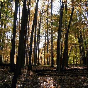
nice, i think you nailed it.. any less saturation and it would look dull and lifeless, but the pastel tones you have are spot on. great job
Mike Leggero
http://www.michaelleggero.com
It is very pretty and has a soft touch to it turned out nice

Create an account or login to comment
You must be a member in order to leave a comment
Create account
Create an account on our community. It's easy!
Log in
Already have an account? Log in here.







![[No title]](/data/xfmg/thumbnail/38/38745-268bf5126e563d77957d73c4fb17dc83.jpg?1734172603)


![[No title]](/data/xfmg/thumbnail/30/30879-16ad830465e571dee0a784c7fa122909.jpg?1734158876)
![[No title]](/data/xfmg/thumbnail/40/40286-86401b94de8b01bea8bb4ea154aaea0a.jpg?1734174701)
![[No title]](/data/xfmg/thumbnail/38/38262-10a9668da9a2b36a92cddde57caf87bc.jpg?1734172150)