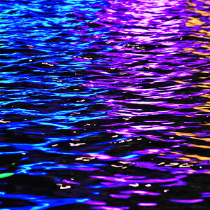
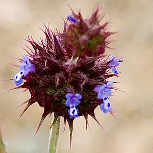
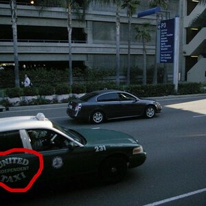
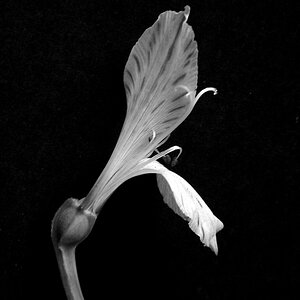
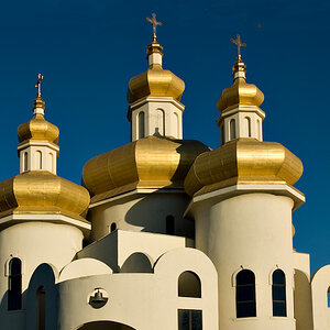
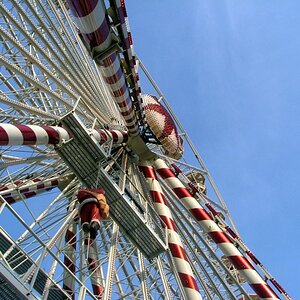
The colors are great, and the DOF is really good. However, it's a little too centered for my taste, and looks as if it's competing with what's on the right side of the frame. Maybe if you cropped out some of that side, and possibly some of the bottom to put the subject on a third, it might stand out a little more.
JDS and I agree on the compositional issue of this photo, and I should think that if you worked just a little on the curves (or levels) to make this a tad darker, the colours would show more, too.



![[No title]](/data/xfmg/thumbnail/36/36664-a1f71b488f6761523649a87f8465fc3d.jpg?1734169172)

![[No title]](/data/xfmg/thumbnail/36/36667-b3265abf8272f21d759a0abd6a0995c3.jpg?1734169172)