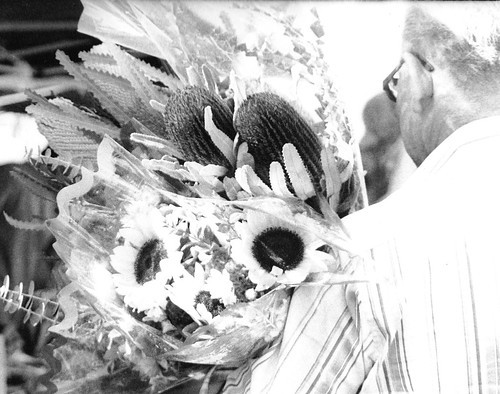
#1 I would consider getting closer. Just show us what is most important about the subject. In many cases presenting just a portion of the subject is stronger than showing the whole, and our minds will fill in the rest.
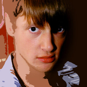
#2 There's a lot going on here so it's a little difficult to tell what the main subject is supposed to be. I would suggest thinking about the message you want to send - what you want people to think when they look at this - and then pick through the whole thing and find all the aspects that help create the feeling or message. Then, consider how you can frame this so that all the things that are there now that don't do that are removed. You'll almost always have some things that cannot be removed, but this exercise can help you get a feel for what you want to show from the larger scene.
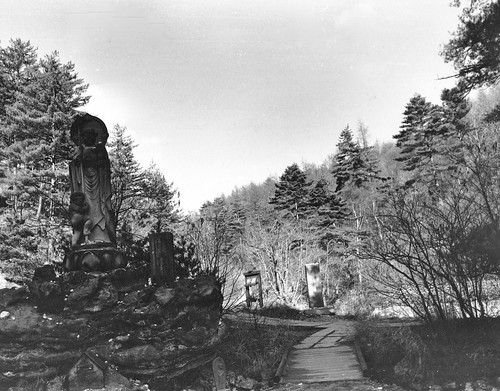
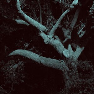
#3 The structure cutting diagonally across the frame divides it into two parts, the bottom right having a lot more impact and weight than the upper left. See comments on #2 on this one as well...
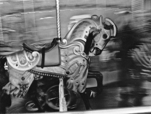
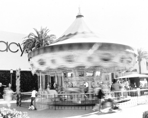
#4 Nice motion blur. This is one of the instances where a centered composition would be stronger I think. Allowing all else to blur puts all emphasis on the horse, so placing it in the center, which adds even more emphasis, would work well.
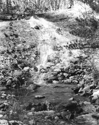
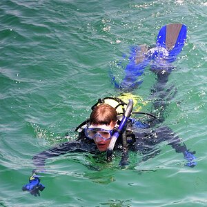
#5 Here's your blown highlight image. I would try to position this so the the ground was level, and then read up a bit on contrast control in the negative. Here's an introduction that might help you get started. The choice to blur the main subject and keep the background in focus works well in this one. It gives us a sense of both motion and place, which augments the feeling of the subject, which is a motion experience which is always found in the setting you presented it in here.
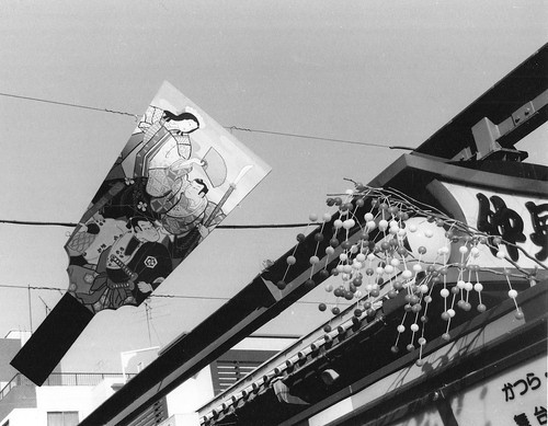
#6 Good balance - the sign bounds the right side and there is a diagonal leading line creating a sense of depth. Better contrast control here than in the others as well, you present enough of the subject to get a good feel of it without going too far, and you kept our eyes from getting lost in a busy background. Nice one.
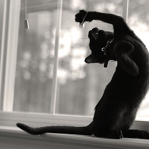
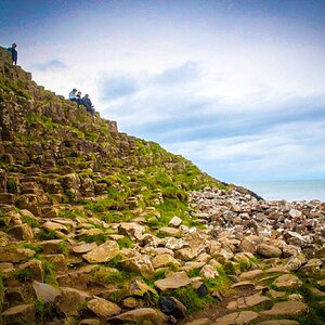
#7 Hmm. more blown out highlights here. I like the composition and the overall feel this presents, but the highlights detract from it quite a bit.
Ummm, aahhh, errr, well, its a start. There's a lot going on in all of them. Prhaps if you could find a subject and focus in on it but keep the busyness (?) around it, separated or isolated somehow. Keep at it, don't give up. There's a lot of potential and maturing to go through. Thanks for posting.