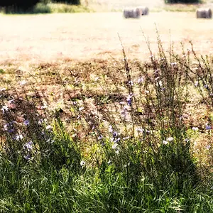
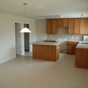
Wow, er111a actually posted some pictures that aren't half bad. I like some of these. Did he finally take our advice?
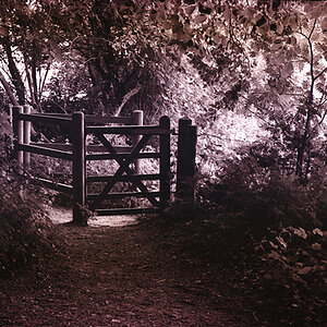
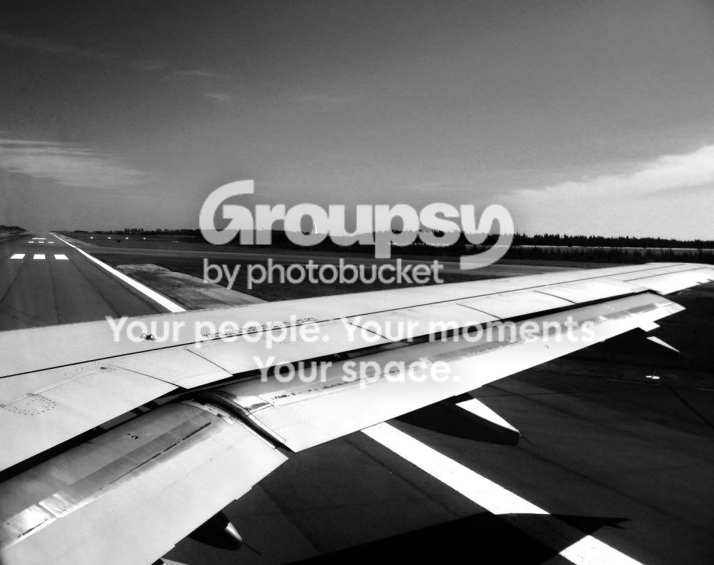
1 - Not sure what I'm looking at...
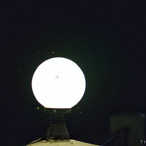
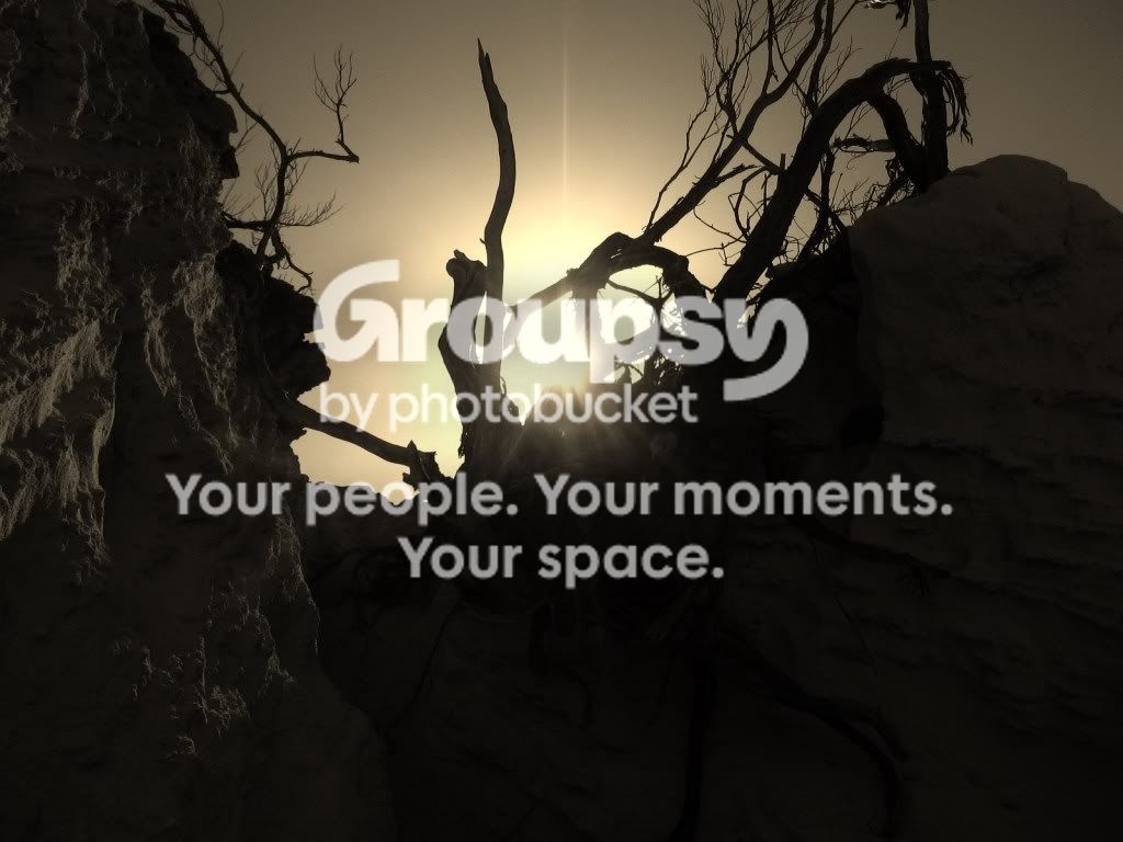
2 - Way blown highlights, a bit more saturation than I like. I actually kinda like the composition.
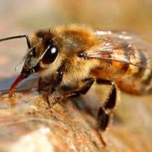
3 - Doesn't do much for me. Horizon isn't level, and it's pretty noisy. B&W was probably a better choice than color for this one.
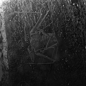
4 - Neat shot, not sure what to say about it, but its kinda neat.
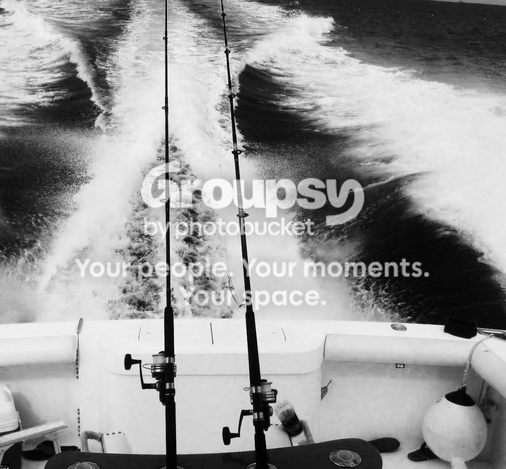
5 - Makes me wish I was out fishing... Water bottle is somewhat distracting to me. Would probably have been worse in color.
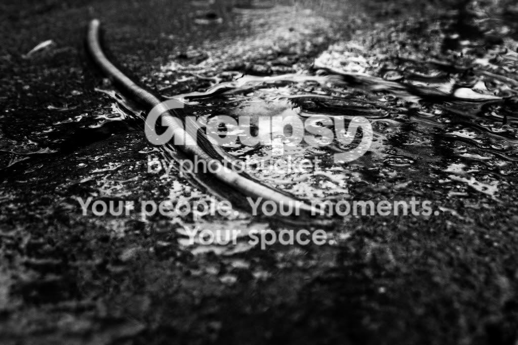
6 - My favorite of the lot. Really cool shot. Nice use of DoF and contrast (finally!).


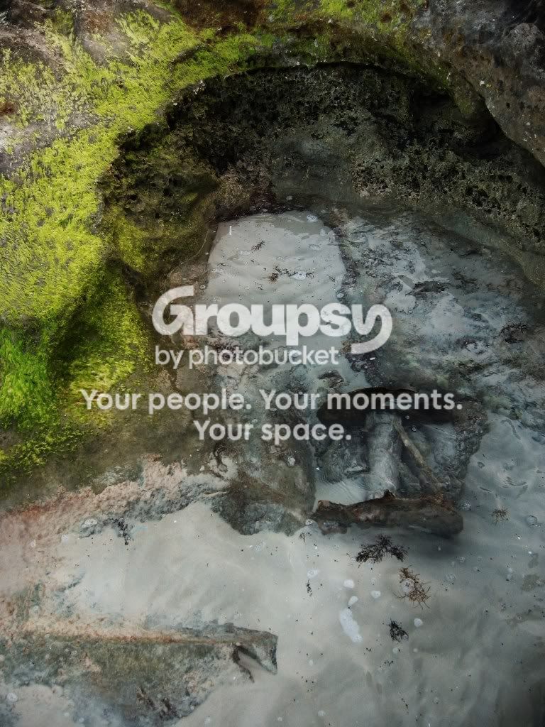
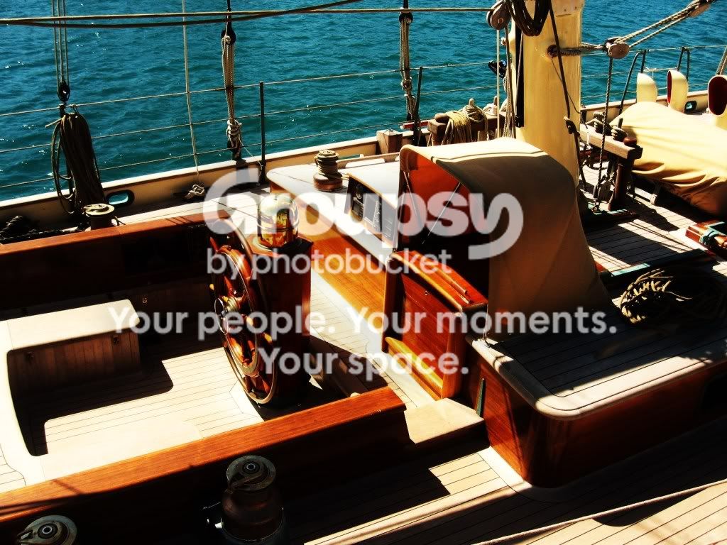


 [forgive me if i am wrong ]


![[No title]](/data/xfmg/thumbnail/42/42271-5db67ba3109fc5edfe486ca6046bcc96.jpg?1734176671)