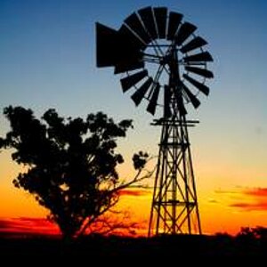
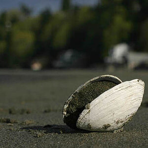
Nice, Carlo! But I don't think it is up to your usual standards.....just doesn't "pop" for me! Subject seems overly contrasty... and the tree on the left is a major distraction..
Watch your sharpening. On my monitor the white outlines are pretty glaring. Agree with contrast and need to remove the tree. I think all of this can be improved significantly in PP.