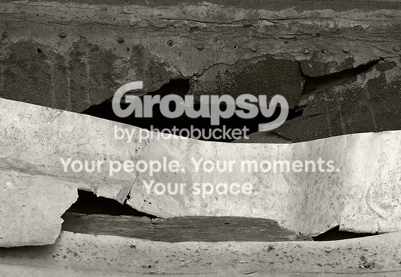
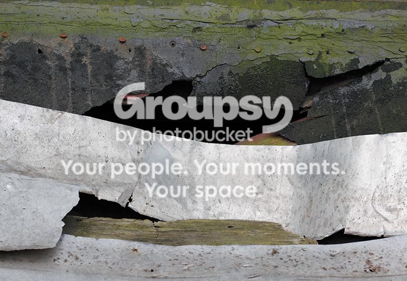
Thanks for the comments and "votes." I'm completely on the fence about this myself, which is why I tossed it out for opinions. It's a close-up of one of those inclined basement entrance doors, obviously a pretty distressed one. I agree about the tones in the upper part of the b&w. I guess I could try lightening the green areas in the conversion instead of darkening them. Having a darker strip in the middle of that area seemed like a good idea, but it's not really dark enough. Well, gotta go, lots of work to do ...




![[No title]](/data/xfmg/thumbnail/32/32981-27e3d29bfa5b1638f18299ec111c7b87.jpg?1734162931)


![[No title]](/data/xfmg/thumbnail/39/39544-f587cf14279888b81e3b51750534ae22.jpg?1734173699)
![[No title]](/data/xfmg/thumbnail/34/34690-8d6bc2af7ea1365e5e05cda2bbe8d08b.jpg?1734165696)
![[No title]](/data/xfmg/thumbnail/39/39543-dfebd471118eabdc8c41e2088dca98f3.jpg?1734173696)
![[No title]](/data/xfmg/thumbnail/37/37603-739c5d9b541a083a12f2f30e45ca2b7b.jpg?1734170731)