What's new

Black & white

Ream

TPF Noob!
Joined
Jul 31, 2013
Messages
74
Reaction score
31
Location
Indiana
$100_2177new.webp$100_2181new.webp
 
Last edited:
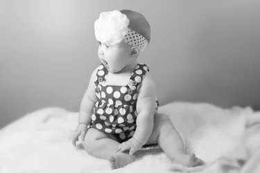
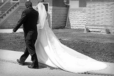
First one framed a little too tightly, second one should lose a little of the dead space on the right side. Cute poses, cute kid. Why do you hate black so much?

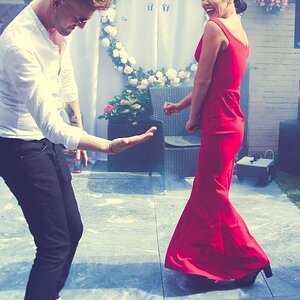
Third one is excessively twee. I don't understand why you did that to the background, the cutting-out job on the couple is fairly bad, and the sharp picture on the blurry one is just silly. It's a strong, graphical picture. Why not let it be itself, instead of photoshopping it into some bizarro piece of graphic art-ish?
 
Glad you pointed out the "cutting out" of #3. Thanks
 
I was going for twee on #3, but is it really in excess?
 
"excess" on that kind of thing is always in the eye of the beholder! I personally think it's a bit much, but I can certainly see that someone else might have a differing opinion.

I would suggest making the patterned cloning of the background a little MORE obvious, if you're going that direction. Right now it reads as 'that lawn is very oddly regular.. wait a second!" as opposed to "here is the couple walking across a charming digital fantasy". You could just go with straight up black and white tiles, for instance. Or have someone render you a simple but obviously digital scene, or place them walking into a macro photograph of a rose, or whatever.
 
#3 is just flat out ridiculous. Why did you clone 95% of the image, why is is bizarrely nested in itself? What the hell is going on?

The other two seem overexposed quite a bit, maybe 1-1.5 stops, but otherwise pretty good. I disagree that #1 is framed too tightly. #2 since she is looking to the left, I would put more empty space to the left than on the right. People looking somewhere draws the eye there, and it's usually nice if that region is still in your photo.
 
The first two are nice and clear and seem underexposed a bit. There's not enough of a dynamic range for me they seem flat. The third one I'm sorry I flat out don't like it at all. Way way too busy.


Sent from my iPhone using Tapatalk - now Free
 
$100_19261new.webp O.K. I agree/ The cloning was way too much, but I felt like the picture was bad to begin with and I got carried away trying to "save" it..
 
I still do not like it, but I love the idea and angle.
 
I don't think the original was 'bad' - just flawed. I think the position of the couple and the emphasis on that long train was a good idea, but yes - the background kind of kills it. Everything else seems to be there - the exposure looks fine, the tones are good (the train of the dress being a tad too bright maybe), the position of the couple relative to each other and the camera. With shots like these that are unplanned, though, you have to remember to take the background into consideration as well and realize that everything else might be how you want it, but the shot still isn't there. This will get easier with more practice. It's hard to think about so many elements at the same time while trying to be fast enough to get the shot, but after a while, some of these elements will become much more automatic and natural.

 
I feel that the lighting on #1 was too harsh and not centered with the subject. Is it noticeable, or is that being overly critical?
 
K. I feel that my photos are right on the line of acceptable and good. I will work on exposure and see what I can come up with next time around. :)
 
LOL! Bizarrely nested in itself.. I like that.. I didn't see it till I got feedback, but now I get it. :)
 

Create an account or login to comment

You must be a member in order to leave a comment

Create account

Create an account on our community. It's easy!

Log in

Already have an account? Log in here.

New Topics

Back
Top Bottom