Block Building Under Demolition

FanBoy

No longer a newbie, moving up!
Joined
Jul 29, 2012
Messages
1,134
Reaction score
152
Location
Pennsylvania
Can others edit my Photos
Photos OK to edit
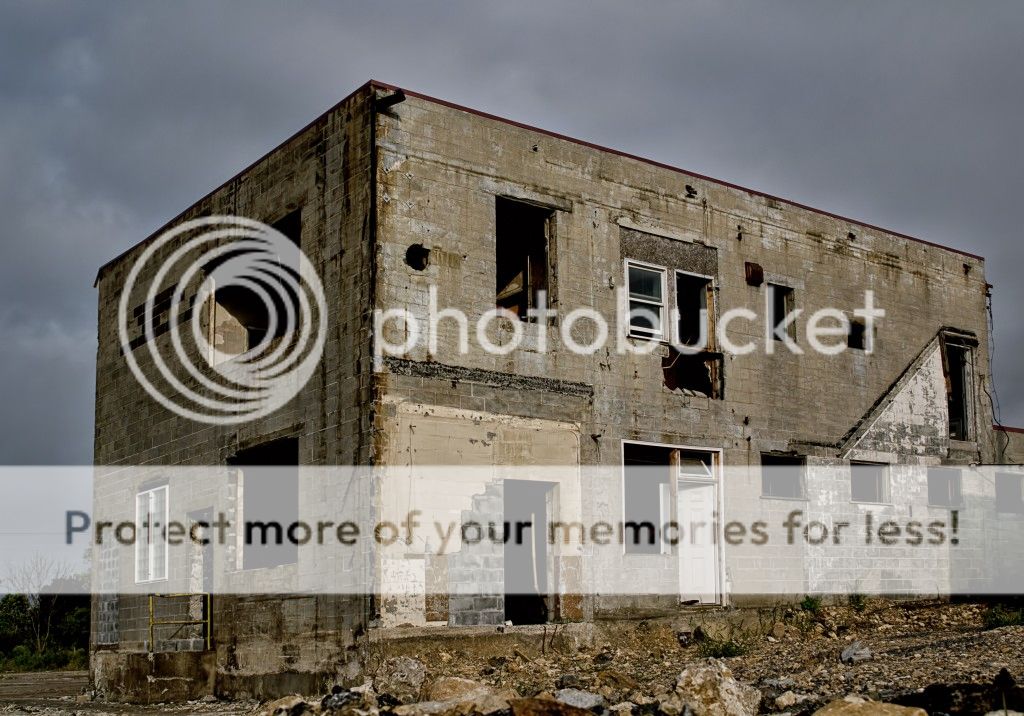
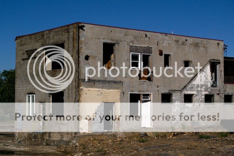
I took this photo of a nearby cinder block building the other week. The building is part of a larger demolition of a foundry that had been underway but has since stopped. The complex was formerly Empire Steel Castings Inc. and it once manufactured the 426 steel bollards that circle the White House. I'm not sure if the bollards are still there.

Story here:

Reading Eagle - Google News Archive Search

So that's the backstory to my photo. I shot this near ground level and gave the image minimal vertical distortion correction. So what do you take from this image, other than it's a mess?

DSC_1101j_1sm_zps1e53e402.jpg
 
Last edited:
I don't know Fan, it's a local interest shot, but I really don't see much more. Maybe someone will see something I'm missing.
 
That's okay, Rick. Thanks.

I know it's not the Taj Mahal or anything, but I like how the light falls on the building creating contrast and the gritty feel to the picture.
 
That's okay, Rick. Thanks.

I know it's not the Taj Mahal or anything, but I like how the light falls on the building creating contrast and the gritty feel to the picture.
Personally, I'd rather look at this then the Taj Mahal. ;)
 
Im seeing a halo.
 
Im seeing a halo.

Evil things. :fangs:

Edit: Looked back at some Nik software settings and I had a contrast slider on a filter set to Strong instead of Balanced.
 
Last edited:
Good color...yet some perspective problem... The edge of the building is not running parallel to the edge of the frame on right. The building shows a tendency to fall away :D
 
Good color...yet some perspective problem... The edge of the building is not running parallel to the edge of the frame on right. The building shows a tendency to fall away :D

Thanks...it was a low angle shot. I gave the photo minimal vertical correction (-4 in lens correction in PS), but I aligned the center eye-level door vertically. I think it gives dimension to a rather dull but stark subject.
 
In no particular order:

- I would like to see it with a bit more perspective distortion correction. It does look too much as though the building is falling away from the viewer. If nothing else, I would recommend using the corner of the building as your vertical reference rather than the doorway. Some distortion is inherently understood by a viewer, but the edges of the building have a much greater influence on a viewer's feeling than a small doorway.

- I think the composition could be improved.
-- I'd like to see some more real estate at the bottom of the shot, so that you can see where the building meets the earth all the way around. As it is, the side of the building runs off the bottom of the frame leaving that portion of the building ungrounded.
-- Obviously I don't know what the building looks like to the right of the frame, but where you've cropped it (just after the building drops down to one story, right through a window opening) makes the crop on the right side look accidental rather than intentional. I'd suggest either going wider, if there is something interesting in the short portion of the building (or at least get all of that window opening in the frame so that you have solid wall getting cut by the frame), or going just tight enough to remove the lower portion and create the feeling that this is a longer two-story structure.

- You may like how the light falls on the building (I haven't seen it in other light to compare), but it doesn't do much for me. There is some difference in tone between the side and front, I'd try accentuating this by dodging/burning the faces as appropriate. But to be honest it feels too flat - partly because the walls are flat, without many features to give them depth, partly because of the boring, flat, cloud-filled sky. As far as lighting goes, the most interesting thing to me is the shadow falling on the lower right corner from what I am guessing is a building out of frame. That's the only thing that really grabs my curiosity.

Not saying this building isn't interesting as a subject, just that I think if you revisit it you can do better.
 
Convert it to monochrome.
 
B&W with the gray cinder blocks? Nah. Way too flat. I would like to see the right side of the building included, even as only a local inerest shot. Persective doesn't bother me on this shot as it might on others.
My eye keeps going over to the yellow railing and the newer window.. don't know why. Just sayin'
 
'eh I'd just mute it a little bit rather than going full monochrome...

hope you don't mind but I corrected the perspective distortion, and played with the curves and saturation a little (it also seemed slightly green tinted, so I bled in a tiny bit of magenta)

there is still a halo though...and I think composition wise, depending on what is around it, you may have wanted to step back a little bit and get some of the surrouding area, and maybe not cut off the right side of the building IMO...I don't mind it though I like old abandoned history and stuff like this..

$DSC_1101hsm_zps3ee12e2c.jpg
 
Studio, thanks for your detailed review. I gave the photo better distortion correction and you're right about viewing it. I added/kept more of the foreground and did some light dodging and burning. (See my updated photo above.)

The image and subject was for mainly contrast and detail. That's why I filled the frame with the building. This is also why I opted for the General gallery instead of the Landscape gallery. To the right is an attached smaller building and another building in front creating the shadow. To the left is nothing but empty lot and rubble.

And thanks to the others for their suggestions/edits!

By the way, here is a 50mm shot from a higher vantage point I did the day after I shot the originals. No editing, just a level layer adjustment:

DSC_1108_1_zps91061bb4.jpg
 

Most reactions

New Topics

Back
Top