BlueGreen

Bitter Jeweler

Been spending a lot of time on here!
Joined
Apr 27, 2009
Messages
12,983
Reaction score
4,991
Location
Cleveland, Ohio
Can others edit my Photos
Photos OK to edit
1.
5079634983_71660b0c02_o.jpg


2.
5080228450_79cd0c0030_o.jpg


3.
5079634099_231c0780e1_o.jpg


4.
5079635459_48f100ded9_o.jpg
 
really like the last one :)
 
Hmmm they look very similar to you moon pictures
 
Nice shots! Where were these taken?
 
Have you been hanging out under a bridge?

First shot is compelling. Very nice. Shots 3 and 4 are also quite nice. I really like the juxtaposition of the curved lines against the straight lines,and the different colors of lighting. You seem to have an affinity for spotting neat patterns and designs in the urban landscape and turning them into interesting photos.
 
the first one is the one i like... nice colors, curves... like the abstractness of it too...
 
really like the last one :)
Cool, thanks!
I love the first two. I am not sure on the last two, #3 feeling the most awkward to me.

Hmmm they look very similar to you moon pictures
Yup, same bridge. :lmao:

Nice shots! Where were these taken?

Under the Veterans Memorial Bridge, in the Flats of Cleveland.

Have you been hanging out under a bridge?

First shot is compelling. Very nice. Shots 3 and 4 are also quite nice. I really like the juxtaposition of the curved lines against the straight lines,and the different colors of lighting. You seem to have an affinity for spotting neat patterns and designs in the urban landscape and turning them into interesting photos.
Thanks, Derrel. Hmmm...so you like #3.
I love the city, and I look for smaller details of bigger things. That's what I do. :mrgreen:


Thanks everybody.
 
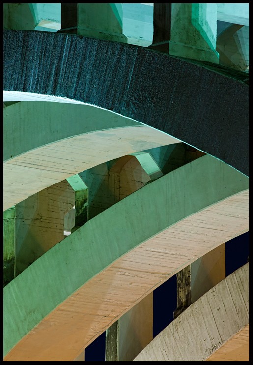
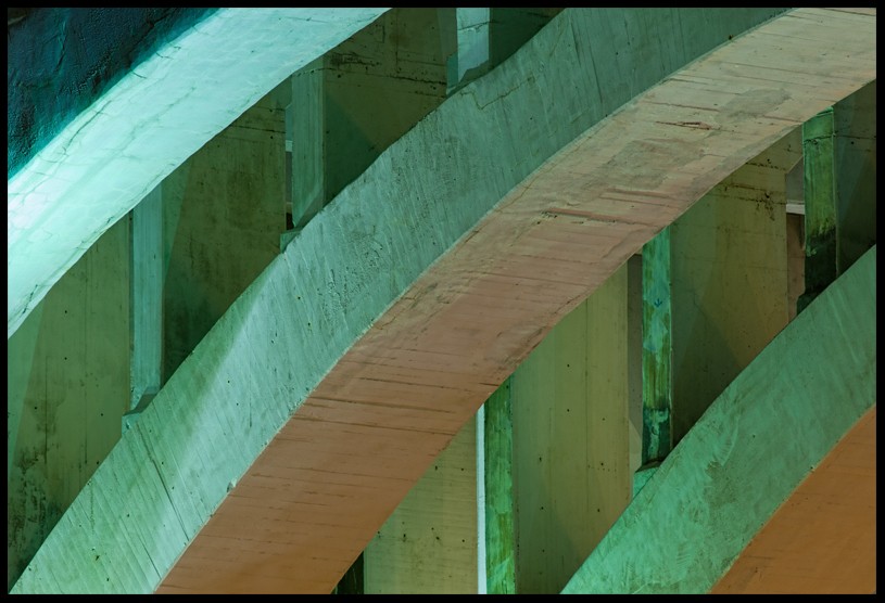
Yeah...I like #3 and the way the entire compositional space is used. What I like about #3 is the intererplay between the curved arches in the foreground areas, against the straight up and down vertical concrete pillars in the background. There are also some very small reinforcement pieces that peek out on the vertical columns, and those add a bit of interest. To me, #3 is a very subtle photo, one that gets better the longer I look at it. In contrast, #2 is brash,and has much more discordant elements in it. In #2, the vertical columns at the very top are interrupted by the curved arches and then the vertical lines reappear lower in the composition; while some people might feel that photo #2 is more dynamic, to me it seems to have almost too much variety, and too much discord, whereas #3 is a lovely study in balance,and in actual architectural design principles put into practice. So, yeah, I like #3 for those reasons.
 
Thanks for that, Derrel.

I think that helps me describe why I wasn't sure about that one. I think it has too much repitition, with out a break, that it just seems even and boring. I tend to like something more dynamic myself, so, there you have it. LOL
 

Most reactions

New Topics

Back
Top